

If you've logged into KnowledgeOwl this morning, you've likely already noticed that we rolled out a major layout change last night!
We removed nearly all of the top navigation:
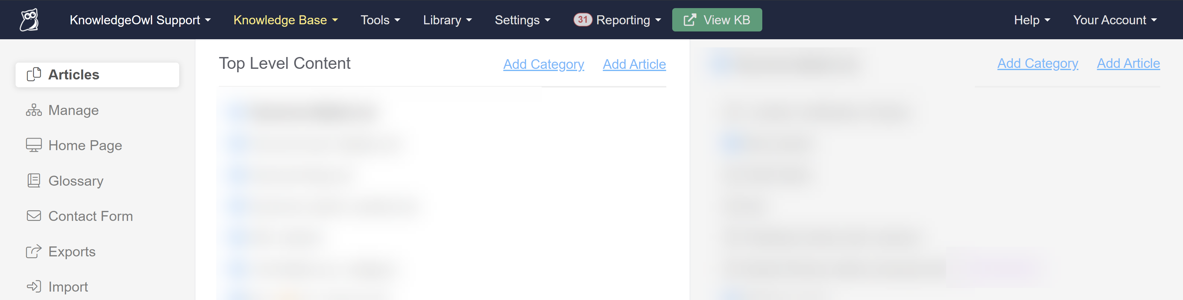 Sample navigation before the change
And moved it into a lefthand navigation bar instead:
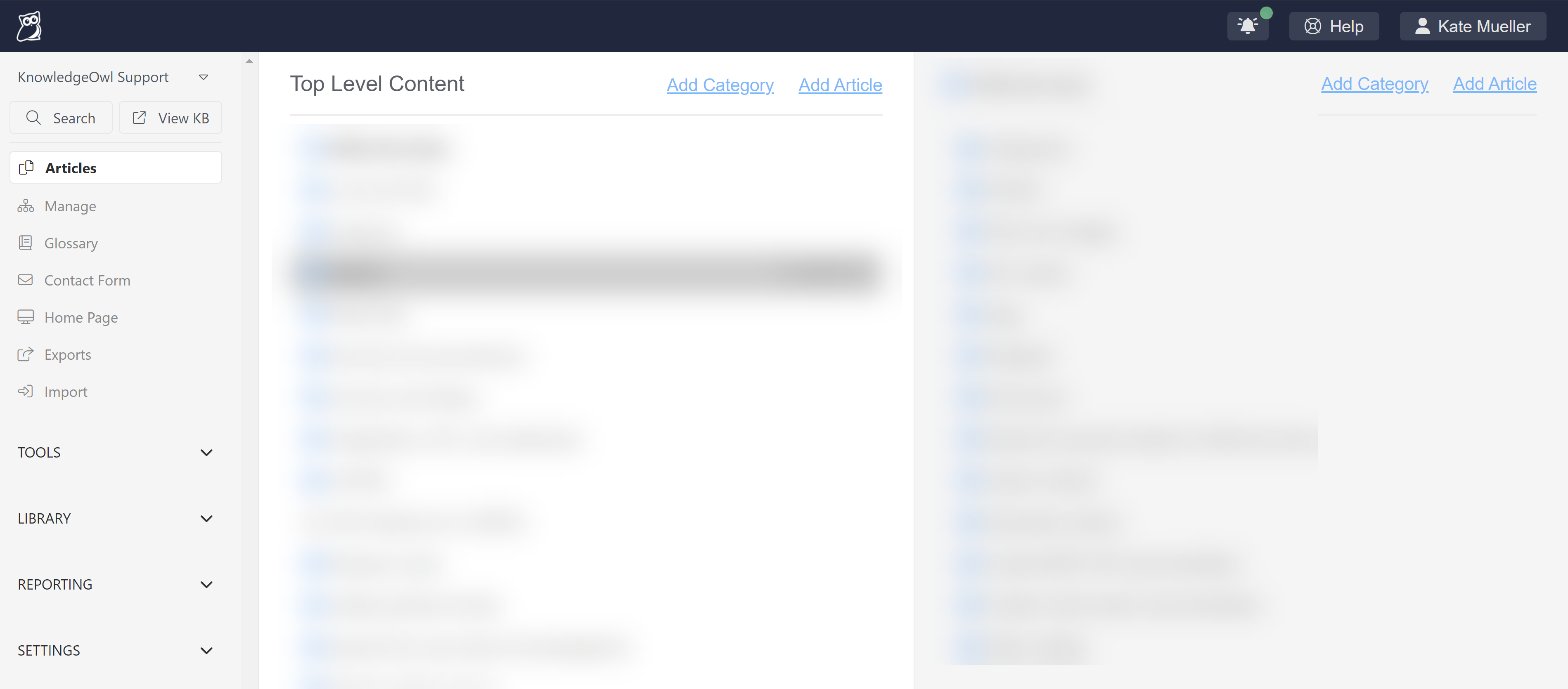 Sample navigation after the change
This change is part of a larger effort to modernize the user interface of app.knowledgeowl.com, and as with the righthand column of the article editor, we're still testing a lot of it out!
Here's a more detailed list of the changes:
Most top navigation is now lefthand side navigation
This is definitely the most obvious of the changes. Most of the dropdown menus that used to be in the top navigation have now moved into the lefthand navigation instead. This gets rid of the submenu-specific lefthand navigation to keep the global navigation present at all times:

- The knowledge base dropdown is at the very top. You can click in here to jump to a different knowledge base.
- The Searchfunction here does what the old "Find Articles" search in the lower lefthand corner did, searching articles for the text you typed. It uses a new pop-up to do the search rather than the more limited list the old Find Articles did.Bonus: this search will now also search categories!
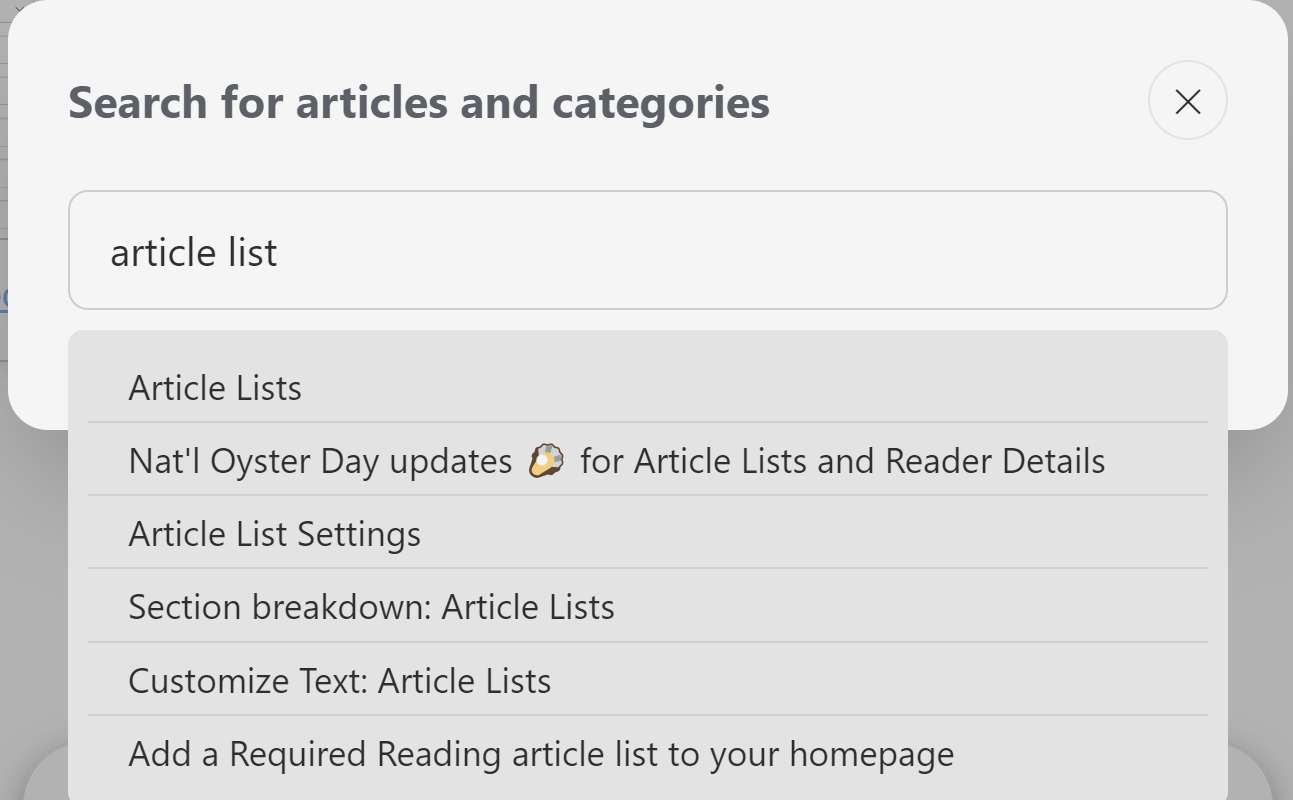 Sample pop-up after Search is clicked and a search term entered
 - View KB does exactly what the old link/button in the top navigation did: opens the live knowledge base in a new tab.

As part of this change, we tried to order these sections in terms of frequency of use, keeping things you might use often near the top.
Like the new righthand column in the article editor, this lefthand navigation will "remember" which sections you had expanded or collapsed as you navigate around.
The main navigation for Articles, Manage, etc., will always remain open.
Your Account is no more
No, not your actual account, just the "Your Account" option in the upper right. Instead, we've replaced it with a little avatar and your name (you can see mine in the screenshots!). All the same menu options live within that menu. It's just not called Your Account anymore--we use your name, instead. 😉

Notifications area
In the upper right, we've also added a new notifications area, with a bell icon:
 This notifications icon gets a different colored dot depending on how urgent the notifications are. The screenshot above shows a situation where there are no notifications, but you may see a green dot for comment reporting submissions, or yellow or red dots for more worrisome issues.
Clicking the notification bell will give you more details about what kind of notifications you have:
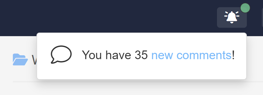 Sample notification showing new comments
Reporting > Comments counts of new submissions don't appear in the lefthand navigation; they appear in this notification area instead!
Page change: Settings > Style
In most places across KnowledgeOwl, the lefthand column was used for a submenu-specific navigation. This wasn't true in Settings > Style. The lefthand column on this page houses all of the built-in controls for changing your colors, theme, layout, and more.
We hope to do a total redesign of this page, but for now, we've kept things the way they were and you'll need to hit the Go back link in the upper left to get back to a page with the full site lefthand navigation:
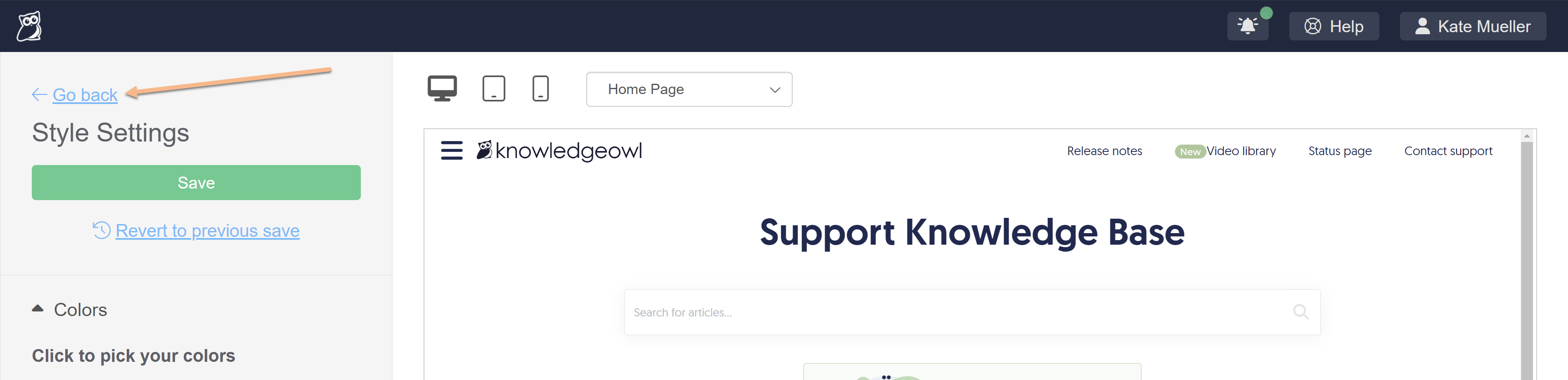 New Go back link in Settings > Style
Page change: Library > Files
The File Library (Library > Files) is one of the few other places where the lefthand column served another purpose.
In this case, if you selected a file in the library, we displayed a summary of the file's metadata in the lower portion of the lefthand column:
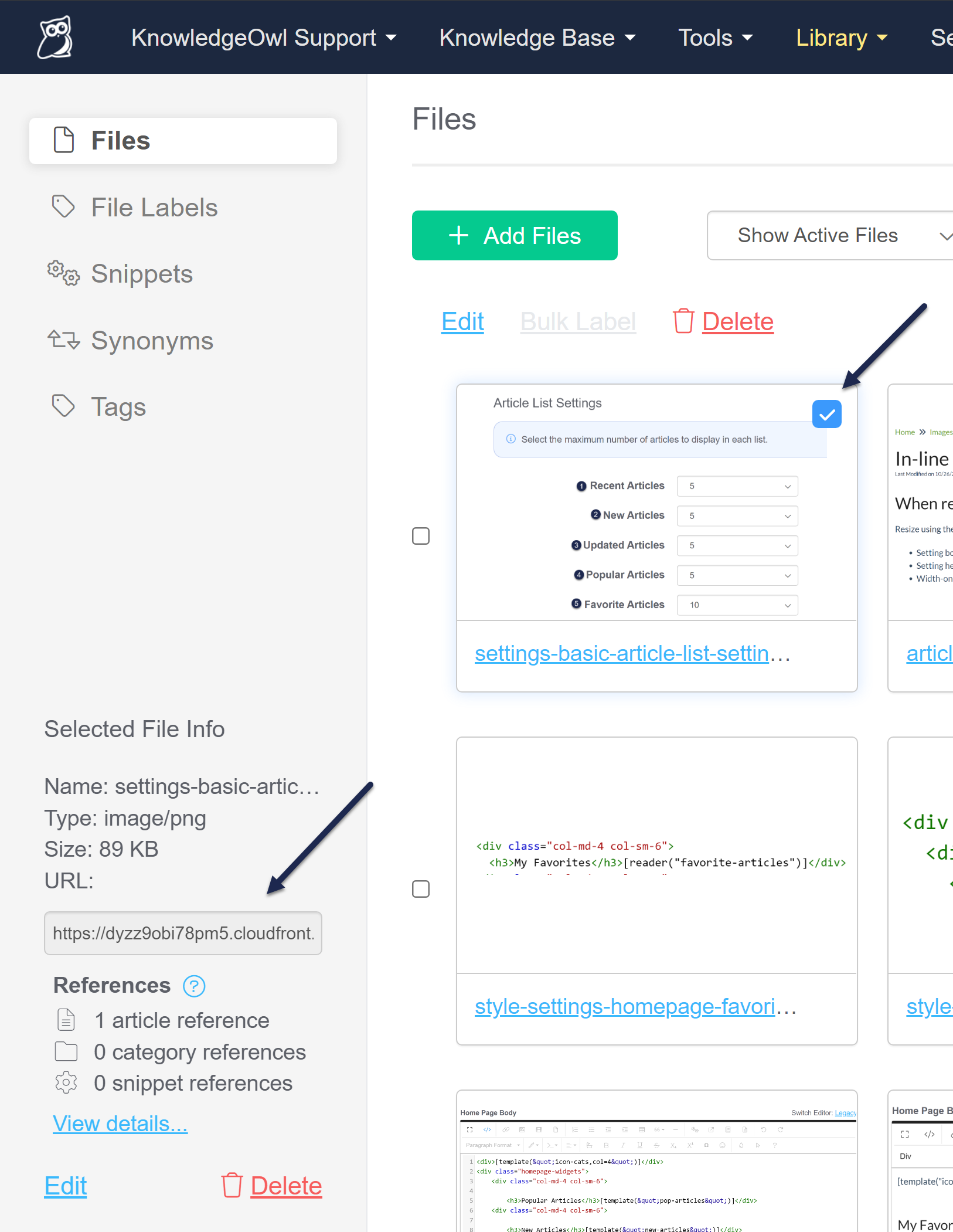 Previously, file metadata displayed in the lefthand columnWe've moved this metadata so that it appears in a pop-up at the bottom of the main page now:
 Sample file metadata pop-up
Those of you who need to copy file URLs, this change has a small Easter egg 🐣for you: there's now an explicit Copy Link option in that pop-up, so you won't need to right-click to copy a file URL!
No lefthand navigation to access Readers, Authors, etc.
One of the changes I'm finding the hardest to get used to involves navigating through things tucked into the Your Account menu. Previously, you'd access these through Your Account, and then the lefthand navigation would display the other menu options in that menu (like Authors, Readers, etc.).
Since the lefthand navigation is now used for the more "global" and not-account menus, there is no lefthand navigation to jump between Readers or Authors. You'll need to click your name in the upper right to navigate there.
I imagine this won't be a problem for newer authors, but for those of us who've been using the app for a long time and use these pages frequently, that change is going to be a little jarring!
Let us know what you think!
We know this was a massive change to our overall site layout. If you notice any weird behaviors on specific pages, or with a certain screen size, or there's just something you love or hate about the new layout, please let us know! You can drop a comment on this release note, contact us from here, use the in-app help to contact us, or send us a messenger owl.