
Different options
The color picker options will look different depending on whether you're using our older themes or our latest theme. To figure out which description you need, go to Customize > Style (HTML & CSS). Check the first option under Colors:
- If it's "Top navigation bar", use New theme.
- If it's "Header background", use Old theme.
New theme
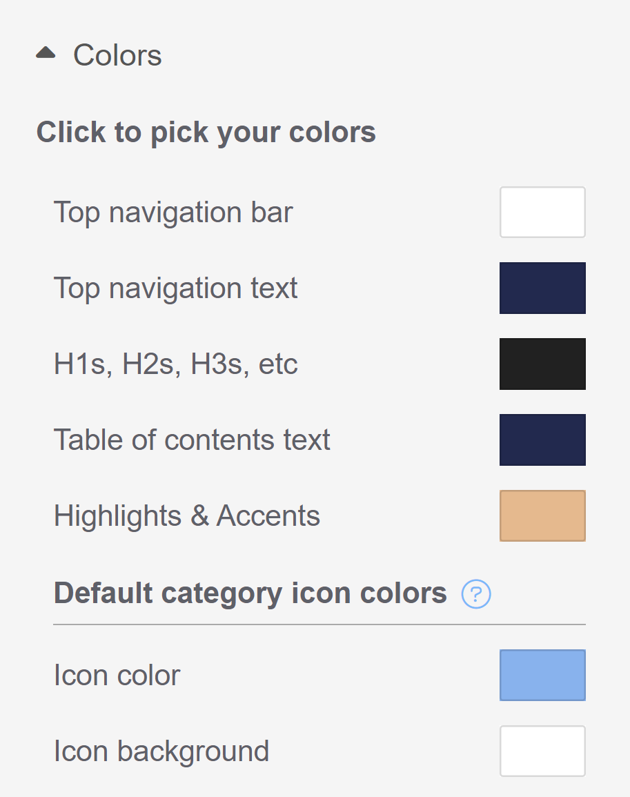
The Click to pick your colors section includes seven different color areas you can set:
- Top navigation bar
- Top navigation text
- H1s, H2s, H3s, etc.
- Table of contents text
- Highlights & Accents
Default category icon colors:
- Icon color
- Icon background
Refer to the sections below for more detailed descriptions of what each color setting does.
Limitations
If you have custom CSS, HTML, or snippets in your knowledge base, those customizations may override these general color area settings.
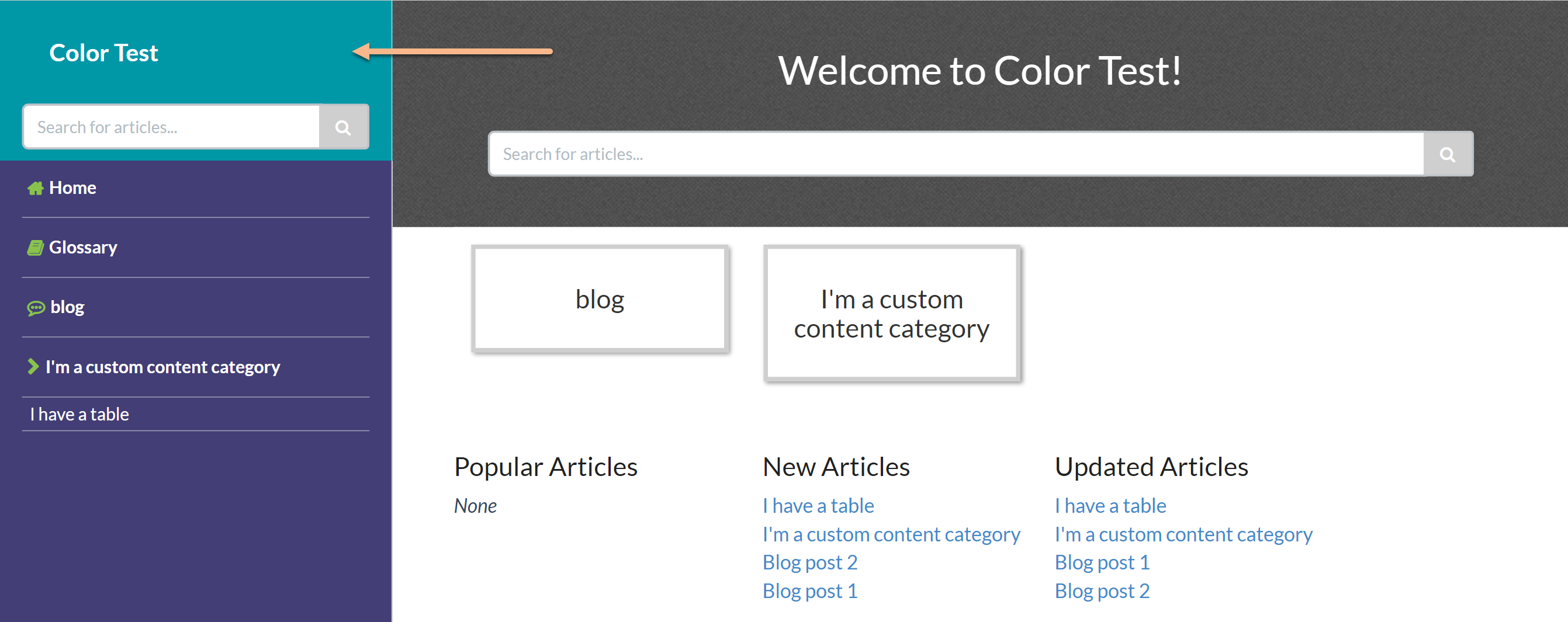
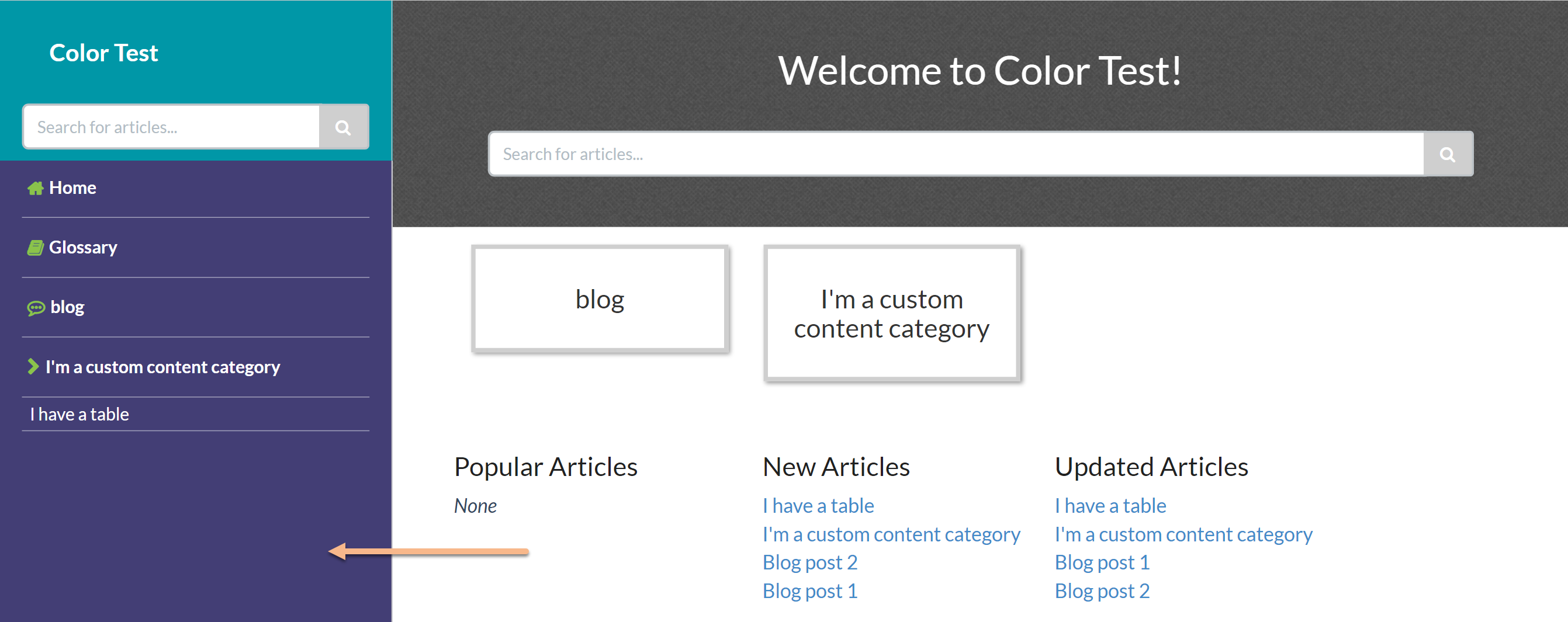
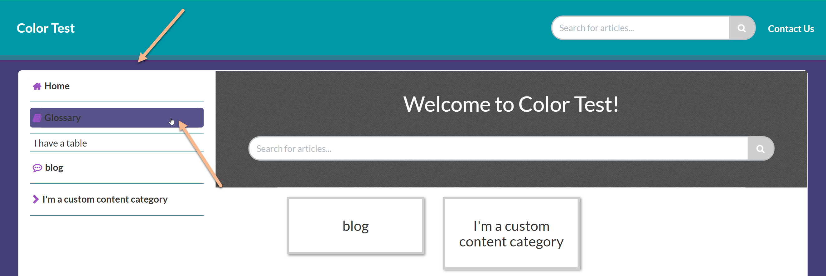
Top navigation bar
Top navigation bar changes the color background of the top navigation bar in your knowledge base.
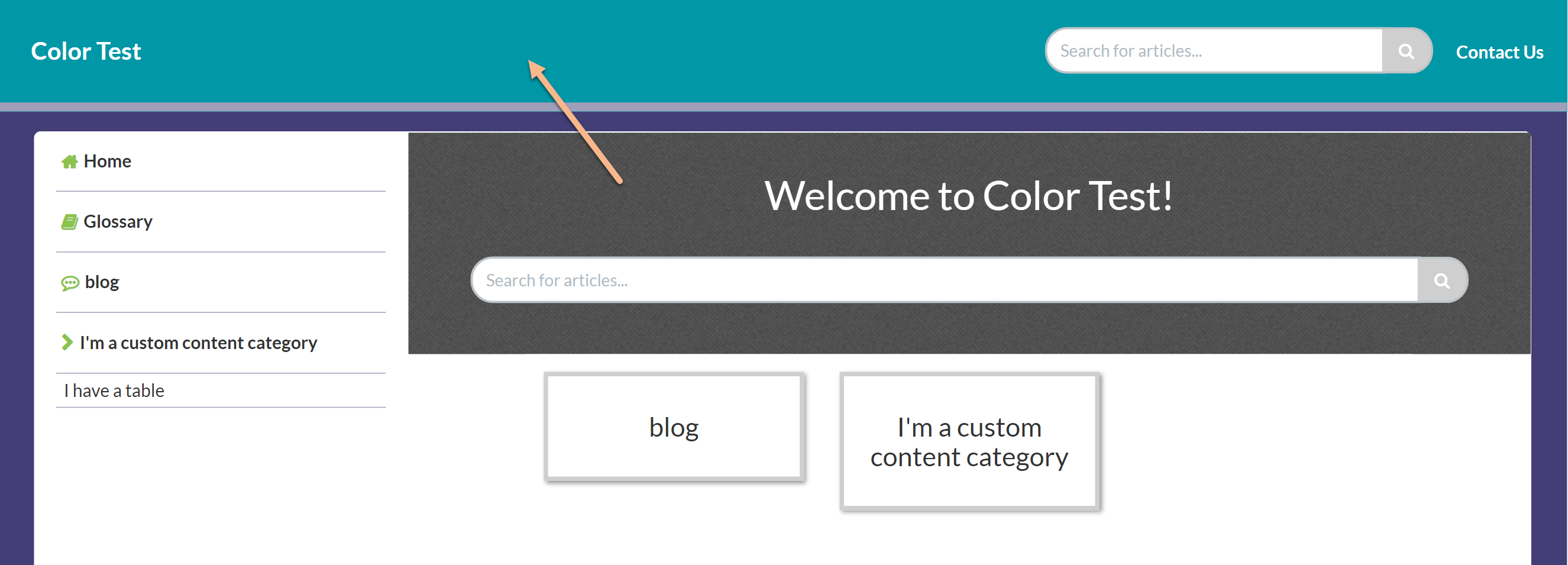
Top navigation text
Top navigation text changes the color of:
- Any text in your top navigation
- Table of contents hamburger icon
- The text color of the buttons impacted by the Highlight & accents button color
H1s, H2s, H3s, etc.
H1s, H2s, H3s, etc. changes the colors of:
- The headers for the homepage article lists (New, Popular, etc.)
- All headings in articles: article title, any headings in the article body, and the Related Articles heading
- The "Search results for..." header on the Search Results page (* default theme includes CSS that overrides this setting)
- The header on the Contact Form once it's opened
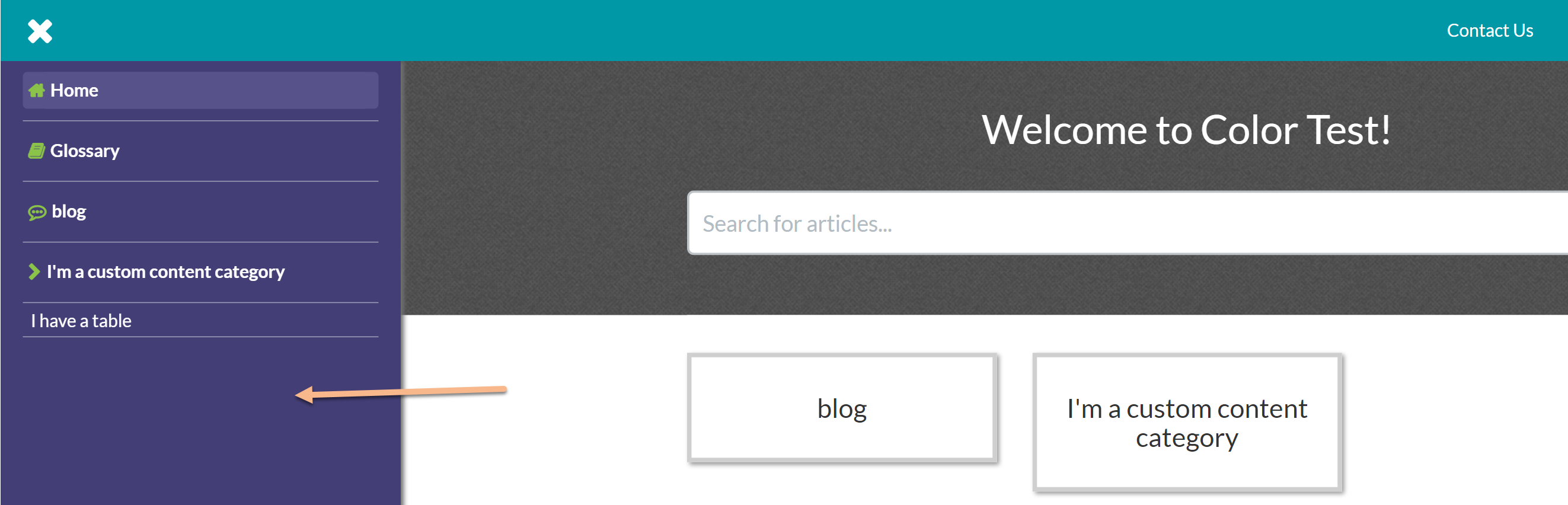
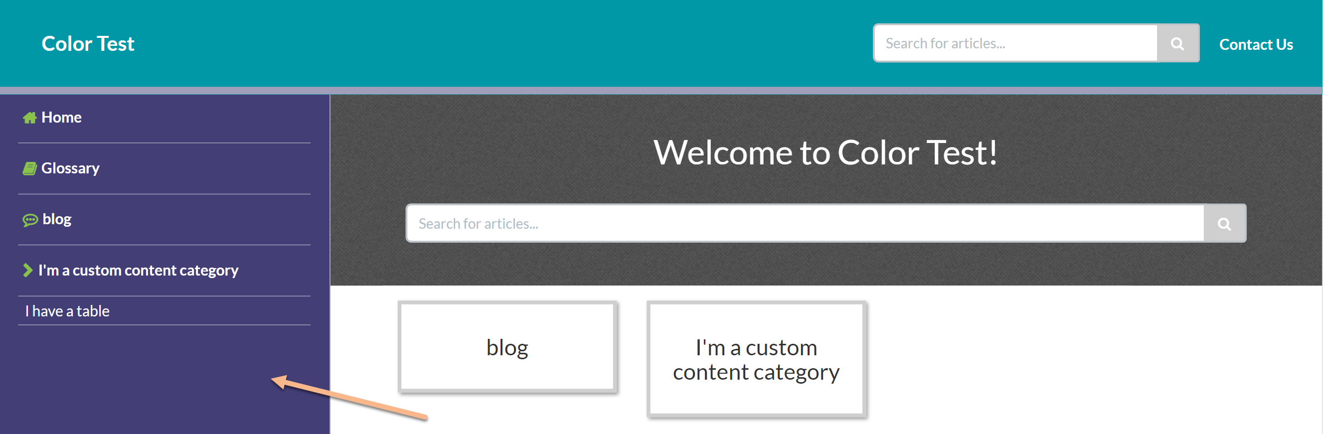
Table of contents text
Table of contents text changes the color of the text in your table of contents for both articles and categories.
Highlights & accents
Highlights and accents are used throughout your knowledge base. Assuming there is no CSS to style them differently, changing this color will impact:
- Icons in the Table of contents
- Hyperlinks in article lists, related articles, category landing pages, search results, Contact Form results, article text (* default theme includes CSS that overrides this setting)
- Breadcrumbs displayed in articles (* default theme includes CSS that overrides this setting)
- Article actions icons: PDF, print, email, favorite (* default theme includes CSS that overrides this setting)
- Search results breadcrumbs and article titles (* default theme includes CSS that overrides this setting)
- Search bar text box and comments text box border highlighting on-focus
- All buttons except Search button (login submit, Contact Form submit, etc.)
Icon color
Icon color changes the default color that the Choose a Font Awesome icon pop-up uses when you add a new category icon. It will not change any of your existing category icon colors. Once a category icon has been saved with a specific color, you'll need to edit that category to change the color.
Icon background
When category icons are displayed, they're displayed within a small box. We set that default icon background color to white. The Icon background changes the default icon background color that the Choose a Font Awesome icon pop-up uses when you add a new category icon. It will not change any of your existing category icon background colors. Once a category icon has been saved with a specific background color, you'll need to edit that category to change the color.
Old theme
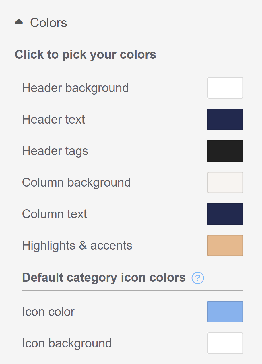
The Click to pick your colors section includes eight different color areas you can set:
- Header background
- Header text
- Header tags
- Column background
- Column text
- Highlights & accents
Default category icon colors:
- Icon color
- Icon background
Refer to the sections below for more detailed descriptions of what each color setting does, and any variations between themes.
Limitations
If you have custom CSS, HTML, or snippets in your knowledge base, those customizations may override these general color area settings.
Header background
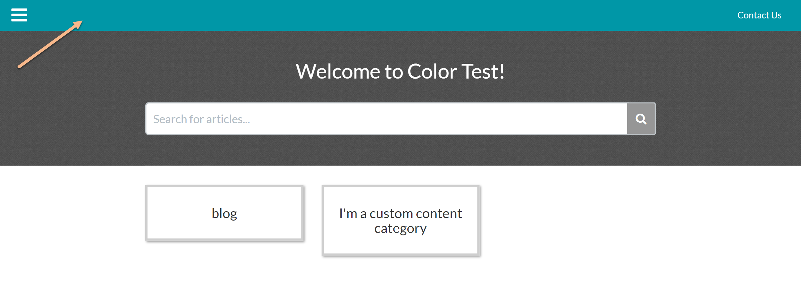
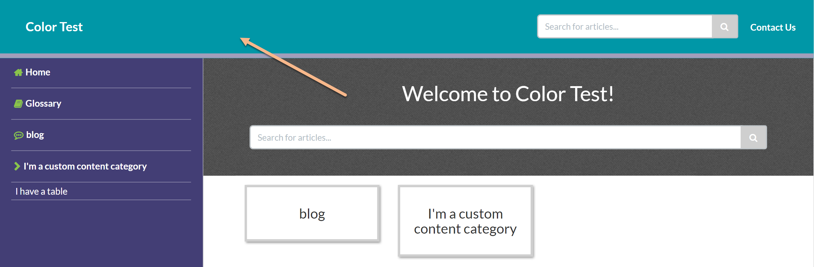
The Header background changes the color background of the top navigation bar in your knowledge base. This bar looks a bit different depending on which theme you have selected. For Minimalist, Classic, and Modern theme, it's the entire top navigation bar. For Clayton theme, it's the portion in the upper left:
 Minimalist theme
 Classic theme
 Clayton theme
 Modern theme
Header text
Header text changes the color of:
- Any text in your top navigation (Contact Us link if the Contact Form is being used in all themes; knowledge base title in the Classic, Clayton, and Modern themes)
- Table of contents hamburger icon (Minimalist theme only)
- The text color of the buttons impacted by the Highlight & accents button color
Header tags
Header tags changes the colors of:
- The headers for the homepage article lists in all four themes
- All headings in articles: article title, any headings in the article body, and the Related Articles heading
- The "Search results for..." header on the Search Results page
- The header on the Contact Form once it's opened
Column background
Column background changes the background color for "column" sections of your knowledge base. For the Minimalist, Classic, and Clayton themes, this changes the background color of the table of contents. For Minimalist theme, this also changes the background color of the footer.
For Modern theme, this changes the background around the content container as well as the highlighting on-hover color of the table of contents:
 Minimalist theme
 Classic theme
 Clayton theme
 Modern theme
Column text
Column text changes the text in your table of contents of the Minimalist theme, Classic theme, and Clayton theme. It doesn't impact anything in the Modern theme.
Highlights & accents
Highlights and accents are used throughout your knowledge base. Each theme uses them slightly differently. Here's a list of the most common highlights and accents. If the color is impacted by the Highlights & accents color swatch, an "X" is included in the table:
| Highlight & accent area | Minimalist theme | Classic theme | Clayton theme | Modern theme |
|---|---|---|---|---|
| Icons in the Table of Contents | X | X | X | X |
| Hyperlinks in article lists, related articles, category landing pages, search results, Contact Form results, article text | X |
|
|
|
| Category tile borders on-hover in homepage and category landing pages | X | X | X | X |
| Breadcrumbs displayed in articles | X |
|
|
|
| Article action icons (PDF, print, email) | X | X | X | X |
| Search results breadcrumbs and article titles | X |
|
|
|
| Search bar text box and comments text box border highlighting on-focus | X | X | X |
X |
| All buttons except Search button (login, submit) | X | X | X | X |
Icon color
Icon color changes the default color that the Choose a Font Awesome icon pop-up uses when you add a new category icon. It will not change any of your existing category icon colors. Once a category icon has been saved with a specific color, you'll need to edit that category to change the color.
Icon background
When category icons are displayed, they're displayed within a small box. We set that default icon background color to white. The Icon background changes the default icon background color that the Choose a Font Awesome icon pop-up uses when you add a new category icon. It will not change any of your existing category icon background colors. Once a category icon has been saved with a specific background color, you'll need to edit that category to change the color.