
By default, we include icons in our various alert divs and style them with specific colors:
Alert Danger div style
Alert Info div style
Alert Success div style
Alert Warning div style
As you've likely noticed, we change those icons here in the Support KB to use Linus icons instead (because...well, why wouldn't we? He's cute!).
If you'd like to make a similar change in your own knowledge base, you can!
You have three options:
- Change the alert box or border color.
- Replace the icons with a different Font Awesome icon.
- Replace the icons with a custom image or icon of your choice.
We'll walk through each setup below.
Change the alert colors and border
To change the colors or border of any of the alerts:
- Go to Customize > Style (HTML & CSS).
- In the Customize HTML, CSS, and JS section, select Custom CSS.
- If you're using our default Custom CSS, the Alert boxes CSS begins around row 577.
- In that section, look for the class for the alert(s) you want to change the colors on:
- Alert Danger:
.alert.alert-danger, at or near row 598. - Alert Info:
.alert.alert-info, at or near row 608. - Alert Success:
.alert.alert-success, at or near row 617. - Alert Warning:
.alert.alert-warning, at or near row 626.
- Alert Danger:
- Each code block includes a background, which sets the color of the alert box, and a border, which sets the color and style of the border around the outside. For example:
/* danger alert styling */ .alert.alert-danger { background: #F4E2E2; border: 1px solid #E6ADA9; } - Update the hex codes for the colors to change them, or play around with other border settings.
Need more help?
Refer to W3 Schools' CSS border property documentation for more guidance on working with borders or contact us to get help from a support owl! - Be sure to Save your changes.
Replace alert icon with different Font Awesome icon
If you'd like to replace any of those icons with a different Font Awesome icon, you'll need the unicode value for the new icon.
To find it:
- Open Font Awesome.
- Search for the icon you want.
- Select the icon to open its details.
- Font Awesome displays the unicode value near the upper right. If you select or click on that Unicode, it should automatically copy to your clipboard. For example, if we wanted to use the circle plus icon, we'd select
f055to copy it.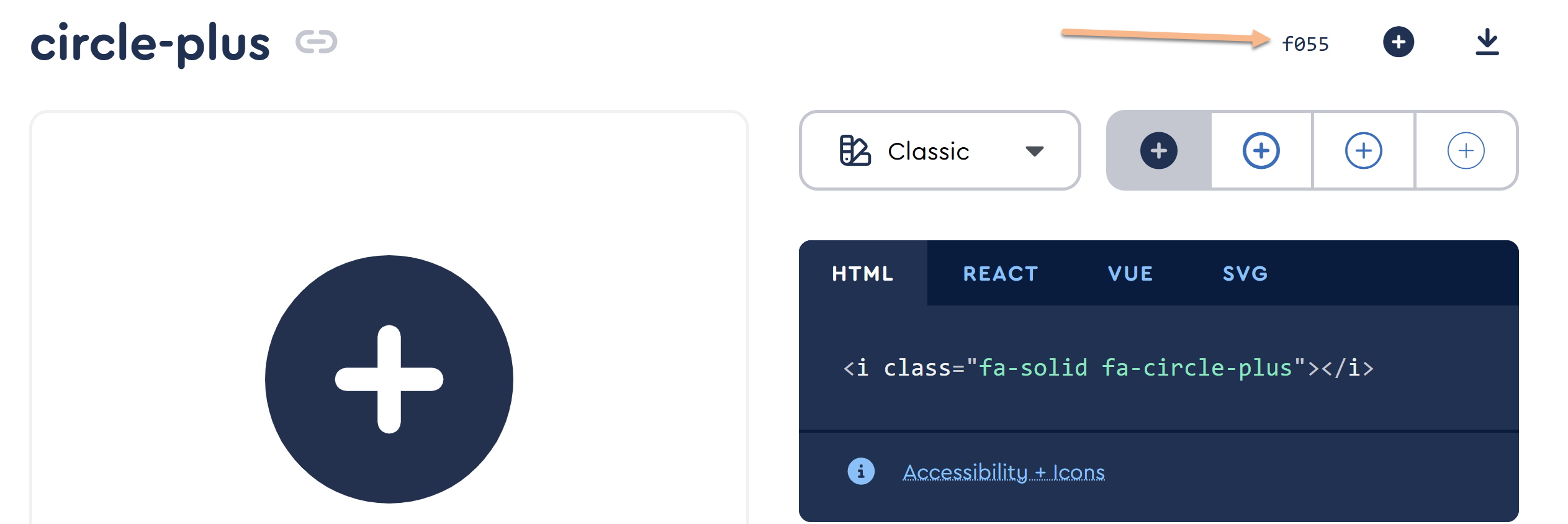
Once you have the Unicode values for the icons you want to use:
- Go to Customize > Style (HTML & CSS).
- In the Customize HTML, CSS, and JS section, select Custom CSS.
- If you're using our default Custom CSS, the Alert boxes CSS begins around row 577.
- In that section, look for CSS with :before on it. The exact class varies based on which alert you want to update:
- Alert Danger:
.alert.alert-danger:before, at or near row 603. - Alert Info:
.alert.alert-info:before, at or near row 612. - Alert Success:
.alert.alert-success:before, at or near row 621. - Alert Warning:
.alert.alert-warning:before, at or near row 630.
- Alert Danger:
- Once you've found the CSS for the div alert you want to update, update the content: "\fxxx"; row with the unicode for the new icon you want. Keep the quotes and the beginning \.
- In that same CSS, you can adjust the color of the icon by adding a new hex code.
- So, for example, here's the default CSS for the Alert Warning:
.alert.alert-warning:before { content: "\f8fa"; color: #ffcc7a; } - And here, we've adjusted it to use the circle-exclamation icon, which has a unicode value of f06a, and a slightly different color:
.alert.alert-warning:before {
  content: "\f06a";
  color: #fcb900;
}
Sample output from that code
- Once you've adjusted your CSS for the icons you want to update, be sure to Save.
Replace alert icon with custom icon/image
Our alerts use a custom icon/image instead of a built-in Font Awesome one, for example:
Our Success Alert
Isn't Linus great?
If you would like to make a similar change:
- First, be sure all of your images are available online.
- If you already have brand resources available at your own publicly-accessible site, grab the URLs for each of the images from there.
- If you don't already have brand resources available anywhere, upload the files to Files. Follow the instructions to Find a file's URL.
- Go to Customize > Style (HTML & CSS).
- In the Customize HTML, CSS, and JS section, select Custom CSS.
- If you're using our default Custom CSS, the Alert boxes CSS begins around row 577.
- First, let's comment out the CSS that adds the icons by default by adding
/*before them and*/after (this is so that you can rollback these changes should you ever need to!). Look for these classes and comment them out:- Alert Danger:
.alert.alert-danger:before, at or near row 603. - Alert Info:
.alert.alert-info:before, at or near row 612. - Alert Success:
.alert.alert-success:before, at or near row 621. - Alert Warning:
.alert.alert-warning:before, at or near row 630. - So this section of CSS should look like this once you're done:
/* danger alert styling */
.alert.alert-danger {
  background: #F4E2E2;
  border: 1px solid #E6ADA9;
}
/*.alert.alert-danger:before {
  content: "\f071";
  color: #f8918b;
}*/
/* info alert styling */
.alert.alert-info {
  background: #F0F7FD;
  border: 1px solid #69B2F0;
}
/*.alert.alert-info:before {
  content: "\f05a";
  color: #97c4ed;
}*/
/* success alert styling */
.alert.alert-success {
  background: #F8FBF9;
  border: 1px solid #BDDCBC;
}
/*.alert.alert-success:before {
  content: "\f058";
  color: #9bdbae;
}*/
/* warning alert styling */
.alert.alert-warning {
  background: #FDF9E6;
  border: 1px solid #FBD9A4;
}
/*.alert.alert-warning:before {
  content: "\f8fa";
  color: #ffcc7a;
}*/
- Alert Danger:
- Scroll to the very bottom of that section, so that you're adding this new CSS below all of the other alert CSS.
- Copy the code below for any of the alerts you want to update, and paste it into that section:
.hg-site .alert.alert-danger:before,.alert.alert-danger:before{ background-image: url('//dyzz9obi78pm5.cloudfront.net/app/image/id/5fd04fb5ad121ce30d79bdc3/n/alert-red.png'); } .hg-site .alert.alert-info:before,.alert.alert-info:before{ background-image: url('//dyzz9obi78pm5.cloudfront.net/app/image/id/5fd04fb4ad121ce30d79bdc2/n/alert-blue.png'); } .hg-site .alert.alert-success:before,.alert.alert-success:before{ background-image: url('//dyzz9obi78pm5.cloudfront.net/app/image/id/5fd04fb3ad121c127b79c7b0/n/alert-green.png'); } .hg-site .alert.alert-warning:before,.alert.alert-warning:before{ background-image: url('//dyzz9obi78pm5.cloudfront.net/app/image/id/5fd04fb5ad121c230e79bce0/n/alert-yellow.png'); - Update the url listed to be the one for your custom image/icon. Be sure it stays in the format of
url('my-image-url.png');. - You'll also need to style that image a bit. We use this CSS, which applies the same layout and format to all the alert types, and add it just before the URLs we added above:
.hg-site:not(.hg-home-page) .alert:before,.alert:before { content: ""; display: block; width: 75px; height: 60px; float: left; margin-top: 0px; background-size: contain; background-repeat: no-repeat; } - Be sure to Save your changes.
Icons not looking right?
This approach may require additional tinkering depending on the files/icons you're using; contact us if you get stuck or need help!