
Here are three ways to add side-by-side images, from favorite to least favorite.
Use a Bootstrap grid in the HTML
While this approach does require you to use Code View, it creates the most responsive image layout and is the easiest way to handle rows of varying length.
- Highlight some text near where you want to add the images.
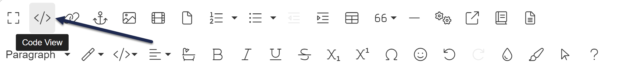
- Select the < /> Code View editor control to switch to the Code View:
- Copy the code below and paste it into the editor where you want your side-by-side images to appear:
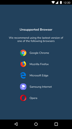
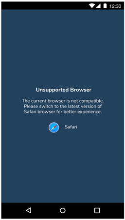
<div class="row"> <div class="col-sm-6"> <img class="img-responsive" src="//dyzz9obi78pm5.cloudfront.net/app/image/id/5e9dee62ad121cd86d8c5903/n/sample-image-unsupported-browser-list.png" alt="My alt text"> </div> <div class="col-sm-6"> <img class="img-responsive" src="//dyzz9obi78pm5.cloudfront.net/app/image/id/5e9dee6aec161c025a0231fc/n/sample-image-safari-unsupported.png" alt="My alt text"> </div> </div> - You can either replace the src URL and the alt text here in Code View (which works well if you already have these images inserted into your content and can copy the details), or switch back to the editor and use the editor controls to update them.
- Save.

Have more than two images? Adjust this to display more than two images. To do so, copy one of the <div class="col-sm-6"> and paste it in below the closing </div> tag. Then adjust the number after col-sm for each div so they total 12. For example, use this code to add a row of three images:
<div class="row">
 <div class="col-sm-4">
   <img class="img-responsive" src="//dyzz9obi78pm5.cloudfront.net/app/image/id/5e9dee62ad121cd86d8c5903/n/sample-image-unsupported-browser-list.png" alt="My alt text">
  </div>
  <div class="col-sm-4">
    <img class="img-responsive" src="//dyzz9obi78pm5.cloudfront.net/app/image/id/5e9dee6aec161c025a0231fc/n/sample-image-safari-unsupported.png" alt="My alt text">
  </div>
  <div class="col-sm-4">
    <img class="img-responsive" src="//dyzz9obi78pm5.cloudfront.net/app/image/id/5e9dee6aec161c025a0231fc/n/sample-image-safari-unsupported.png" alt="My alt text">
  </div>
</div>
Here's a sample of this layout:
Use Display Inline on images
This approach uses built-in editor controls.
- Insert the images one after the other.
- For each image, select the image. The image context menu appears.
- Select the star to show the Image Display submenu.
- Choose Display Inline instead of Break Text so the images are inline with each other.
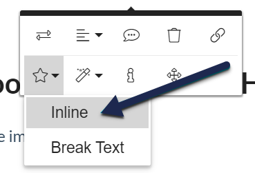 Use the Inline display option for both images
 - Adjust the widths how you want.
- Save.

Here's a sample of this layout:
Put them in a table
- Create a table with one row and two cells. (Insert Table > 1 x 2.)
- Insert the images. They should be the same size or you can set them to be the same size.
- Select anywhere in the table. The table's context menu opens.
- Select the paintbrush to open the Table Styles submenu.
- Deselect Bordered Table to remove the borders.
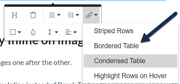 Be sure you deselect the Bordered Table option
 - You can use either the image alignment or the table cell alignment to get the desired effect (center align on the cells gives the most consistent spacing).
- Save.

Here's a sample of this layout:
|
|