
Quick links
Overview
Your Articles content hierarchy automatically generates a table of contents for your knowledge base.
As readers navigate through your knowledge base, the table of contents will expand the category they're in and highlight the article or subcategory they're currently viewing with a different background color:
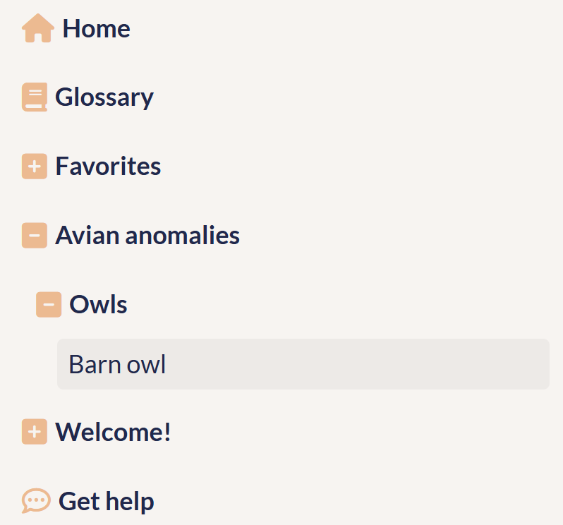 Sample table of contents; reader is viewing the Barn owl article
Make your table of contents your own in three ways:
- Add or remove links or search bar: Use built-in options to add a Home link, search bar, and links to certain features. Or use URL redirect categories or scripts to add even more customized links. Refer to Add links to your table of contents for more details.
- Change the style: Use built-in options to set default table of contents open/closed state, whether categories appear by default opened or closed, or add some custom CSS to change the icons or colors used in your table of contents. Refer to Style your table of contents for more information.
- As you edit content: Use the category or article editor's Display Settings to set whether those pages appear in your table of contents. For categories, you can also set the Table of Contents Display to set whether the category appears open or closed when the table of contents initially loads.