
Use the Widget Settings section to choose how you want an end-user to open the widget from your website or application.
We offer two widget launch methods:
- An automatic circular button with the "?" icon -- no coding required!
- Attach the widget to an element of your choice (such as a menu option, top navigation link, hyperlink, icon, image, etc.) by Element ID
Refer to the more detailed instructions below to set up either option.
Settings changes may require refresh due to browser caching
If you make changes to these settings, it may take up to an hour to see them in your browser due to caching. You can bypass the caching by doing a hard refresh.
Automatic button
With the automatic button option, you don't need to adjust anything else on the website you're adding the code to. The script will automatically create the button and icon and place it based on the location setting you select.
To use this configuration, select any of the Button Page Position options other than Attach to Element (e.g. Bottom Right, Top Center, etc.):
 Widget Settings when an icon display position is selected
- Select the display location for the icon in the Button Page Position dropdown.
- Enter a hex color in the Button Text Color to set the color of the question mark on the button.
- Enter a hex color in the Button Background Color to set the color of the button.
- Be sure to Save any changes you made here.
Here's what a widget button looks like if it's configured with:
- Button Page Position: Bottom Right
- Button Text Color: #ffffff (white)
- Button Background Color: #8080ff
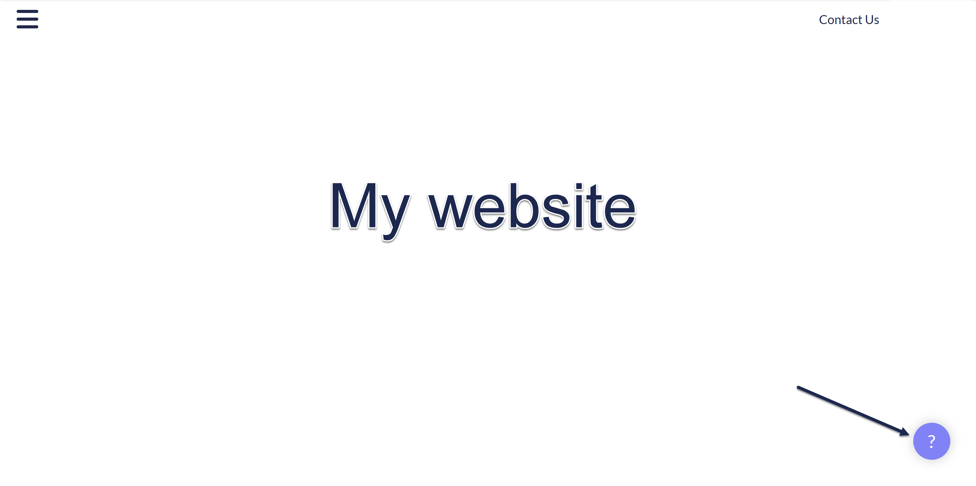 Sample website with embedded widget configured using the settings above
Attach to element
If you don't want to use the built-in button, you can launch the widget by attaching it to an element of your choice--this can be a menu option, an icon, a hyperlink, etc.
For example, we use this option within app.knowledgeowl.com when you use the Help > In-app help menu.
To use this option, select Attach to Element from the Button Page Position dropdown:
 Widget Settings when Attach To Element is selected
- In the Button Page Position dropdown, select Attach to Element.
- Once you select Attach To Element, the page hides the other Button Page fields and displays an Element ID. Set the Element ID to match the html ID attribute of the element you want the widget attached to in your website or application. When someone clicks on this element, the widget will open. If your developers are creating an element from scratch, we recommend using the default
ko-launchElement ID or another obviously KnowledgeOwl-related Element ID. (You can't useko-widget; we prevent that ID from being used, and you'll see an error message if you try to use it.) - Be sure to Save your changes.
For example, if we used "ko-launch" as our Element ID, we might add this HTML element to a top navigation option in our other website:
<li><a class="header-link" id="ko-launch" href="javascript:void(0);">Get Help</a></li>Anytime an end-user selects the Get Help link, the widget will open.