
New knowledge bases created with our default theme use these icons in the table of contents:
- A plus + icon when a category can be expanded to view content or is empty
- A minus - icon to collapse a category
 Sample of our table of contents icons
You can change these icons:
- Change to right/down chevrons like this:
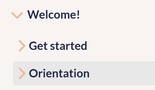 Sample table of contents with chevrons
 - Change to any icon of your choice, like a folder:
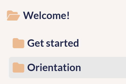 Sample table of contents with folders
 - Change the "empty" category icon, which defaults to the closed category icon.
Refer to the detailed instructions below for each setup.
Change to chevrons
To change from the plus/minus icons to chevrons:
- Go to Customize > Style (HTML & CSS).
- In the Customize HTML, CSS, and JS section, select Custom CSS.
- Use the Find option to search for override default toc slideout behavior, which is usually near row 300:
- Delete the CSS to "Change TOC chevron-right to plus-square" or "Change TOC chevron-down to minus-square", rows 311-318 in our example. Your CSS should now look like this:
/* override default toc slideout behavior */ .hg-minimalist-theme #ko-article-cntr.slideout-panel.open { transform: translateX(360px); width: calc(100% - 360px); } /* make icons slightly larger */ .hg-minimalist-theme .cat-icon, .hg-minimalist-theme .home-icon, .hg-minimalist-theme .alt-icon { padding: 8px 0 0 6px; font-size: 18px; } - Be sure to Save your changes.
Change to other icons
We use Font Awesome icons in the table of contents, and we recommend you change to other Font Awesome icons. Before you begin, you'll need to get the unicode of the icon(s) you want to use. To do so:
- Open Font Awesome.
- Search for the icon you want.
- Select the icon to open its details.
- Font Awesome displays the unicode value near the upper right. If you select or click on that Unicode, it should automatically copy to your clipboard. For example, if we wanted to use the circle plus icon, we'd select
f055to copy it.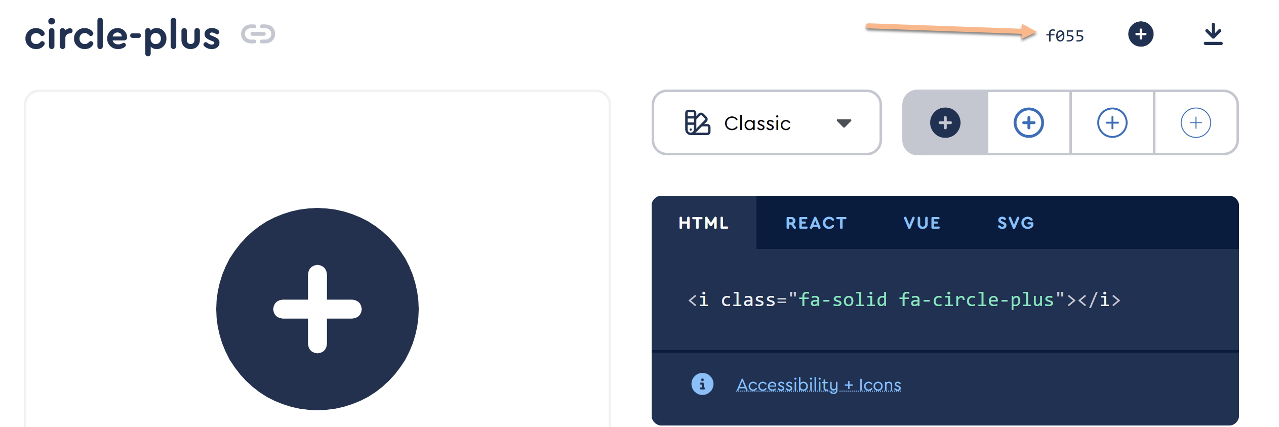
Once you have the code value for the icon(s) you want to use:
- Go to Customize > Style (HTML & CSS).
- In the Customize HTML, CSS, and JS section, select Custom CSS.
- Use the Find option to search for Change TOC chevron-right to plus-square, which is usually near row 310:
- Replace the content value in row 313 with the unicode value of the icon you want to use instead of the plus square.
- Replace the content value in row 317 with the unicode value of the icon you want to use instead of the minus square.
- For example, this code will change the plus square to a closed folder and the minus square to an open folder:
/* Change TOC chevron-right to plus-square */ .hg-minimalist-theme .documentation-categories .fa-chevron-right:before { content: "\f07b" !important; } /* Change TOC chevron-down to minus-square */ .hg-minimalist-theme .documentation-categories .fa-chevron-down:before { content: "\f07c" !important; } - Be sure to Save your changes once you're done.
Change the "empty" category icon
Using the setups above, an "empty" category will get the same treatment as a collapsed category (a plus-square or a right-chevron).
In this knowledge base, we set a different icon for "empty" categories: a solid box:
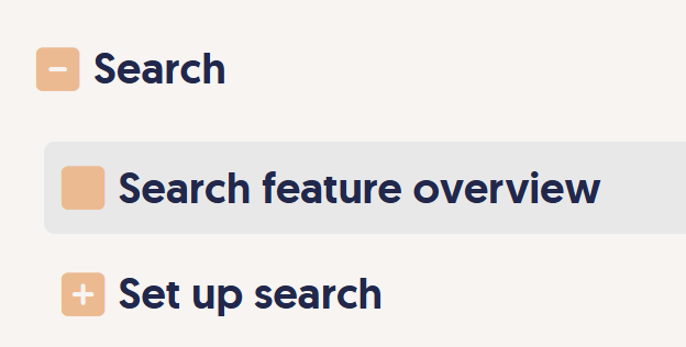 Sample different icon for empty category
If you'd like to use a different icon for empty categories:
- Go to Customize > Style (HTML & CSS).
- In the Customize HTML, CSS, and JS section, select Custom HTML.
- Select Body from the Select HTML section to edit dropdown.
- Copy the code below and paste it into the bottom of the editor. This code will check to see if the category is empty; if it is empty, it will remove the chevron-right/plus-square and add the plain square icon.
<script> $(function(){ // For Table of Contents items with no content, change remove chevron-right class and add plain square $('.nav-header-sub').each(function() { if($(this).find('ul').find('li').length < 1) { $(this).find('i:not(".fa-home,.fa-envelope-o,.fa-book")').removeClass("fa-chevron-right").addClass("fa-square"); }; }); }); </script> - To use a different icon, copy the Font Awesome icon's class, like
fa-folder-closedand replacefa-squarein row 6 with that class. Keep the class "in-quotes". - Be sure to Save your changes once you're done.