
The Locations report provides aggregate data about where your visitors are when they view your knowledge base.
It's a top-level report available in the Choose your report dropdown.
How to view the report
To open the Locations report:
- Go to Reporting > Owl Analytics.
- Select Locations from the Choose your report > Type dropdown.
- Select the time Period you want the report to display. Refer to Use the Period filter for more information on the options available.
- By default, reports include views and visits from authors and readers. Use the Audience to filter to Readers (no authors) or Authors only. Refer to Use the Audience filter for more information on the options available.
Anatomy of the report
The Locations report opens in the main report window. It includes color-coded map with some controls at the bottom of the pane:
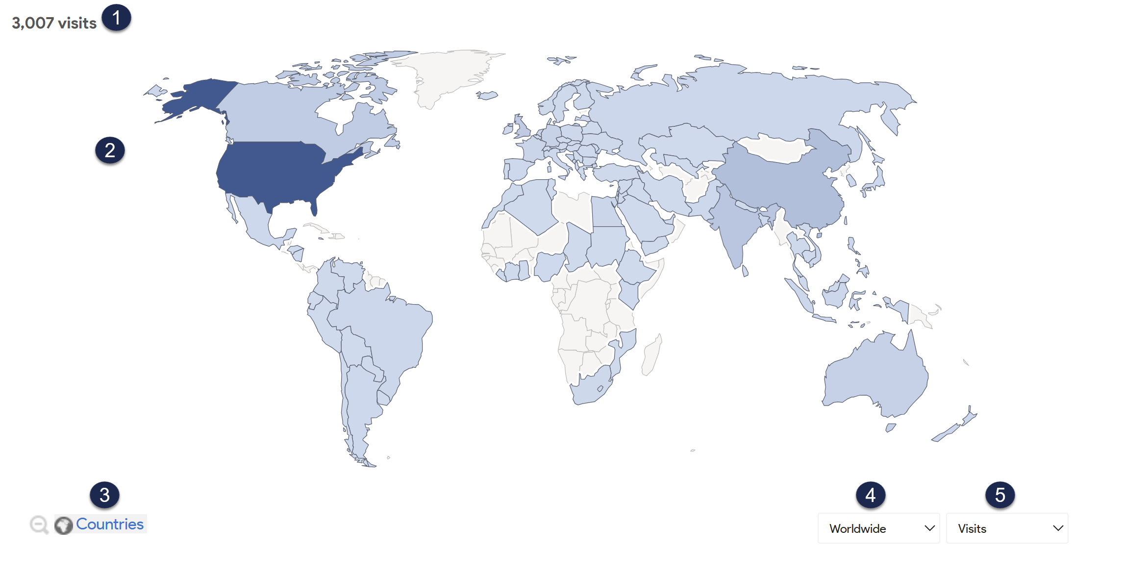 Sample Locations report
Let's review each section in more detail below.
1: Aggregate total
The upper left corner displays the total of the selected metric that we tracked for the selected time period. This number updates as you drill into the map or select a different metric to display.2: Locations map
The locations map shades locations in a darker shade of blue depending on their relative number of visitors.You can interact with the map in a few ways:
- Hover over anywhere in the map to display a key in the lower righthand corner that explains the shading colors used.
- Hover over a specific country or region to display how many visits came from that location and what percentage that is of the total visits.
- Select a country or region on the map to drill into it further. For example, we can go from the world to North America, to the United States, to Colorado.
3: Shape toggle
The shape toggle in the lower left corner tells you which shape level the data's currently being aggregated for. This toggle updates as you drill into the map. More detailed map displays may give you multiple shape toggle options.
For example:
- If you view Worldwide visits, the shape toggle is set to Countries.
- Select somewhere in the world, and the map zooms to the selected continent's data, still giving you Countries in the shape toggle.
- Select an individual country, and the shape toggle gives you the option to choose between Regions (like states or provinces) and Cities.
Select the magnifying glass with the minus icon to go up one level.
4: Shape dropdown
The shape dropdown lets you drill into the main map the same way that clicking in the map does. Use it as a quick navigation between levels without having to go up a level.
The shape dropdown includes these options:
- Worldwide
- Continents (Africa, Asia, North America, etc.)
- Countries (United States, Canada, etc.)
You'll need to select regions or cities within individual countries in the main map.
5: Metric dropdown
The Locations report defaults to display the Visits to your knowledge base. Use the metric dropdown to update the map to display a different metric. Options include:
- Visits
- Actions
- Actions per Visit
- Avg. Time on Website
- Bounce rate
Access drilldown report
The Locations report includes one drilldown report for individual locations: the row evolution graph. You don't need to select a special icon to open this report; just keep selecting in the map to drill down. Once we reach the lowest level at which we can aggregate the data, we'll open the drilldown report.
Row evolution graph
Access the Row evolution graph by drilling into an individual region or city within the map.
This graph plots the selected metric in a line chart over time, so you can view this metric within a larger context to determine if it's higher, lower, or consistent with what you expect. You can also add multiple metrics on the same graph and export the chart as a .png file.
Refer to Row evolution graph for more information on working with this graph.