
In KB Settings > Widget, the Customize Text section allows you to change a lot of the text in the widget:
- The Knowledge, Recommended, and Contact tab labels
- The header text displayed in the Knowledge and Recommended tabs
- The Open in full site and Scroll to top actions in the footer
- The search bar placeholder and the header text displayed above Quick Search and Full Search results
- Add a custom footer that will display below the open in full site and scroll to top footer
Settings changes may require refresh due to browser caching
If you make changes to these settings, it may take up to an hour to see them in your browser due to caching. You can bypass the caching by doing a hard refresh.
If you want to change any of this text, check out the screenshot and descriptions below so you know you're changing the right field(s)!
Knowledge tab
The widget's Knowledge tab displays your full knowledge base and lets your readers browse and navigate your knowledge base. All articles selected in other tabs open in the Knowledge tab.
On the Knowledge tab, you can customize:
- The tab's "Knowledge" label: Edit the Knowledge Tab text.
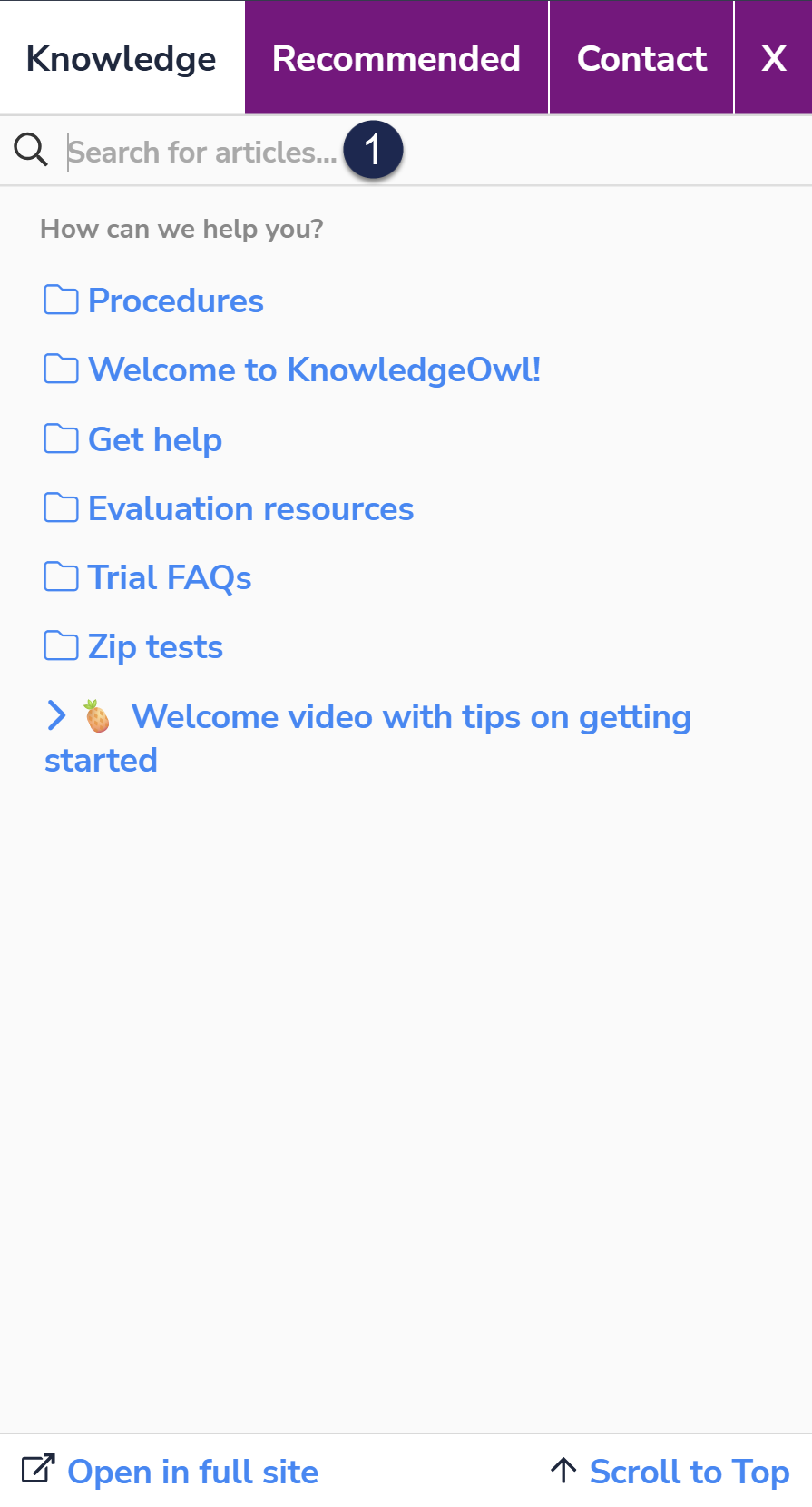
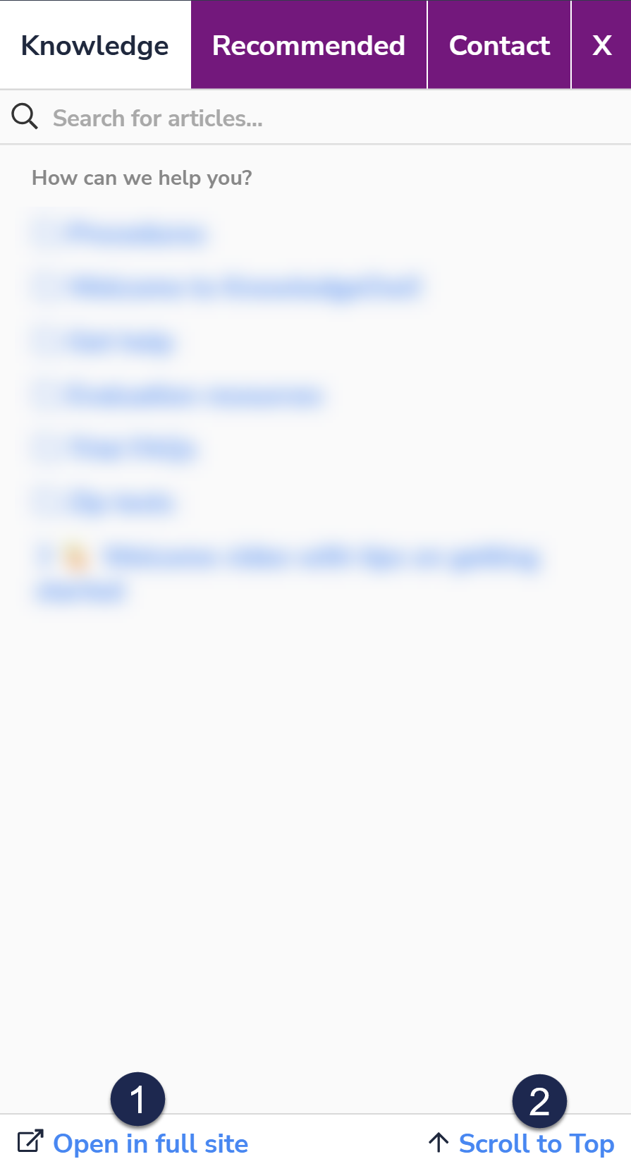
- The text displayed between the search bar and your knowledge base's table of contents (default: "How can we help you?")
- Search bar text--refer to Search box below for more information.

Recommended tab
If you're using Contextual Help and Pages to Recommend On, the widget displays recommended articles for the current page in the Recommended tab.
On the Recommended tab, you can customize:
- The tab's "Recommended" label: Edit the Recommended Tab text.
- The text displayed between the search bar and your list of recommended articles (default: "Recommended Articles for You")
- Search bar text--refer to Search box below for more information.
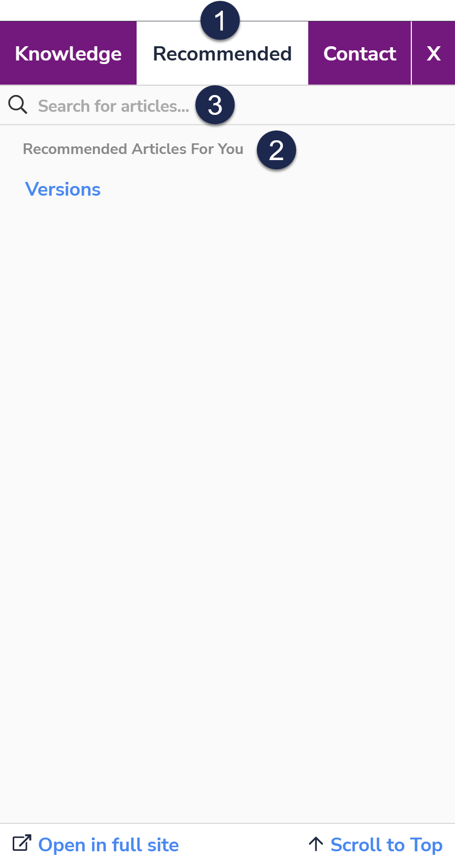 Sample Recommended tab text
Contact tab
If you're using the Contact Form in your knowledge base, the widget displays a Contact tab for your readers to submit requests.
On the Contact tab, you can customize the tab's "Contact" label by editing the Contact Tab.
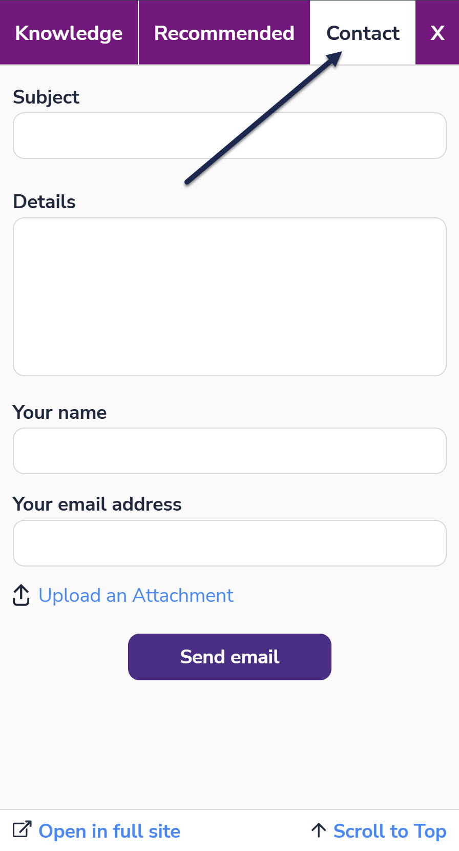 Sample Contact Tab label
Search box
The search box displays on both the Knowledge tab and the Recommended tab. Once someone enters a search term, quick search displays autosuggested resources along with guidance on how to complete a full search. Once someone hits Enter to complete the full search, more detailed search results display.
You can customize this search-related text:
- The search bar's "Search for articles..." placeholder: Edit the Search Bar Placeholder to change this text.
- The header text displayed between the search bar and the autosuggested search results: Edit the Quick Search Header
- The header text displayed between the search bar and the full search results list: Edit the Full Search Header to change this text.
Here are three sample screenshots showing where each text string displays in the widget:
 The Search Bar Placeholder text
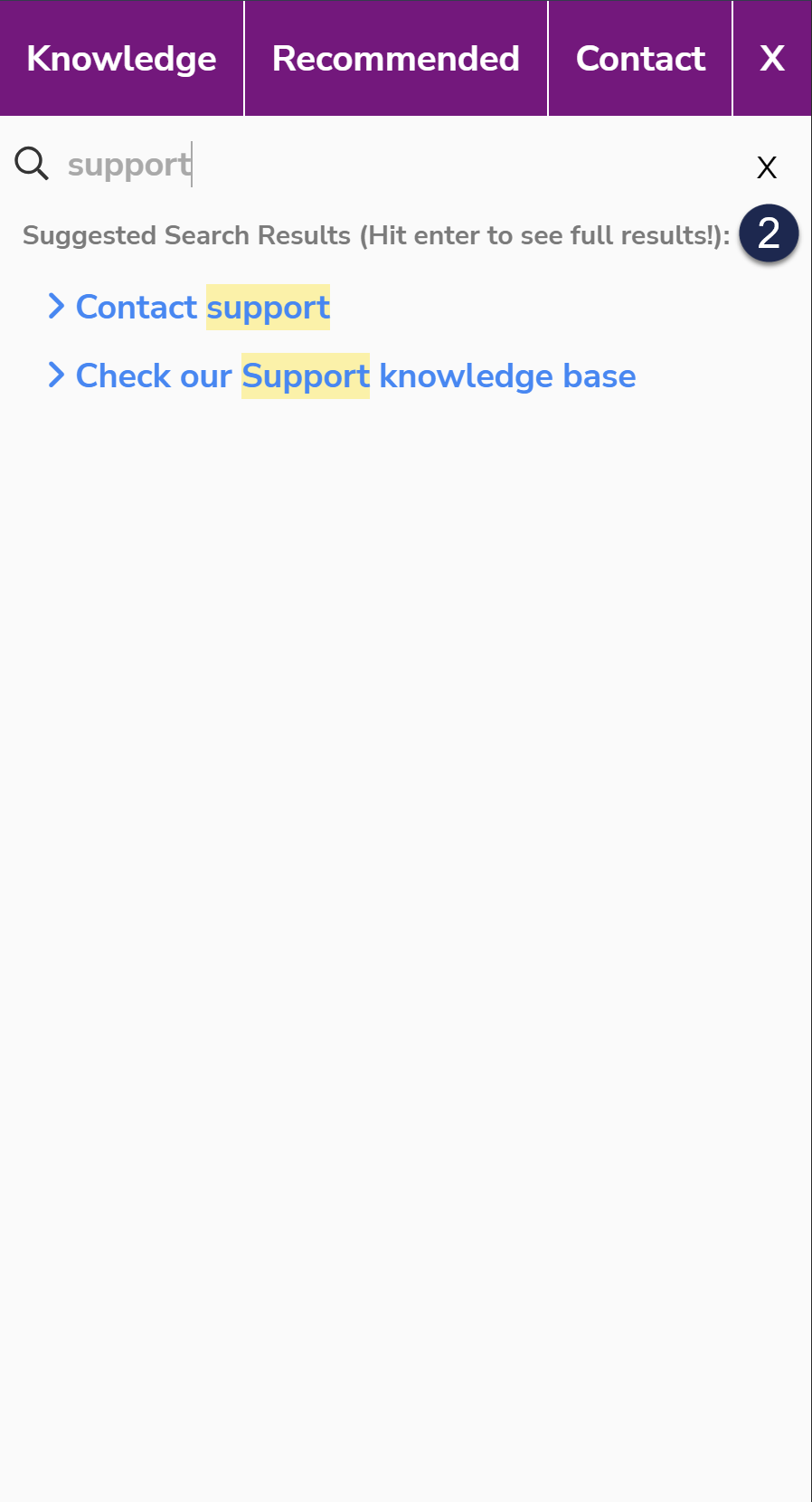 The Quick Search Header text
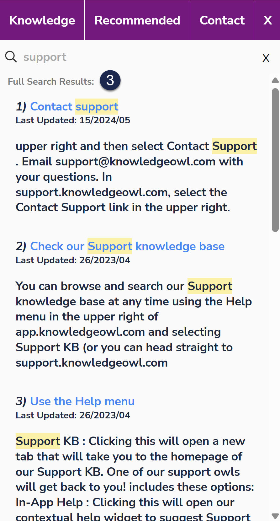 The Full Search Header text
Widget footer
All tabs of the widget display a standard footer containing two options:
- Open in full site: This link opens a new browser tab with the widget's current page opened in your full knowledge base. Change the text for this hyperlink by editing the Open in Site.
- Knowledge tab: Opens to whatever page you're currently viewing, or the homepage if you're just viewing the table of contents.
- Recommended tab: Opens to the homepage.
- Contact tab: Opens to the Contact Form.
- Scroll to Top: This link is shown on non-touch devices so that if someone is scrolling through a lengthy article in the widget, they can quickly jump back to the top of the article. Change the text for this function by editing the Scroll to Top.
- The widget also supports a custom footer, which displays below the standard two links. Add raw HTML to the Custom Footer Content to add, edit, or remove that custom footer. In the screenshot below, we've entered this HTML in the Custom Footer Content:
<span style="text-align:center;">This custom footer powered by KnowledgeOwl</span>
 Sample default widget footer text
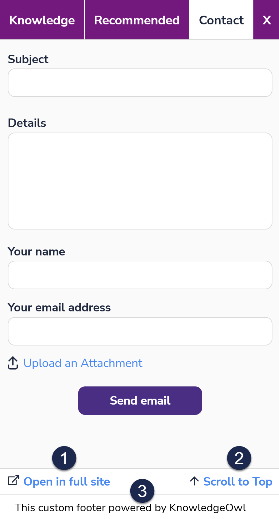 Sample widget footer with Custom Footer Content entered