
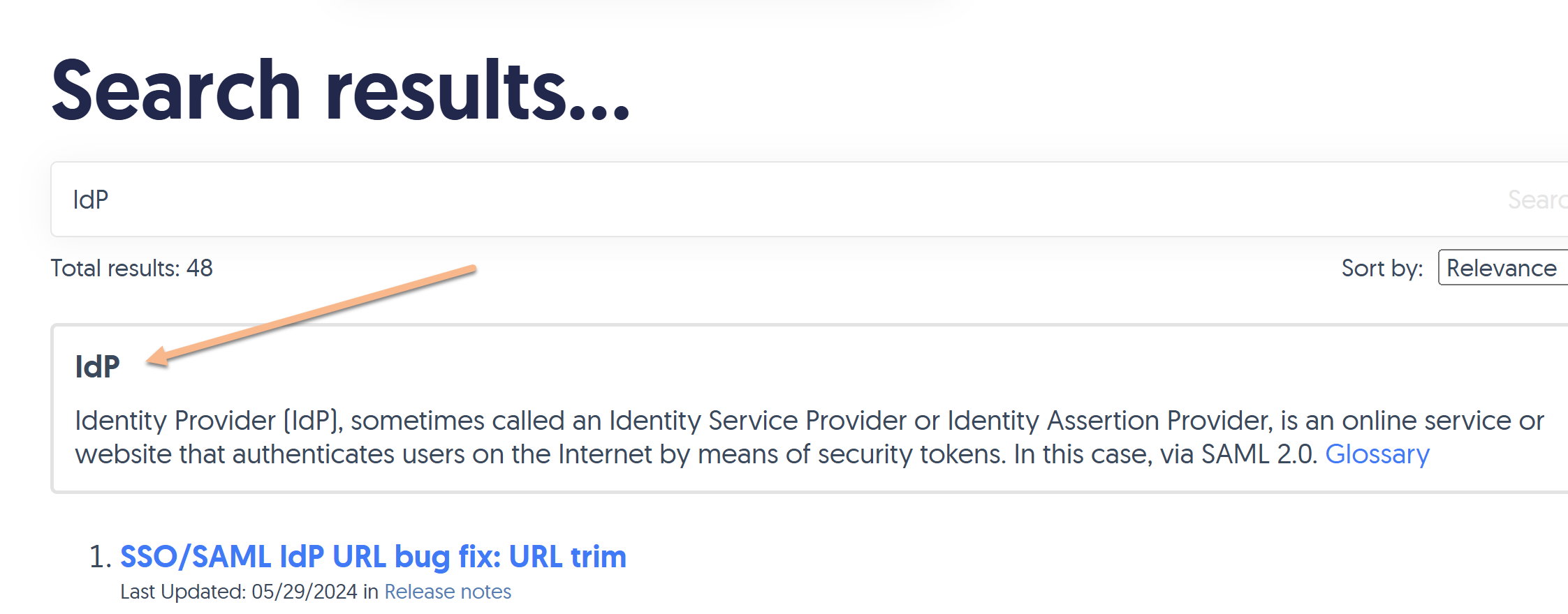
If you've enabled the option to display Glossary term callouts in your search results, they'll look something like this:
You can style different elements of these callouts:
- The box overall, like its color, border, border color, and so on.
- The term
- The definition
- The Glossary link
Refer to the more detailed instructions below.
Style the box
You can style the box the result displays in, to adjust the background color, border, border color, thickness, and so on.
The default styling for this box is:
/* Style the search result glossary term callout box */
.ko-glossary-search {
    border: 2px solid #e3e3e3;
    border-radius: 4px;
    margin: 15px 0;
    padding: 12px;
    position: relative;
}
This creates a box with a light grey border, with a white background and some padding between the text and the border, as seen in the screenshot above.
If you'd like to change any or all of this styling:
- Go to Customize > Style (HTML & CSS).
- In the Customize HTML, CSS, and JS section, select Custom CSS.
- Add CSS to style the
.ko-glossary-searchclass the way you'd like. (You can start by copying the CSS above and tinkering with it!)- For example, this CSS will keep the border the same size and width but change it to dark red, gives the entire box a light pink background color, and changes the font-color of all regular text in the box to white:
/* Style the search result glossary term callout box */
.ko-glossary-search {
    border: 2px solid #9c4728;
    background-color: #dc9b83;
    color: #ffffff;
}
- For example, this CSS will keep the border the same size and width but change it to dark red, gives the entire box a light pink background color, and changes the font-color of all regular text in the box to white:
- Save your changes.
Style the term
By default, the term displays in bold and the definition will appear below it in slightly smaller regular font text.
The glossary term is styled using the .ko-glossary-search-header class. You can add custom CSS to change the font-weight, color, font-family, and so on. To do so:
- Go to Customize > Style (HTML & CSS).
- In the Customize HTML, CSS, and JS section, select Custom CSS.
- Add CSS to style the
.ko-glossary-search-headerclass the way you'd like.- For example, this CSS will display the glossary term in all uppercase letters and in a dark pink color:
.ko-glossary-search-header {
    text-transform: uppercase;
    color: #9c4728;
}
- For example, this CSS will display the glossary term in all uppercase letters and in a dark pink color:
- Be sure to Save your changes.
Style the definition
By default, the term's definition will be displayed in bold, and the definition will appear below it in slightly smaller regular font text.
You can style the definition font differently using one of two classes:
.ko-glossary-search-resultwill style the definition as well as the Glossary hyperlink at the end. Use this class if you want to set the font-family, etc., for all the text there. (Since the Glossary is a hyperlink, the color and a few other traits cannot be styled here and need to be styled for the Glossary hyperlink itself--refer to the next section. But the font-family added here will apply to that hyperlink!).ko-glossary-search-result-definitionwill only style the definition. Use this class if you want to style the definition only but not touch the Glossary hyperlink.
To add styling for either of these classes:
- Go to Customize > Style (HTML & CSS).
- In the Customize HTML, CSS, and JS section, select Custom CSS.
- Add CSS to style the
.ko-glossary-search-resultclass or the.ko-glossary-search-result-definitionclass the way you'd like.- For example, this CSS will set the full search result to display in Garamond, in all uppercase, and a dark pink color:
.ko-glossary-search-result { text-transform: uppercase; color: #9c4728; font-family: Garamond; } - This CSS will make those changes only for the definition itself:
.ko-glossary-search-result-definition {
    text-transform: uppercase;
    color: #9c4728;
    font-family: Garamond;
}
- For example, this CSS will set the full search result to display in Garamond, in all uppercase, and a dark pink color:
- Be sure to Save your changes.
Style the Glossary link
Last but not least, you can also style the hyperlink pointing to the Glossary. To do so:
- Go to Customize > Style (HTML & CSS).
- In the Customize HTML, CSS, and JS section, select Custom CSS.
- To style the link's hover state, copy the CSS below and adjust the color in row 4 as you'd like:
/* Change color of Glossary page link in search results glossary term callouts */
.hg-minimalist-theme a.ko-glossary-search-link:not(btn), a.ko-glossary-search-link { color: #5C9AD1; } - To style the link's hover state, copy the CSS below and adjust the color in row 4 as you'd like:
/* Change color of Glossary page link in search results glossary term callouts */
.hg-minimalist-theme a.ko-glossary-search-link:not(btn):hover, a.ko-glossary-search-link:hover { color: #5C9AD1; } - Be sure to Save your changes.