We're often asked for image best practices in using KnowledgeOwl. Below are some general guidelines.
In most cases, we shy away from saying you should "always" do something a specific way, because different approaches have advantages and disadvantages.
Our top recommendation:
Try out some of the recommendations below and find the best practices that work best for you!
First, a quick note about working with images. A lot of guidance around file types will discuss two key factors:
- File overall size: If you have a single image on a page, this probably won't matter too much, but if you have twenty, it might matter a great deal.
- Whether a file type has lossless or lossy compression: this has to do with how detailed the image is/how much it compresses the original file. In general, lossless types are more detailed, but they are also often larger in size.
There are a wide variety of file types for images and pros and cons to using each. (And if you search for answers on this, you'll also find a wide variety of advice!) We're summarizing the things we've found most useful.
The dominant file types for images include:
- .jpeg or .jpg (JPEG)
- .png (PNG)
- .webp (WEBP)
Selecting between these largely comes down to a tradeoff between file size and file compression or loss.
The best choice for you is definitely an "it depends" situation. Let's look at each format in more detail:
- JPEG is the default original in online image quality and is still considered a good default for actual photos shared online. Photos in particular can be very bulky in file size, and the JPEG format goes through a "lossy" compression--meaning that as it compresses, it strips out a lot of detail, and therefore lowers the file size.
- PNG is usually larger in size than JPEG, but they are more specialized for detailed, high-contrast web graphics because they have a lossless compression--so if you do resize, your display won't look blurrier as a result. They also support transparent backgrounds, a useful feature if you're sharing icons or other oddly-shaped images. (PNG has been our own default for screenshots for years.)
- WEBP is a "newer" standard, owned and pushed by Google. On the surface, it combines the best of both worlds: it has both lossless and lossy compression much closer to PNG in behavior, but the sizes are much smaller, comparable to a JPEG. Like PNG, it supports a transparent background. And unlike both JPEG and PNG, it supports animation (which you otherwise would need a GIF or an SVG for). If you're running pages with many images on them, WEBP usually creates faster load times and better performance, which can help with SEO. (We are slowly moving to this standard.)
Our recommendations:
- For actual photos, use .jpeg.
- For screenshots or images used occasionally or in moderation, use .png.
- For image-heavy documentation--especially where SEO performance is critical--use .webp.
Some additional resources if you'd like to explore this more:
- Adobe has a fairly good write-up comparing JPEG vs. PNG
- Mozilla's Image file type and format guide
Icon files are most often available in one of two formats:
- .png (PNG)
- .svg (SVG)
Honestly, either one of these options generally works well for category icons or article thumbnails. They're both fairly lossless, they both work on transparent backgrounds, and they're designed to scale up and down.
Here's a quick side-by-side comparison, though Adobe has a more detailed PNG vs. SVG write-up if you want a deeper dive:
| Trait | SVG | PNG |
|---|---|---|
| File size | Smaller, quicker loading | Larger, slightly slower to load than .svg |
| Compression type | Fully lossless | 5-20% lossless |
| Animation | Supported | Not supported |
| Transparency | Supported | Supported |
| Accessibility | Written in XML text, rather than code, so screen readers and search engines can analyze them | No underlying text; alt text and other descriptions must be added manually |
| PDF display | Don't always display consistently in KnowledgeOwl PDFs | Display consistently in KnowledgeOwl PDFs |
Really, either will work, but we lean toward .svg for these reasons:
- SVG is slightly smaller and faster to load, so it gives you better page load times. Especially if you're displaying a lot of icons on a page, this matters.
- SVG files will scale down/up more gracefully than PNG, so it shouldn't matter as much what the original dimensions it was generated for were.
- Since icons are often present on every page, the accessibility/text-based scanning makes your general navigation and presentation that much more accessible.
But the big caveat with using SVGs is that they do NOT play well with PDFs. So above all, consider where/how the icon is used. If it will somehow end up in a PDF, don't use an SVG.
Our recommendations:
- For icons displayed online (category icons or article thumbnails and the body of articles that aren't in PDFs), use .svg.
- For icons that might be displayed within PDFs--whether they're used in a header/footer or in the body of the article--use .png.
Our editor gives you several ways to resize images. While they do all work, here are some of the tips we have for working quickly with them:
- When you insert a new image, it gets added with "auto" height and width. This allows for good responsiveness on different device sizes.
- The fastest way to resize is to select an image and then drag one of the corners to resize it.
- This will automatically set a percentage value in the width, which will keep things responsive. You also don't have to fuss with percentages. But your resizing can be somewhat biased by your screen size!
- You can also select an image and then select the Change Size control to add your own size adjustment. This control opens a small pop-up where you can specify a Width and Height for the image.If you use this control:
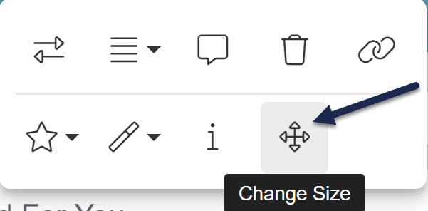 The Change Size control in the image menu
- Use percentages (like 50%) instead of pixels (like 200px). Percentages keep the image more responsive on different screen sizes, which is why we use them in the corner drag control.
- Adjust the width only; keep the height set to auto.
- Don't ever set width to be blank/nothing. This will prevent your image from appearing in PDFs.
Our recommendations:
- When in doubt, use the corner drag to resize.
- If you resize using Change Size, adjust the width to a percentage; keep the height set to auto.
If your knowledge base needs to be WCAG-compliant, or if you just want to incorporate good accessibility practices into your documentation, images can be a tricky content element.
The easiest best practice we can offer is that alternative text (alt text) is your friend! This text provides a short description to help those with screen readers or other assistive devices so they aren't losing information conveyed by the image.
Official accessibility guidance classifies images as one of seven types. Alternative text entry varies based on the image type.
Here's a quick breakdown of the different image types:
| Image type | Image details | Alternative text recommendations |
|---|---|---|
| Informative image | Graphically represents concepts and information. Typically pictures, photos, some screenshots, and illustrations. | A short description conveying the essential information presented by the image |
| Decorative image | Purpose is to add visual decoration to a page, rather than to convey information. | Empty/null alt text (which signifies to assistive devices that they can skip it without losing information) |
| Functional image | Used as a link or button, like a printer icon. | A description of the functionality of the link or button, rather than a description of the image |
| Images of text | Displays readable text. Generally a no-no in the world of accessibility. | Contain the same words as the image |
| Complex images | Graphs, diagrams, or flowcharts | A complete text equivalent of the data or information in the image |
| Groups of images | Multiple images that convey a single piece of information: this can be things like star ratings where each star is a separate image, or a collection of images | Add the alt text to only one of the images to describe the entire collection; the other images should get null/empty alt text |
| Image maps | An image divided into selectable regions that allow user interaction (usually the selectable regions are links to other pages/resources) | Add text on the image itself to convey the informational context and on each selectable element to convey the link destination or the action that selecting the link will trigger |
Related resources
For adding alternative text--including how to add the empty/null alt text--refer to Add alternative text to images.
For more information on writing alt text, consider these resources:
- W3C's Web Accessibility Initiative (WAI) is the ultimate resource on these details; check out their Images Tutorial for far more detailed guidance than we could ever provide; their Tips and Tricks can give you some good guidance on writing alternative text, too.
- Te Web Content Accessibility Guidelines (WCAG) section 2.2
- Web Accessibility in Mind's (WebAIM) page on Alternative text
- Section508.gov's Authoring Meaningful Alternative Text
- Nielsen Norman Group's Alt Text: What to Write and Alt Text: Not Always Needed
- gov.uk's Alternative text in action
Our recommendations:
- Don't use an image as the only way to convey information
- Be thoughtful about how you're using images
- Always add alt text for images that are conveying information
- Only use images with text, complex images, groups of images, or image maps if they really are the best way to present information; be thoughtful with your alt text if you do!
Gifs and animations are sometimes a contentious visual asset in knowledge bases (not least of all because there are competing factions on how to pronounce gif--are you a jif or gif supporter?).
Four factors should impact your use of gifs:
- Accessibility
- Maintainability
- Performance
- Usefulness of conveyed information
Accessibility
Gifs, like other images and visual content, may be used to convey information or for decorative purposes. Evaluate them just as you would other images and use appropriate alternative text. Refer to Accessible images for best practices on visual accessibility and Add alternative text to images for working with alt text.
The one way gifs depart from static images is that looping gifs can be classified as flashing content. In accessibility requirements, you want to avoid flashing content that may present a risk for seizures, physical reactions, and other photoreactive responses.
Broadly speaking, this means you:
- Do not include content that flashes at particular rates and pattern
- Warn users before flashing content is presented, and provide alternative
- Provide mechanisms to switch off animations, unless they are essential (source)
We like the guidance provided by Accessible Web:
Animated gifs can be accessible if they are set to stop after 5 seconds or if users are presented with a way to pause it, if they have alt text and if they do not contain blinking/flashing.
You should also ask yourself if there is another way that the message can be communicated. Would a still image do? If not, think about providing an alternative or some way that users can forgo the animation or switch to an embedded video.
A useful tool when checking your gifs for flashing may be this Photosensitive Epilepsy Analysis Tool. You want to make sure the animation won't trigger seizures in people who are sensitive to flashing.
If you're using looping gifs, consider something like Only play GIFs while hovering.
Maintainability
Animated gifs can be harder to maintain than static images, especially if the gif is of a user interface that changes frequently. Instead of grabbing a single screenshot, someone must re-create the original action(s) shown in the gif. The longer the gif, the more involved this process becomes.
Performance
One gif on a page--provided it's short--likely won't hurt your page load times or performance. But if you use a gif after every numbered step on a 20-step process, it definitely will.
Usefulness
Last but not least, is a gif the best way to present this information? Would a static image, or a couple static images, convey the same information? Gifs don't have the start/stop control that videos do, so if it's a complex or lengthy process, someone may be stuck watching the gif repeatedly to try to get the information. Make sure that a gif truly is the best way to present the information.
Recommendations
Our recommendations:
- Only use gifs when you are capturing an interaction that cannot be adequately described or shown with static images.
- A gif should supplement your written content, not replace it.
- Always add alt text to your gif, just like an image.
- Test your gifs against tools designed to check for photosensitivity triggers.
- Keep gifs short: always under 10 seconds, ideally no more than 5.
- If you use looping gifs, consider options to limit the number of loops or only play gifs while hovering.
Screenshot blurriness can come from a few places in your authoring workflow. Usually those issues lie outside of KnowledgeOwl.
We don't do any processing or resizing on the images you upload to your content.
If you're seeing image blurriness or inconsistent resolution, review the items in this checklist:
- Are you taking all your screenshots on the same monitor or device?
Different screen sizes or screen resolutions can have a big impact on the quality of your screenshot. Pick one monitor or device as your default and always use it. - Are you taking all your screenshots in the same browser?
Different UI elements can display slightly differently in different browsers. Choose one browser as your default and always use it. - Are you taking all your screenshots at the same browser zoom level?
If you've zoomed in or zoomed out the browser window, screenshots will have a different resolution. Be sure you're consistently using the same zoom level (the default is 100%, so that's generally a good default for screenshots). - Are you using the same tool to take your screenshots?
Tools can vary widely in the resolution they capture. Find a tool that works for you and always use the same tool. If necessary, you can try taking the same screenshot with different tools, add them all to an article, and compare to find the best choice! (We use TechSmith's Snagit here at KnowledgeOwl.) - If you edit, resize, or otherwise pre-process screenshots in your tool, are you doing so consistently?
Just as using different tools can produce inconsistent results, editing images in different ways can also product inconsistency. We've most often seen resolution inconsistency when screenshots are resized in the tool, since you might not resize in the same way every time.
If you're one of a team of writers, be sure your entire team is being consistent with these things, too. Even a small change like screen size or a slightly different editing process can produce different results!
Our recommendations:
- Consistency is key. Establish a standard browser, device, screenshot tool, browser zoom, and editing process to ensure consistent image output.
Some of our customers have uploaded base64 images to their content, either by accident or due to a quirk of our old Legacy editor.
In general, you're better off replacing base64 images with images uploaded to KnowledgeOwl.
Base64 images encode image data as a text string. This can make the HTML for the page very large.
Base64 images are really ideal for use in offline applications where images may be blocked. Since KnowledgeOwl itself isn't designed to be used offline (and if you wanted to use it that way, you'd be exporting a PDF), there's no great reason to keep base64 images in your articles.
But there are a lot of reasons to remove them. Base64 images can increase the underlying HTML for the page much larger, which can make your pages load a lot slower. This is even more true if it's a large image file. They also can't be cached by the browser, so when you visit the same page multiple times, it will be slow every time. And they're a lot trickier for an author to look at and track down: since they aren't stored in KnowledgeOwl, they're much harder to try to reuse.
You'll know you have a base64 image if you switch to Code view and the image HTML looks like this:
<img src="data:image/svg+xml;base64,iVBORw0KGgoAAAANSUhEUgMassiveTextString..." />Instead of something like this:
<img class="img-responsive" src="//dyzz9obi78pm5.cloudfront.net/app/image/id/69f38c6486dd2ae9ca078974/n/my-image.png"/>Want to track down base64 images? You can take a couple approaches:
- Go to Tools > URL checker, include all passing links in your report, and look for links that begin with
data:image/svg+xml;base64,or otherdata:imagevalues followed bybase64. Refer to Run the URL checker for more information on using this feature and Use the URL checker links report for more information on working with the report. - Go to Tools > Find and replace and run an exact match search for
;base64,. Refer to Run a search in Find and replace for more information.