To add a new top-level category:
- In the left navigation, go to Articles.
- If it's your first category, select + Create, then select Category. If you have existing categories, select + Add, then select Category in the Top Level Content section.
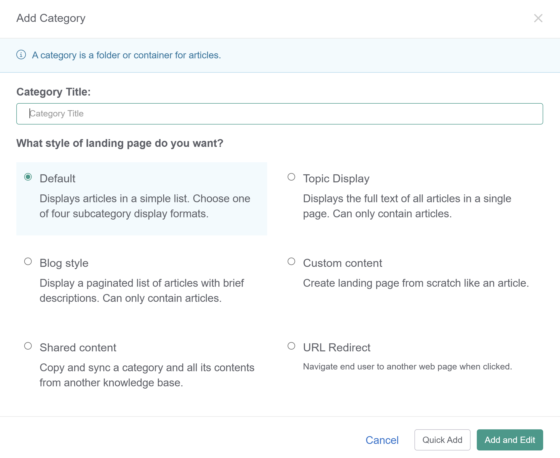
- The Add Category modal opens. Here you can choose between six category types that change the layout of the landing page. The default is a Default category, which will display articles in a list and subcategories in one of four subcategory display formats.
 The Add Category modal with the different category types
 - Once you choose a category type, select Quick Add to create the category and return to Articles to add more content, or select Add and Edit to go to the category editor and customize the category further.
To add a new subcategory:
- In the left navigation, go to Articles.
- In the Top Level Content pane, select the top level category where you want to add the subcategory.
- This will open the category in the right pane. In that pane, select + Add, then select Subcategory.
- Continue the category creation process.
Content hierarchy
KnowledgeOwl does not limit the number of layers or levels of categories and subcategories in your knowledge base, so if you want more than three layers, go for it! Just be sure to test how it displays in your table of contents so you don't create a monster. Note that blog style and topic display categories do not allow subcategories.
When you create or edit a category, you can choose between several different types of categories. Category types can be changed at any point in time by editing the category.
The types of categories control :
- How the category landing page appears in the knowledge base.
- How the category looks and functions in the table of contents.
- Whether or not you can have subcategories within the category.
- Whether or not this category will pull and sync content from another knowledge base.
- Whether or not the category will redirect to another web page when viewed.
The six types of categories in KnowledgeOwl are:
- Default
Displays articles in a simple list. Choose one of four subcategory display formats: title and description, subcategory panels, content list, or icon panels. Default is icon panels. - Blog style
Display a paginated list of articles with brief descriptions. Can only contain articles. - Topic display
Displays the full text of all articles in a single page. Can only contain articles. - Custom content
Create a landing page from scratch like an article. This type of category is available in search. - Shared content
Copy and sync a category and all its contents from another knowledge base. - URL Redirect
Clicking on this category to view it redirects the reader to another webpage of your choice.
The default category type is the most common choice for organizing and displaying content. You can create both subcategories and articles within a default category.
The landing page for a default category automatically displays the following:
- Full category title
- Category description
- Subcategories (using one of three display types)
- Articles in a simple list with the title and description
The subcategory display types are:
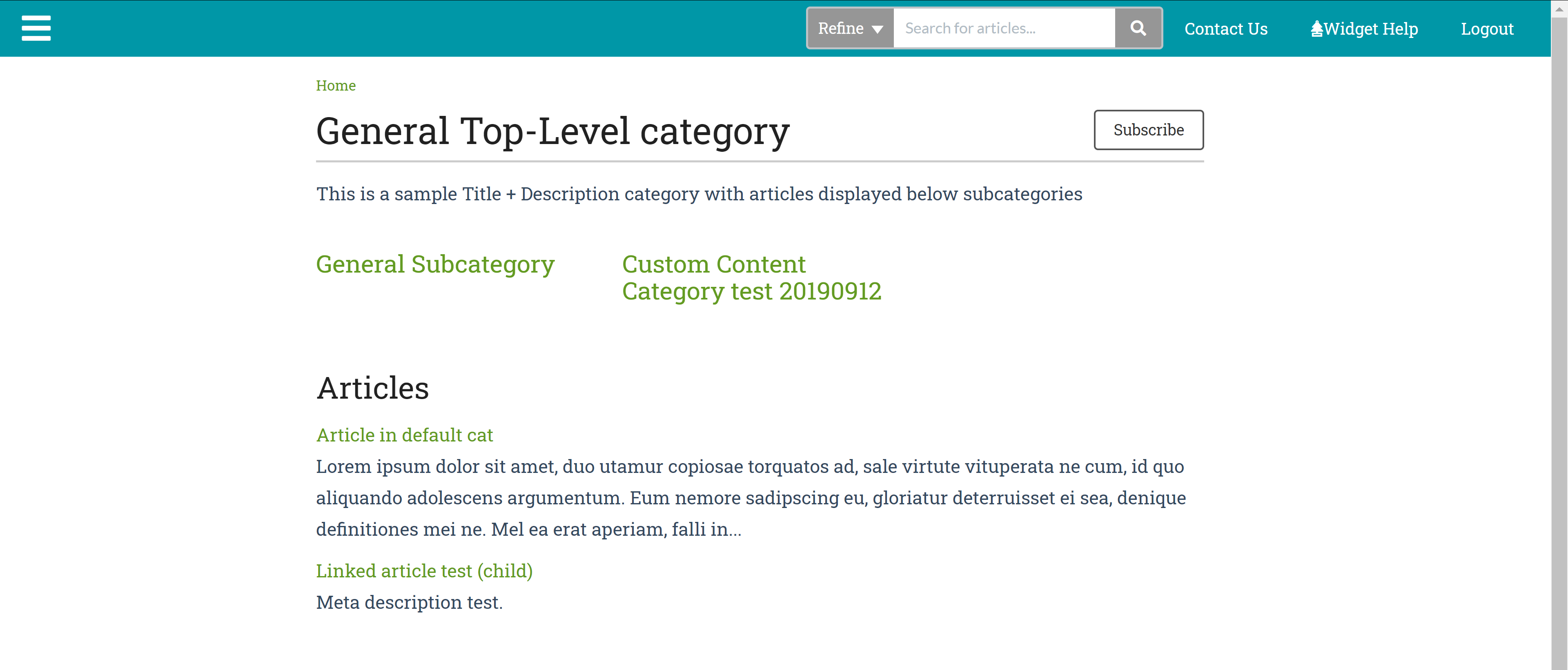
- Title and description
Displays category titles and description in a simple grid format with three categories to a row. Example: Company and product info We have a modified version with subcategories in our knowledge base (we force one subcategory per row): Example: Security and permissions Sample Default category with Title and description subcategory display type
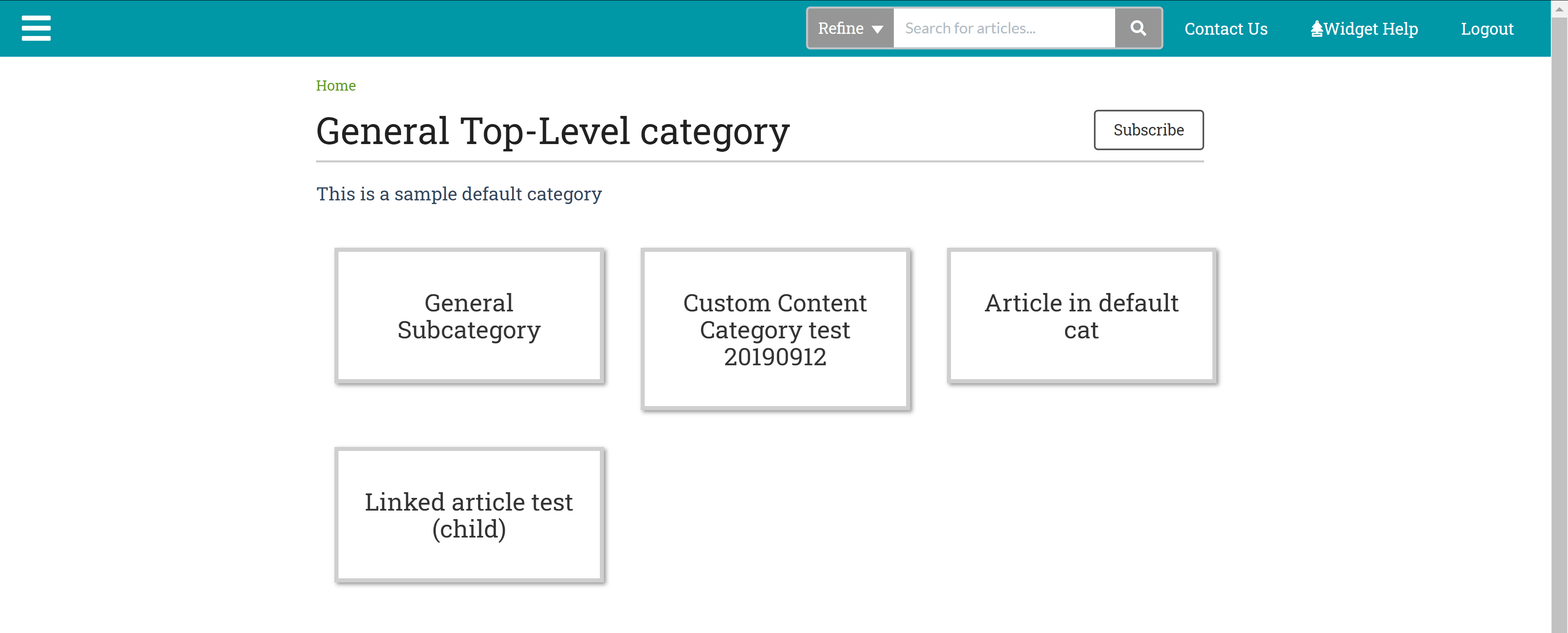
- Subcategory panels
Displays subcategory titles in panels matching the homepage base category panels with three categories to a row. We have modified versions of this in our knowledge base (we force one category per row).Article Display limitation
When using subcategory panels, articles only show when using inline display for the Article Display options.So, for example, here is the same category as above with subcategory panels selected, without the inline display selected:
 Sample Default category with Subcategory panels subcategory display type
And with the inline display selected, where articles are displayed in the same panels:
 Sample Default category with Subcategory panels subcategory display type and article Inline display option
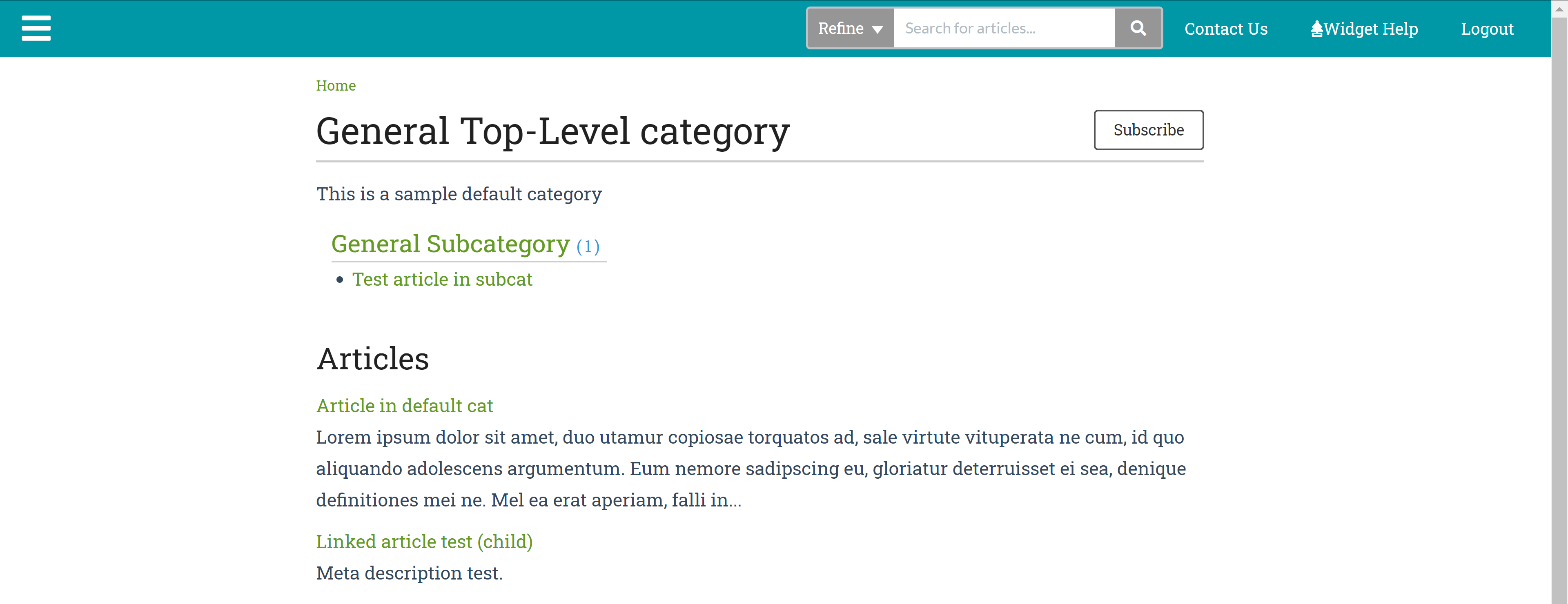
- Content list
Displays the title of each subcategory with a list of links to the first five subcategories or articles in the categories. The total number of subcategories and articles are displayed in parentheses with a link to view all. You have options to show all child content rather than only the first five and whether to display the subcategories' descriptions. Example: Single Sign-On. Sample Default category with Content list subcategory display type
 - Icon panels
Like Subcategory panels, this display option will display each category in a panel, but it also displays the category's icon. If no icon has been added to the category, we'll display one of four default icons. With this layout, you can set how many categories you'd like to appear per row, limit how many categories to show, and whether to show the category description.Articles cannot be displayed inline in this setup.Here's a sample of the layout without category descriptions: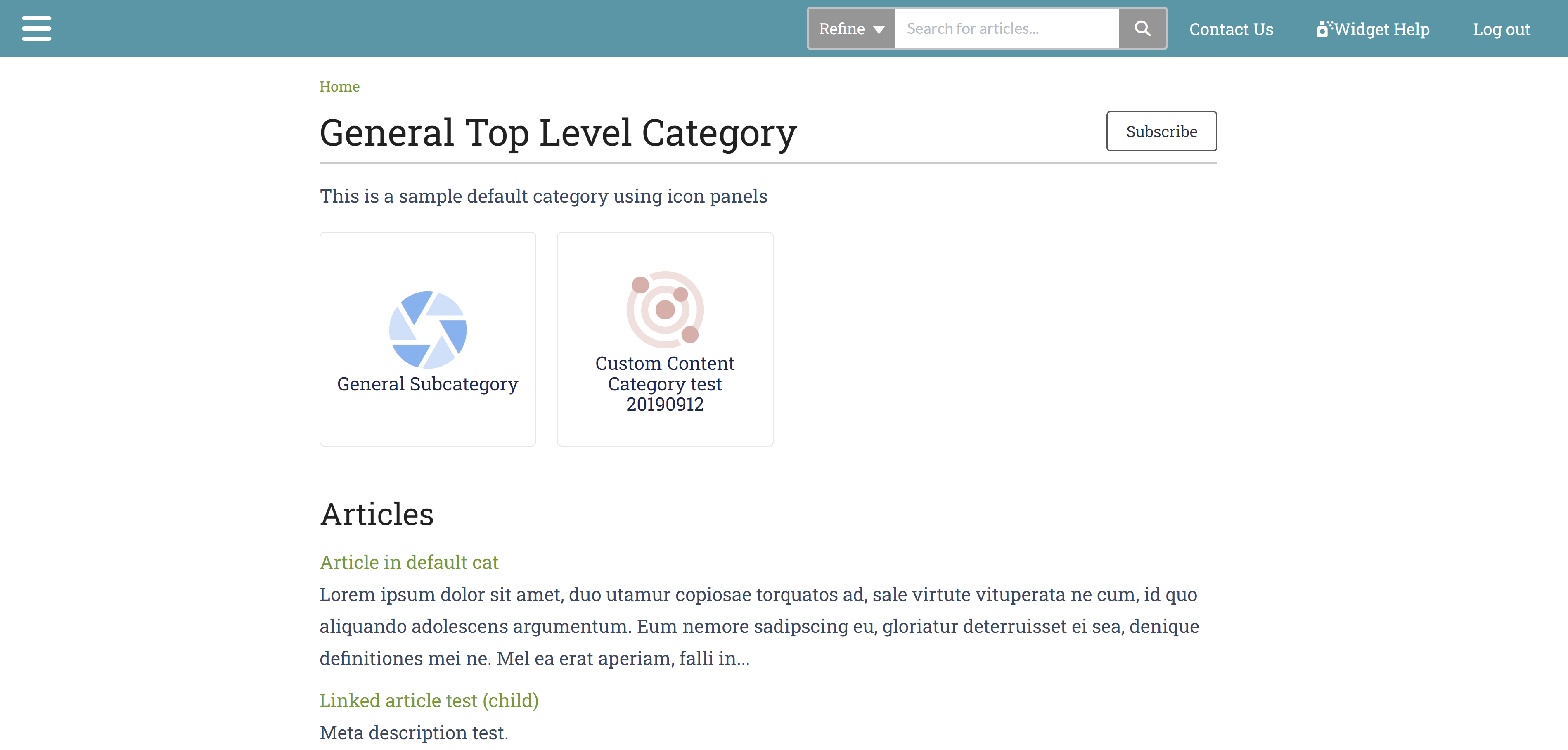 Sample Default category with Icon panels subcategory display typeAnd with category descriptions:
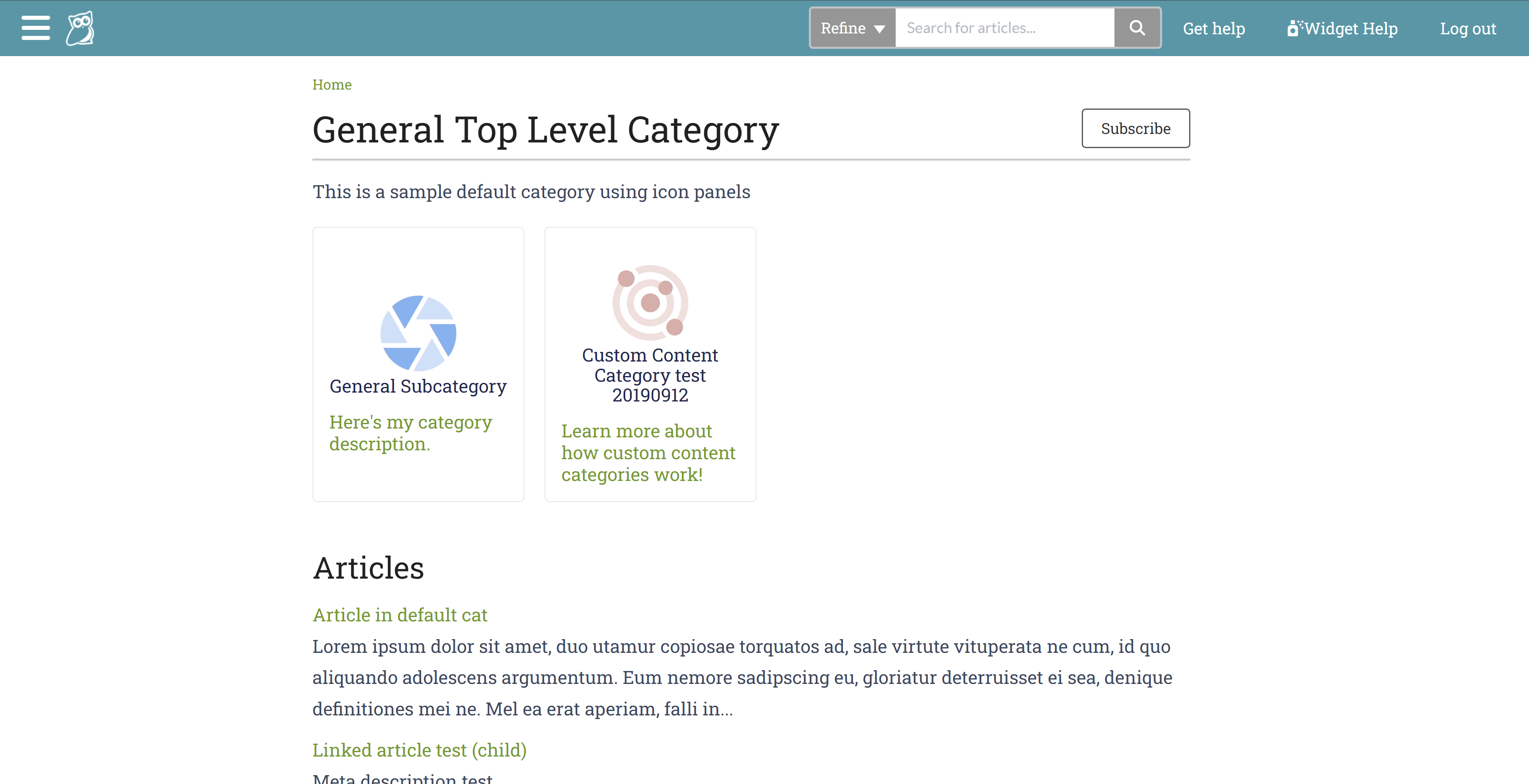 Sample Default category with icon panels subcategory display type and category description shown
After you set up your category, KnowledgeOwl automatically displays the category's content in the chosen format.
The default settings for a default category are:
- Icon panel subcategory display type
- Toggle option in the table of contents
If you choose to Quick Add a category, it will have the default settings.
Table of contents appearance
Since default categories generally contain other content, they typically have an expand/collapse icon in the table of contents. See Category appearance in the table of contents for more details.
Topic display categories display the full text of all articles they contain on a single page, like one very long article. Readers can view all the topic display category's articles on a single page, reading it like a book or choosing which articles to read.
Topic display categories:
- Can only contain articles (not subcategories)
- Can be displayed accordion style, with each article collapsed below its title and clicking the title expands the content
- Can be displayed tabs style, with each article in a different tab at the top of the page
- Can have quick links, or a mini table of contents, at the top of the article that link to each article on the page
- Can have the first article set as an "intro" which will display above any of those controls
- Include their own Display Options to set all of that behavior 😊
Recommended use cases
Topic display categories are ideal for topics where you want a series of articles presented on a single screen, like chapters from a book or steps in a process. These are great for Frequently Asked Questions (FAQs) or long user guides.
For example, you might have an FAQ page with 20 frequently asked questions and answers. If you set this up using a topic display category, you would create the 20 FAQs as 20 separate articles.
When someone wants to read your FAQs, they can browse to the topic display category and view all the FAQs in one place. However, when someone searches for one of the FAQs, the individual FAQ article comes up in search, giving them the answer immediately rather than sending them to the FAQ page and requiring them to browse to their question.
Besides FAQs, longer documentation with multiple steps or sections are often good candidates for topic display categories. Some readers might want to view the full documentation in one place like a guide, whereas others might only need or want help with one section or step. Breaking up the documentation into separate articles in a topic display category allows people searching to get straight to the step or section they need, while people who want to view the documentation in full can use the topic-based category page.
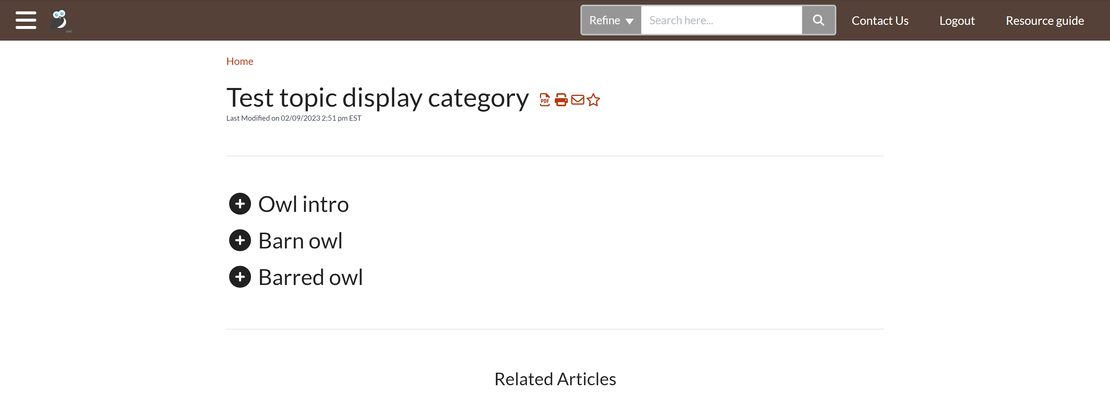
 Sample topic display category, using quick links and override article links options
Layout options
There are three available layout options:

- Default: This option will display the full text of all articles in the topic display category.
- Accordions: This option places each article into an expandable block, with the article title displayed as the block heading. The blocks are collapsed and include a + / - icon displayed before them:
 Accordions display option
- Tabs: This option creates a separate tab for each article, using the article's title as the tab label.
 Tabs display option
Display options
There are five additional display options for topic display categories. You can select as many or as few of these as you'd like:
 The Display Options available
- Quick Links: Creates a Quick Links section, like a table of contents, at the top of the category. Selecting a link jumps you to that section of the category:
- For the Default layout option, the screen automatically scrolls to the selected article.
- For the Accordions layout option, the screen automatically scrolls to the selected accordion and expands it.
- For the Tabs layout option, this navigates you to the selected tab.
- Short Article Titles: When this box is checked, if the articles in this category have short titles, those will be used for:
- The article's title (for Default this adjusts the title as it displays; for accordions it adjusts the accordion text; for tabs it adjusts the tab label)
- The article's Quick Links link, if selected
- Override Article Links: By default, articles in topic display categories can also be accessed as standalone articles from search.
- Checking this box means that any time a link for this article is clicked (permalink, search result, and so on), it will open the topic display category with this article open/visible instead. This can be useful if you want to force people to view the content in-context.
Potential SEO impacts
If your knowledge base is publicly available, checking this box will generally prevent these articles from being indexed as standalone articles, which may impact your SEO for these pages. - Leave this box unchecked if you also want the article to appear as a standalone article.
- Checking this box means that any time a link for this article is clicked (permalink, search result, and so on), it will open the topic display category with this article open/visible instead. This can be useful if you want to force people to view the content in-context.
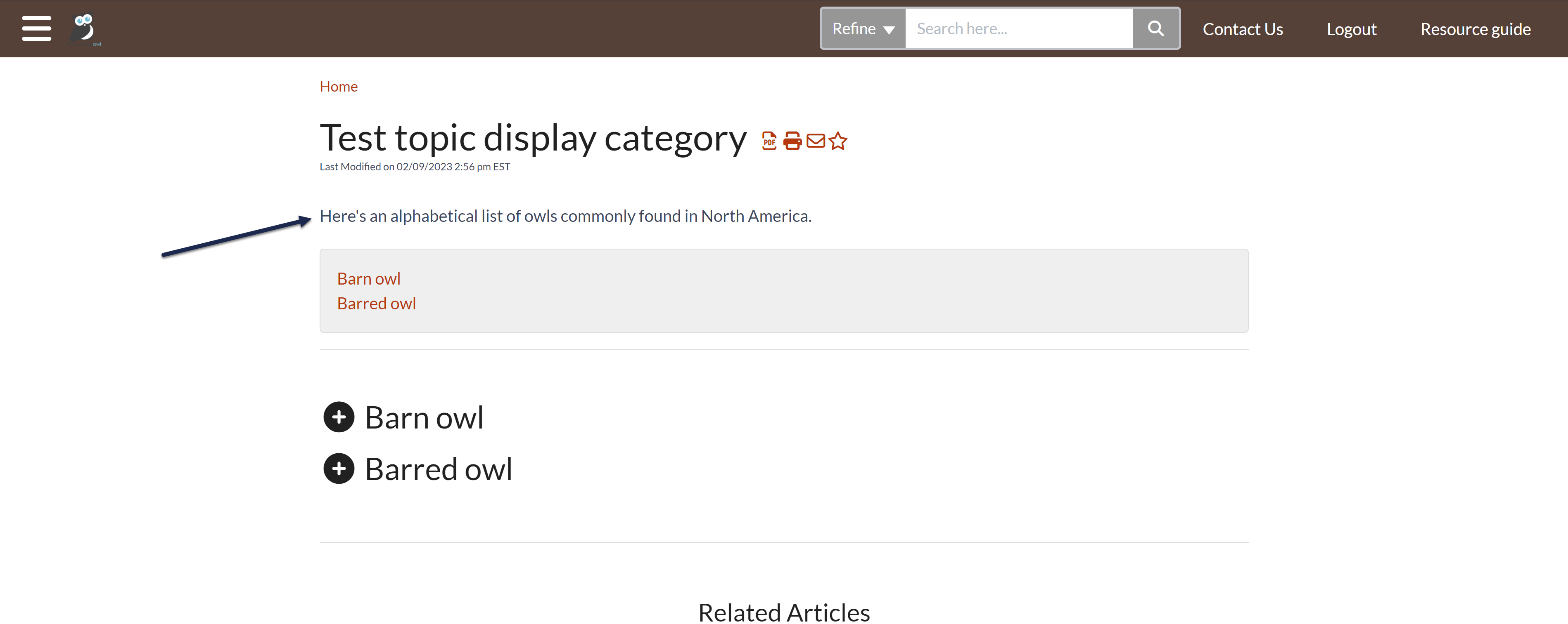
- Intro Article: You can check this box to set the first article in your topic display category to be an "intro article".
- The intro article is displayed at the very top of the category with no article header, immediately under the category header. If you've used the Accordions or Tabs layout options or the Quick Links display option, the intro article will appear above those. With this option selected, reorder the articles to change which one is used as the intro. Here, we've used the option so that our intro article text displays above our other controls:
 Intro article + Quick Links + Accordion display options. Whew!
The intro article title will only be hidden in the topic display category and its PDF. It will be displayed in the Standard PDF and Custom PDF exports. And if the category is set up to display articles as standalone articles, too (you don't have the Override Article Links option checked), the title will display normally in the standalone article, too!
- The intro article is displayed at the very top of the category with no article header, immediately under the category header. If you've used the Accordions or Tabs layout options or the Quick Links display option, the intro article will appear above those. With this option selected, reorder the articles to change which one is used as the intro. Here, we've used the option so that our intro article text displays above our other controls:
- Hide description: By default, the topic display category page will display the category description between the category's title and the rest of the content. Check this box to hide that description. We find this especially useful when you're using the Intro article, since usually the Intro article is more detailed than the category description!
Table of Contents options
As with other categories, you have the option to set whether a click in the table of contents will Toggle the category open/closed in the table of contents or Navigate to it. You can also choose to Hide contents of the category. See Customize category behavior in the table of contents for more details.
Table of contents appearance
Since topic display categories generally contain other content, they typically have an expand/collapse icon in the table of contents. See Category appearance in the table of contents for more details.
PDFs
Because topic display categories display all of their articles' content, they also get their own PDFs. When you update an article in a topic display category PDF, you'll need to resave the category itself to update its PDF. You'll see a warning message across all articles in the category once this occurs:
 Sample warning of outdated topic display category PDF
As well as in the category itself:

Once you resave the category, the category's PDF automatically updates.
The blog style category displays articles in a similar way to a blog - reverse chronological order and paginated.
The blog style category:
- Can only contain articles
- Does not display its articles in the table of contents
- Can display 5, 10, 15, or 20 articles per page (the default is 10)
- Can display articles in reverse chronological order OR in the same set order as the application (the default is reverse chronological)
- In the article display, if a meta description exists for the article, that is used for the description. Otherwise, the first ~250 characters of the article body text are used.
- Has a special icon in the table of contents, which looks like a speech bubble (open the table of contents here and look at the Release notes category to see it!)
If your category uses reverse chronological order, it will sort your articles by:
- Date published, if it exists, with most recently published at the top
- Date created, if no date published exists
Recommended use cases
Aside from blog posts, this category type is particularly useful for announcements, such as:
- Changes
- Release notes
- Newsletters
It gives readers the chance to browse through topics while keeping the most recent articles at the top. We use this format for our own Release Notes.
 Sample blog style category layout, using reverse chronological order
Table of contents appearance
As noted above, blog style categories have a different icon displayed in the table of contents. See Category appearance in the table of contents for more details.
The shared content category allows you to pull in and sync the content from a category in a separate knowledge base. You must have access to both knowledge bases to set up this kind of category.
This category type is useful when you are maintaining separate knowledge bases and have content that needs to be shared between them.
For more information on how syncing works, refer to Sync behavior in shared content categories.
Table of contents appearance
Shared content categories take on the table of contents display based on the category's overall type (default, topic display, blog, URL redirect, etc.) Refer to Category appearance in the table of contents for the different icons.
Limitations
Shared content categories don't work well when the source category's knowledge base requires login to view files/images.
Custom content categories allow you to create your category landing page from scratch, much like an article. Like an article, custom content categories are included in search results. A custom content category is both an article and a category.
If the category contains subcategories, add one of the Custom content category merge codes to format and display those categories.
Table of contents appearance
Custom content categories will show up in one of two ways in the table of contents:
- If they contain additional content (like subcategories and articles), they'll have an expand/collapse icon like default and topic display categories.
- If they don't contain any additional content, they'll use the solid icon that URL redirect categories use.
Refer to Category appearance in the table of contents for more details.
Recommended use case
Custom content categories are great when you want total control over your category's look and feel, or when you have a page of content you'd like readers to be able to subscribe to receive notifications on updates.
You can use URL redirect categories to include a category-styled link to other URLs, both within and outside of KnowledgeOwl.
When you use a URL redirect category, KnowledgeOwl does not show the content in the category; instead, it loads the URL specified in the URL redirect.

Once you save the category, you have the option to open the link in the same tab or a new tab.

Table of contents appearance
Since URL redirect categories generally don't contain content, they don't generally show an expand/collapse icon in the table of contents. See Category appearance in the table of contents for more details.
Recommended use cases
URL redirect categories are a great solution when you want to provide a link to your company intranet, company website, or partner websites, and you want that link to appear in the table of contents, homepage, or category landing pages, just like another category.
Example: go to Company and product information and click the Company website link.
KnowledgeOwl displays links to categories in the table of contents. The category type and contents can affect its appearance:
All category types display a plus sign icon in a box when they're collapsed. Once expanded, they display a minus sign icon in a box.
Blog-style categories have a talking speech bubble icon.
Non-category links generally show up differently:
- If the option to add a homepage link to to the table of contents is checked in Customize > Website, the Home link displays with a house icon.
- If the option to add a link to the Glossary is checked in KB settings > Glossary, the Glossary link displays with a book icon.
- If the option to add a link to the full PDF download is checked in Customize > Website, the Full PDF download link displays with a PDF icon.
Here's a sample of what you might see with the Home and Glossary links added, Favorites turned on, and a few categories followed by a blog category:
![]()
Change category expand/collapse icons
In this knowledge base, we use plus (+) and (-) icons and show a different icon if the category contains no content. To change to chevrons or different icons, follow the instructions in Change the icons used in the table of contents.

