The option to display content in a tabbed layout has been a long-time request, and we previously provided a snippet-based workaround for this request.
I'm very proud to say that the days of having to create a customized snippet and insert it into the editor are over!
We've added a new Layout Option to Topic display categories: Tabs.
When you use this option, a separate tab is generated for each article.
A few caveats:
- The tab label will use the article's full title, and long titles can look awkward. We recommend using the Display Option to use Short Article Titles, and then adding Short Titles to your articles to control the tab display a bit more.
- We have not implemented any restrictions on the number of articles/tabs you can have. The tabs' width will adjust to try to fit all the articles in, so having a lot of articles can make the tabs very skinny and tall. For example, a small handful of articles looks pretty good:
 More articles looks a little less good:
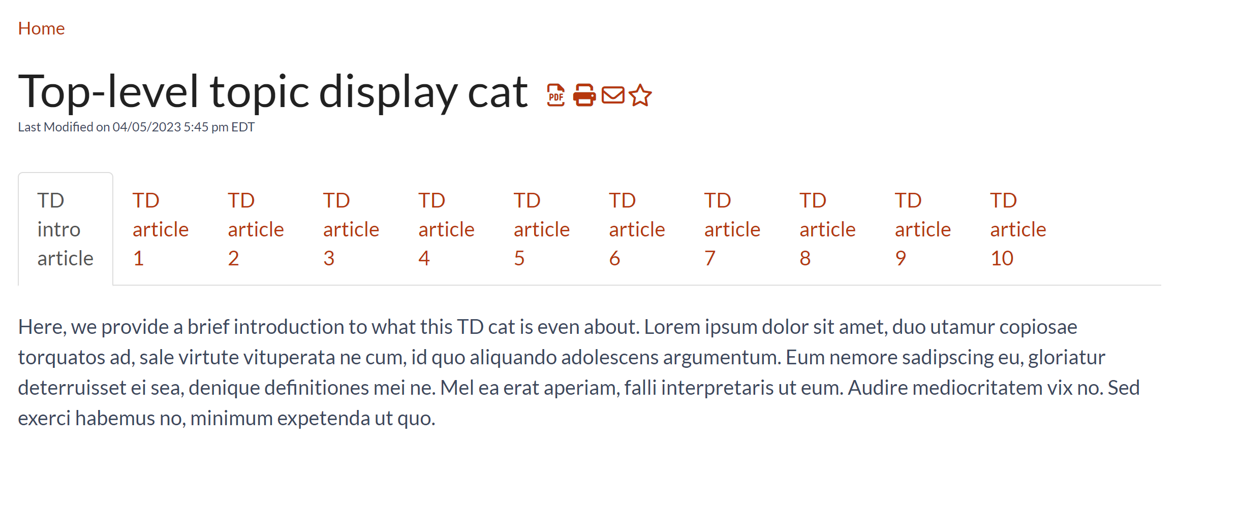
 And 10 articles can look quite crowded:
If you're hoping to tweak the default styles on the tabs, see Topic display: Style your tabs for more info!
Category editor change
As part of this change, we also reworked the Category Editor layout just a bit.
Instead of all options being lumped together under the "Display Options" header, we've created separate controls for Layout (Default, Accordions, and Tabs) and Display (Quick Links, Short Article Titles, Override Article Links, and Intro article). Each Display Option will work with each Layout Option, so you can play around to find the combination that works best for you.

Let us know what you think of this enhancement to topic display categories!

 More articles looks a little less good:
 And 10 articles can look quite crowded: