
 I have been teasing y'all with this for a couple product newsletters, and I am incredibly proud to make this announcement:
We have just released a major facelift to the Article Editor's righthand column!
I'm including a rundown of the changes here in both video and text format, so you can choose the format that works best for you.
The video is first, but those of you who want to read can just keep scrolling:
We changed a lot of things here, so let's start with the changes that are going to take the most time to get used to.
Major changes
- Show the controls you care about
Instead of the always-open sections we've always had, the new righthand column now has sections that can be expanded or collapsed using the arrows in the upper right of each section: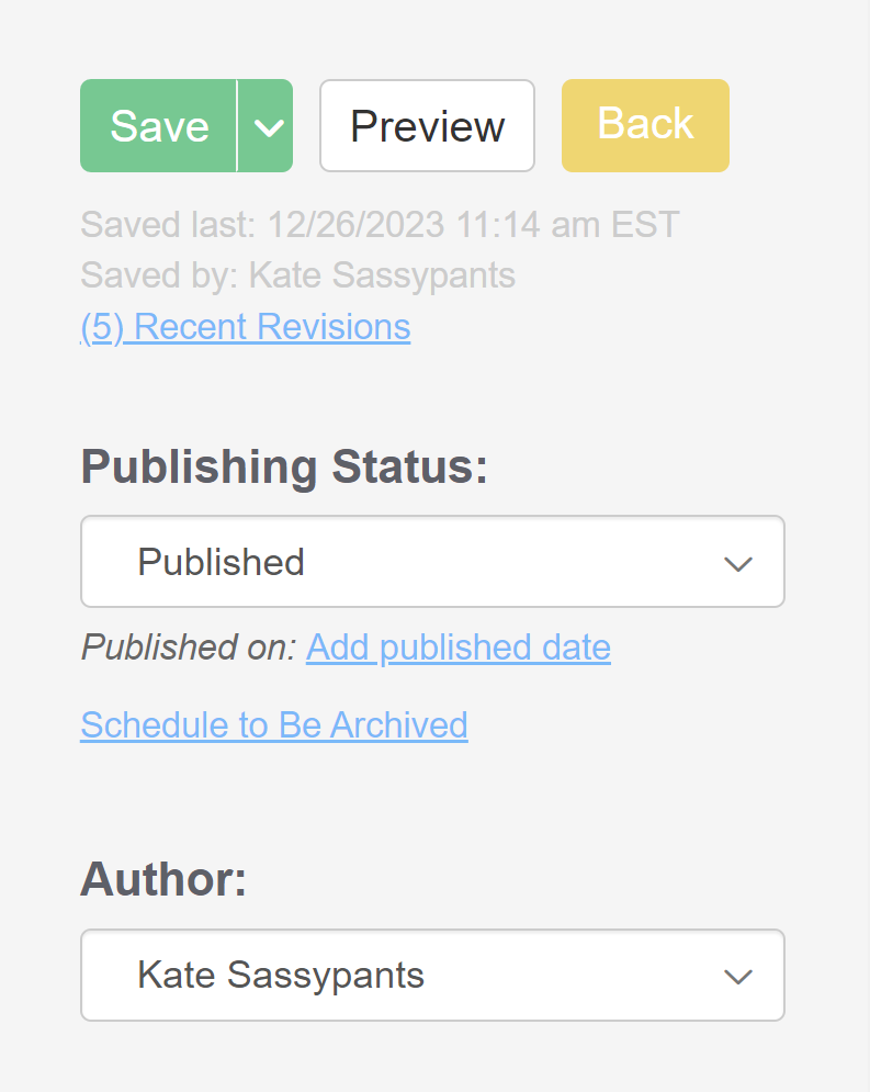 Righthand column before
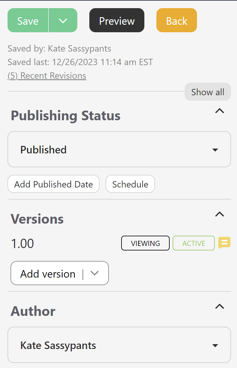 Righthand column now
- The editor will "remember" your previous selections here, so the next time you open it, the same sections will be expanded or collapsed.
- There's also a Show all/Hide all control at the top of the editor to quickly open or close them all, visible in the screenshot above. :)
- When a section is hidden or collapsed, it still shows a truncated summary of what that section contains, for example:
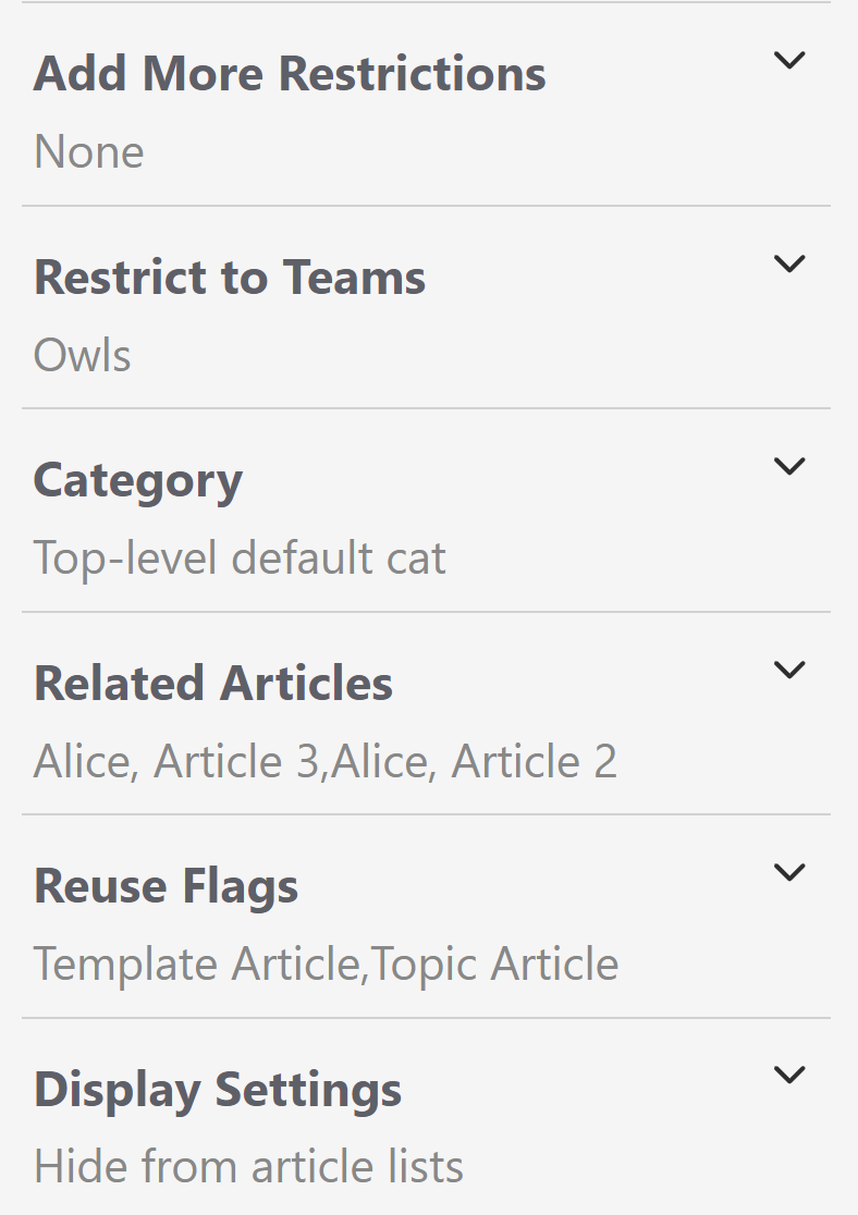 Sample collapsed sections with summary statements displayed
- Revamped Versions section
Also visible in my sample screenshots above: we've overhauled the Versions section and moved it MUCH higher in the column, so you can find it without scrolling. This section has a lot of new changes.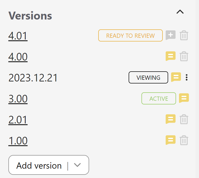 Sample new Versions section with several versions
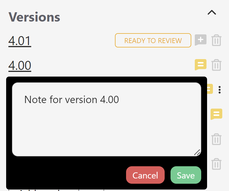
- Version notes can now be viewed, added, or edited from ANY version by clicking the Note icon to the right of the version. A grey talk bubble with a plus sign indicates no notes exist; a yellow talk bubble with two white lines in it indicates there is a note. Click the icon to view the note and edit it:
- When viewing an inactive version, we've removed the Version Status checkboxes at the top of the editor to mark for review, activate, or delete. Instead, there's a new triple dot "more" menu that gives you access to the Version actions for the inactive version you're viewing:
These options do the same thing as the old checkboxes.
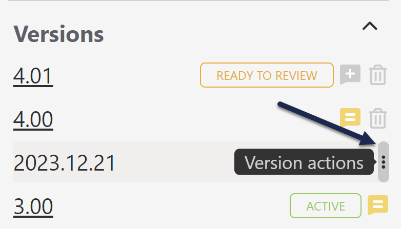 The triple dot Version actions menu in an inactive version
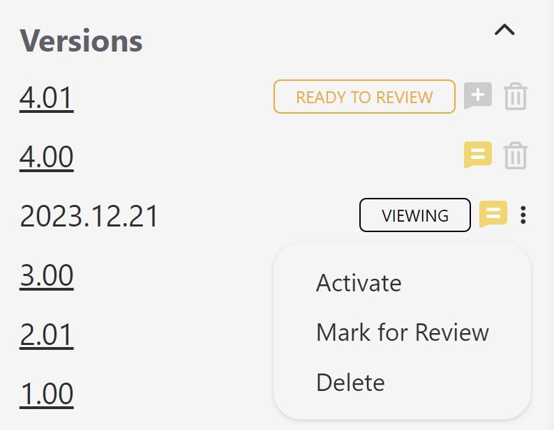 Version actions menu expanded
- We're moving away from the red X toward trash can icons for deletions.
- We're also moving away from bright blue hyperlinks for versions, in favor of these darker underlined links.
- And in the upper right, we've added a "Viewing version" section below the last saved information:
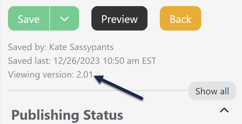 New "Viewing version" info underneath Last saved info
- Version notes can now be viewed, added, or edited from ANY version by clicking the Note icon to the right of the version. A grey talk bubble with a plus sign indicates no notes exist; a yellow talk bubble with two white lines in it indicates there is a note. Click the icon to view the note and edit it:
- Sections renamed
We took this opportunity to update the names of three sections to provide further clarity:- Restrictions, which contains the settings for hiding from search results, the table of contents, home or category landing pages, and for hiding the comments, ratings, and PDF icon, is now called Display Settings. (This is mostly to try to avoid any confusion with reader group and author team restrictions.)
- Internal Flags, which contains the checkboxes to mark an article as a Template or Topic article, is now called Reuse Flags, since these flags are used to designate ways the content can be reused within KnowledgeOwl.
- Article Call Outs is now Article Callouts because we've spelled it that way in our documentation for a long time. "Callout" is a recognized usage for the noun, whereas "call out" is more common for the verb. Since these are nouns, we're opting for the single word.
- Sections reordered
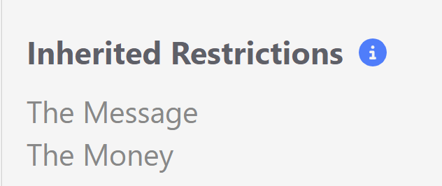
As you probably noticed with the Versions section, we also changed the order of sections in the righthand column. We've tried to put the sections and controls that get updated the most often closer to the top of the page:Old Order New Order Version Status (if inactive version; now in Versions section/Versions Action menu) Publishing Status Publishing Status Versions (includes Version Notes and Version Actions menu) Author Author Category Article Callouts (formerly Article Call outs) Internal Flags (now Reuse Flags) URL Redirect URL Redirect Required Reading (if enabled) Make Visible to Groups (if inactive version) Inherited Restrictions Inherited Restrictions Make Visible to Groups (if inactive version) Restrict to Groups/Add More Restrictions Restrict to Groups/Add More Restrictions Restrict Editing to Teams Restrict to Teams Required Reading (if enabled) Category Article Call Outs (now Article Callouts) Related Articles Restrictions (now Display Settings) Reuse Flags (formerly Internal Flags) Active Version + All Versions Display Settings (formerly Restrictions) Version Note (now in Versions section) Recommend On Pages Related Articles
Recommend On Pages


Minor changes
The rest of the changes should not hugely impact how you use the editor, but I'd still like to acknowledge the ways the experience has changed. Many of these smaller changes were delightful for me, so I'm hoping they're also delightful for you!
- Scheduled publication/archival date and time in righthand column
Once you scheduled an article to be published or archived, we used to display that in a banner at the top of the main editor pane only, and if you wanted to remove that schedule, you had to click a link in that banner announcement: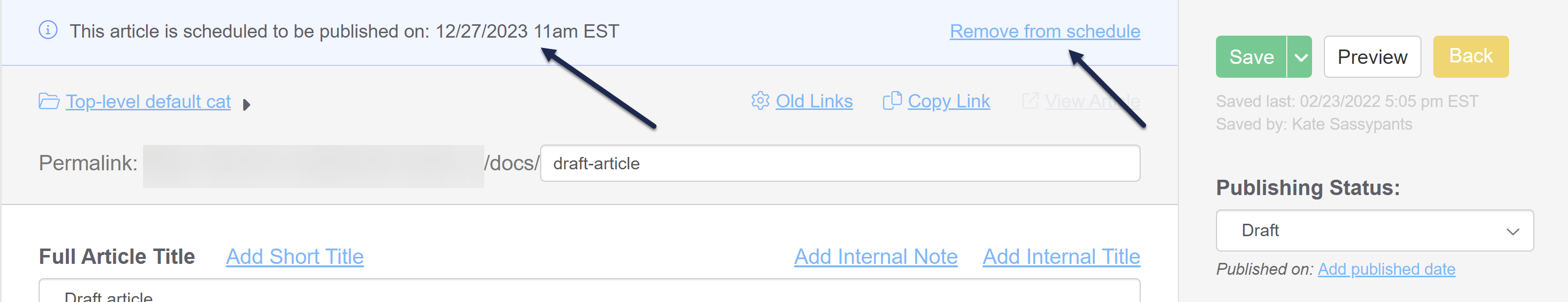 Scheduled publication/archive dates previously only displayed and removed in main paneNow, that scheduled date and time is also displayed in the righthand column and you click a trashcan next to it to remove it:
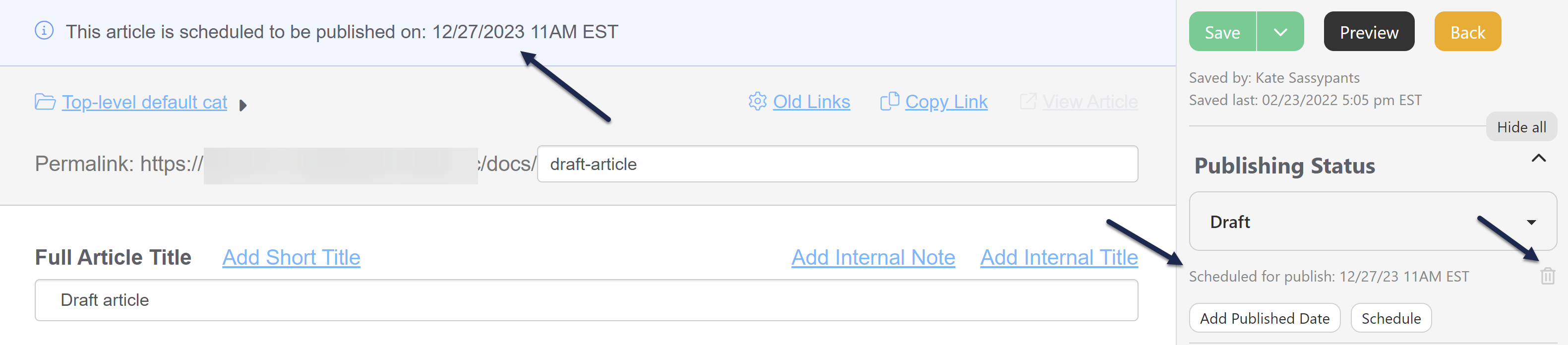 Scheduled publication/archive dates now displayed in righthand column and removed there too!
 - Set Published Date date/time picker
Our previous date/time picker forced you to scroll a month at a time backwards if you wanted to set a published date in a previous month. (And if you had to set it in a previous year...well, it was a lot of clicking!) The new picker has selectors for both the year and the month, making it much easier to update existing articles with the correct published date. Click on the Month Year label at the top of the picker to open the additional controls.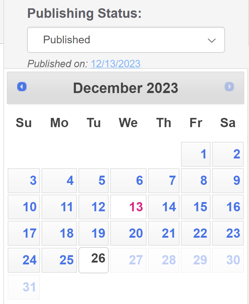 The old date picker, navigated only via arrows at the top
- Schedule to be published or archived date/time picker
As with the published date, we've upgraded the date/time picker for this scheduling. Select the date first, then the time. You can click the am/pm in the upper right to toggle between those setting. - Ability to clear Published Date completely
Our old date/time picker didn't let you clear the Published Date--you could only update it. The new date/time picker lets you clear a Published Date that is no longer needed using the Clear option in the picker. - Buttons rather than links
In order to create a little less visual distraction for you, we've shifted the Add/Set Published Date and Schedule to be Archived/Published options from blue underlined hyperlinks to be buttons. We hope this makes the options a little less distracting while also making it clear which options are available. - Tooltips are now an info icon rather than a question mark
This is a pattern we'll be gradually changing across the app, but we wanted to try it out in the editor first to see how y'all felt about it. We've previously used a question mark icon for tooltips/helper text: Old tooltips, question mark in circle outline
 New tooltips, info icon in solid circle
- Trash can icons instead of red X's
As you could see in the Versions section, we're moving away from using red X's in favor of trashcan icons for one-click actions to remove or delete things. Other places you'll see this include:- Category
- Related Articles
- Recommend On Pages
- Change category button rather than gear cog icon
We've long used the gear cog icon to indicate that you can edit something. The Category section used that icon. We've swapped it out for a button with the "Change category" label to try to make it more clear what action is available. - Fewer green buttons
Our previous righthand column had a lot of green buttons for actions to add or create things. We've changed nearly all of these to be grey buttons instead, so they look clean and clearly button-like but aren't visually competing with the Save button. You'll see this new button treatment in:- Versions
- Required Reading
- Related Articles
- Related Articles drag and drop - arrows begone
The old Related Articles section required that you click on the arrow icon and drag/drop to reorder the Related Articles list. We're testing a new user interface pattern in this section that removes that arrow. Click anywhere on the article name to drag/drop to reorder. Let us know what you think of this change! - Recommend On Pages is no longer a giant text box
Those of you using the Contextual Help Widget may either love or hate this change. Previously, the Recommend On Pages section was a giant text box, and you had to know to enter each new recommended page path on a separate line. We've updated this user interface so that it functions a lot more like the Related Articles section:- Each page path is listed as its own entry in a list
- There's a button to add new pages
- You can click on the page paths to edit them
- There's a trashcan icon to remove page paths you don't want to use anymore (with a delete confirmation!)
We hope this makes it easier to view recommend on page paths at a glance and edit/remove them: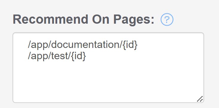 Recommend On Pages before: the giant text box
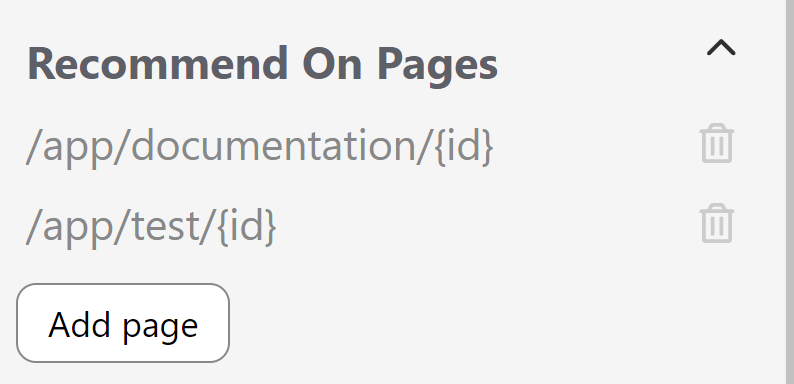 Recommend On Pages now: discrete entries with actual controls!
- Updated pop-ups
If a button or action in the righthand column triggers a pop-up, those pop-ups may be styled a bit different than our traditional styles. We're playing around with making our interface a bit cleaner and more modern, and this was a great place for us to begin some of those style changes. You'll see these changes especially with:- Add Related Article pop-up
- Any of the delete confirmations
- Change Category pop-up
- Tweaked button colors and font colors
Those of you who are very keen-eyed will likely also notice we've made some font size, color, and bold changes throughout the column. Most obviously, our main action buttons (Save, Preview, and Back) are all slightly different. We've tried to make them a bit more streamlined and make the labels easier to read: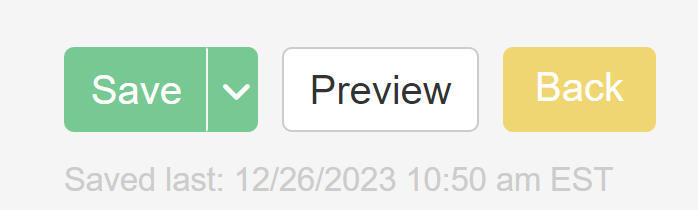 Main action buttons before
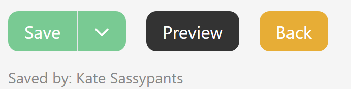 Main action buttons after


Closing thoughts
Whew, if you made it all the way down here, first: have a 🍪.
Second: we've opted to make these changes available before we have all of our documentation updates prepared, so you may still see older labels or screenshots here in the Support KB for the next couple weeks. I promise, they will all be updated, but I didn't want to hold up the release just for that!
Third, if you'd like to offer us feedback on these changes, you can choose your own method:
- Drop a comment on this release note
- In the editor itself, click Help in the upper right. Then:
- Click the "Let us know" link in the footer to fill out a quick product feedback survey OR
- Click the Contact tab and drop us a note with your thoughts
- Or reach out to support in whatever other ways you normally do that. Dealer's choice!
We couldn't make all the changes we wanted to in this first iteration, but we do have an ongoing list of editor improvements we'd still like to make a reality in the coming year, including:
- Making the category editors have a similar righthand column feel
- Moving the URL redirect option out of the righthand column and fully into the main pane, where it makes more sense
- Truncating the righthand column version list and having a pop-up that will display all versions in greater detail
- More tooltip-type help to explain things or answer questions you might have directly in the editor
- ...and whatever other ideas you give us in this feedback!