Happy first release note of 2024, everyone! (I'll admit, I intentionally waited to publish this just so I could also celebrate National Bird Day with y'all, because we have a soft spot for birds here. 🦅🐧🦆🦢🐦🦃🐓🐤)
In case you missed it, over the holidays we released a major makeover to the article editor's righthand column. Nearly all of our recent bugfixes are related to that, since that column has more interactions and combinations in it than basically the entire rest of KnowledgeOwl combined. But let it be known that we never fail to rise to a challenge!
We fixed these editor righthand column bugs:
- If the article was in a category that had an apostrophe in the title, the editor wouldn't properly load.
- If the knowledge base was using European date formats, the editor wouldn't properly load.
- Discarding unsaved changes to a version wasn't properly saving the Publishing Status.
- Custom roles with permission to create versions but not edit published articles weren't able to create versions in published articles. (Permission conflict--we've fixed this so the create versions permission is what's looked at, as before.)
- The Generate Version PDF link was showing in Draft, Archived, and Deleted articles (it should only show in versions for Published and Needs Review articles).
- The new version notes icon would look really funky in situations where a custom role or author team prevented you from saving changes to the article.
- The Required Reading section allowed you to select start dates way in the future. (It shouldn't--today/tomorrow is the most recent it should be able to do.)
Not a bug, but a word to the wise:
Some of our older knowledge bases have a bug with floated images or other floated content at the very bottom of articles. In these knowledge bases, if you float an image as the very last part of an article, when you view the article, the image is floated next to the article footer (with the Related Articles section, etc., in it), instead of appearing above the footer. We fixed this for more recent knowledge bases, but if you ever run into this issue, you can fix it by:
- Go to Settings > Style.
- Below the Preview Pane, be sure Custom HTML is selected.
- In the Custom HTML dropdown, select Article.
- Look for the
<div class="hg-article-footer">div. - Add
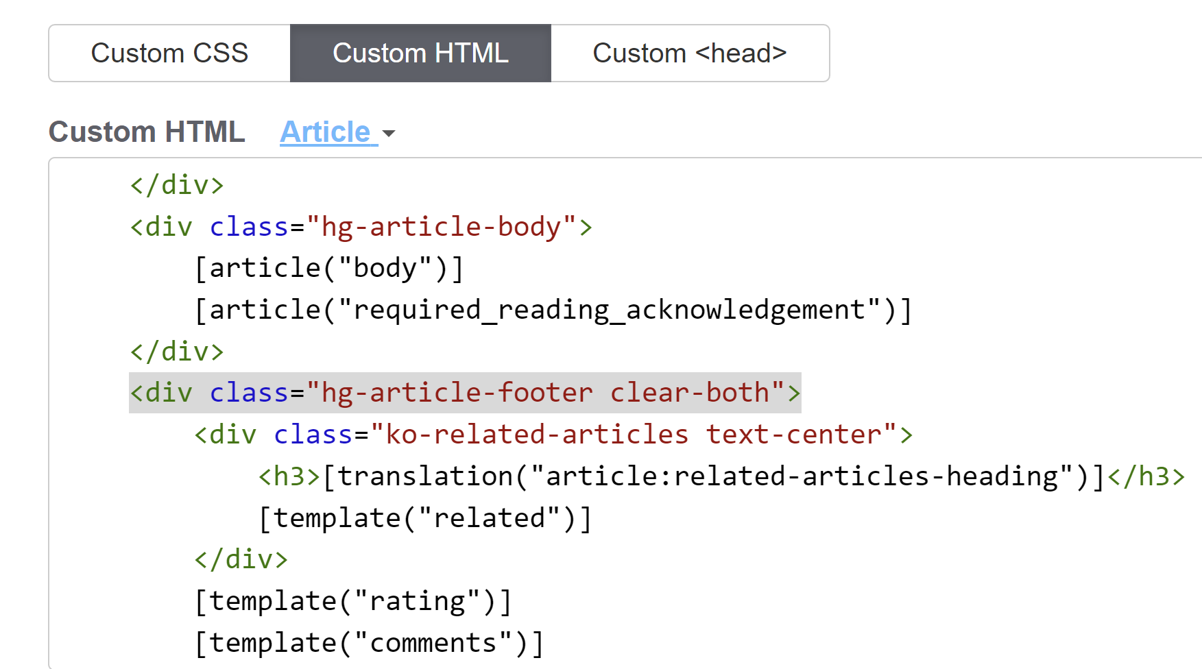
clear-bothin between the hg-article-footer class and the closing ". - Your HTML should now look something like this:
 Sample hg-article-footer div with the clear-both class added
 - Be sure to Save your changes.
- If that still doesn't fix the overlap issue, please contact us to help get it sorted!

