Your knowledge base's homepage is the initial landing page that readers will see if they go to your default link. The homepage often includes things like customer support contact information, announcements, or a description of what the knowledge base contains. You can also show article lists.
There are two places you can edit your homepage, depending on what type of edit you want to make:
- Customize > Homepage: This opens the homepage custom content editor where you can add more content to your homepage, like announcements, instructions, or welcome videos.
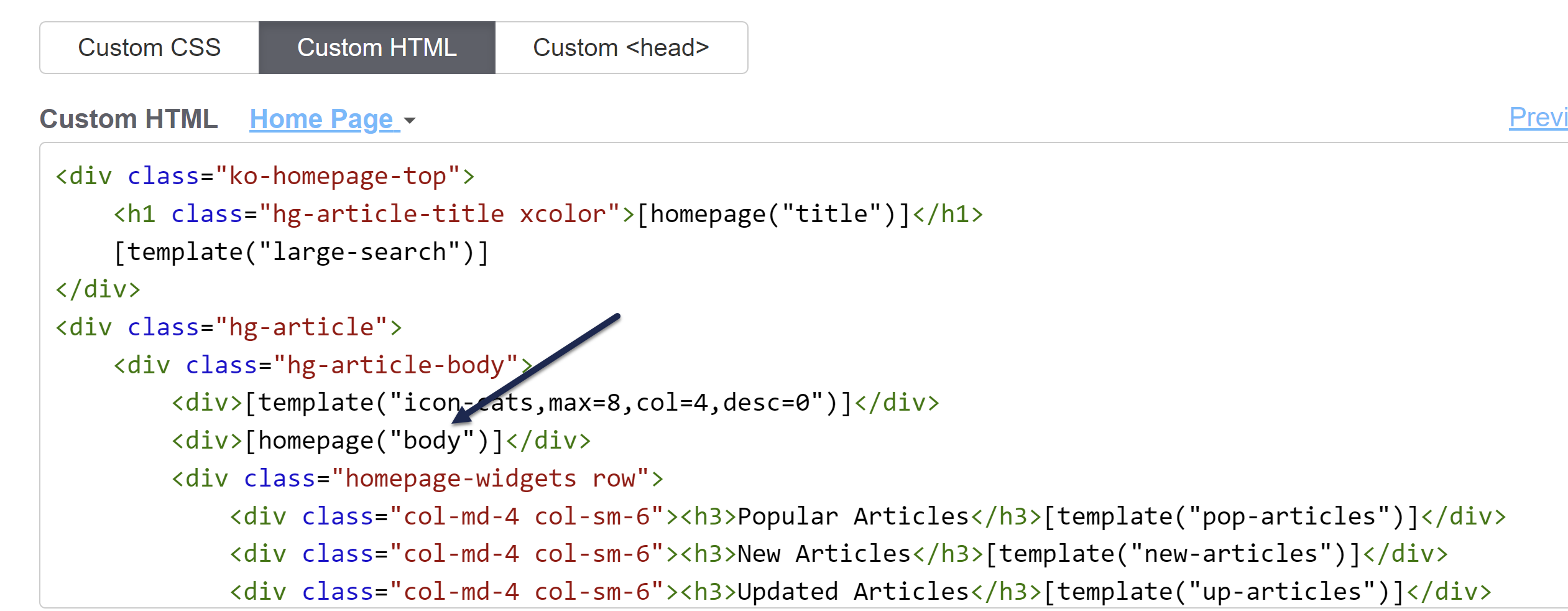
- Customize > Style (HTML & CSS) > Custom HTML > Homepage: Here you can edit the overall layout, add or remove the article lists, and more. (You can also adjust styles for how things display in the Custom CSS section.) The text entered in the Homepage custom content editor mentioned above gets inserted wherever the
[homepage("body")]template is: The text entered in the Homepage editor will display where the homepage body template is
Older knowledge bases
Knowledge bases created before October 2022 or created from copies of knowledge bases created before then may have most of their HTML in Customize > Homepage instead of Customize > Style > Custom HTML > Homepage.
If you're editing Customize > Style > Custom HTML > Homepage, the homepage("body") mergecode must appear in the Custom HTML for the Homepage, even if the Homepage editor is empty.
A new knowledge base displays a title at the top saying "Welcome to...." with the knowledge base name after it. We populate this text based on the name you initially picked out for your knowledge base.
If you want to change that text, there are a couple ways to do it.
If you just want to update the portion that comes after "Welcome to...": that text is based on the name of your knowledge base as it's defined in KB settings > Basic. If you want to rename your knowledge base completely (which will also update that welcome text):
- Go to KB settings > Basic.
- Update the Knowledge base name.
- Be sure to Save your changes.
If you want to update the "Welcome to..." text in any other way:
- Go to Customize > Homepage.
- In the Homepage content section, edit the Title.
- You can Preview your changes to be sure you like them.
- Then Save once you're done.
(You can also Remove the homepage welcome text completely if you so choose!)
That didn't work...
If editing the Homepage content Title in Customize > Homepage doesn't make any changes in your knowledge base, that generally means someone's already customized your homepage a bit.
In this case:
- Go to Customize > Style (HTML & CSS).
- In the Customize HTML, CSS, and JS section, select Custom HTML.
- Select Homepage from the Select HTML section to edit dropdown.
- Our default layout includes the title in an h1 with
class="hg-article-title xcolor", usually on or around row 2. If this h1 contains text rather than the homepage("title") merge code, update the text directly to update your homepage title:<div class="ko-homepage-top"> <h1 class="hg-article-title xcolor">Edit your title here</h1> [template("large-search")] </div> - You can Preview Changes to be sure you edited the right thing.
- Be sure to Save once you like the changes you've made.
All new knowledge bases are created with no banner image on the homepage. If you'd like to add one, you can choose to replace it with:
- A solid color
- A color gradient
- An image of your choice
Steps for each are outlined below.
Before you begin
Only use if you have no banner
These instructions assume you do not already have a banner image set up on your homepage. If you DO already have some type of banner image or colored section on your homepage, check out Change the background image on my homepage!
Before you begin, you'll need to know two things:
- The color(s) you'd like to use for a solid color or color gradient background (hexes, RGB, or browser default names are fine) OR the image you'd like to use
- Whether you're using our out-of-the-box Support Theme or a customized theme (read on in this section for more details)
To figure out if you're using our out-of-the-box Support Theme, first, be sure your knowledge base currently doesn't display a banner image of any kind on the homepage. If it does, head over to Change the background image on my homepage instead.
Then:
- Check if your Custom CSS begins with a comment with General structure at the top:
/******************************************************** General structure ****************************/ - If it does, you're using our new Support Theme. You can follow any of the instructions below without making major adjustments.
- If it doesn't begin with that section, your knowledge base has a customized theme. You'll need to see if there's any CSS that includes
.ko-homepage-topand adjust that CSS. You can use the instructions below as a guide, but you may need to make additional tweaks.
Add a solid color banner
To add a solid color to your homepage banner area:
- Go to Customize > Style (HTML & CSS).
- In the Customize HTML, CSS, and JS section, be sure Custom CSS is selected.
- Find the Homepage Top and General section of your Custom CSS, which should be between row 330-350:
/******************************************************** Homepage Top and General */ /* get rid of background banner and add some padding to top of homepage */ .hg-minimalist-theme .ko-homepage-top { background: none; padding-top: 2em; padding-bottom: 0em; } - From the
.hg-minimalist-theme .ko-homepage-topsection make the following edits:- Remove
background: none; - Copy the code below and paste it in where the
background: none;was:background-color: #8bc34a; /* set background color for homepage banner */ background-image: none; /* ensure no background image displays */
- Remove
- Adjust the background-color value to be the hex or rgb value of your choice.
- Your final CSS should look something like this, with your background-color hex of choice:
/******************************************************** Homepage Top and General */ /* get rid of background banner and add some padding to top of homepage */ .hg-minimalist-theme .ko-homepage-top { background-color: #8bc34a; /* set background color for homepage banner */ background-image: none; /* ensure no background image displays */ padding-top: 2em; padding-bottom: 0em; } - Optional: if you'd like the banner to extend slightly below the search box on the homepage, remove the
padding-bottom: 0em;line from that Custom CSS. - Be sure to Save your changes.
Add a color gradient banner
What if you'd rather use a color gradient, instead of a solid color, for your banner area?
Don't worry, you don't have to know anything about image editing tools and don't have to generate it yourself. There's a built-in CSS function that can do color gradients for you--you just need to know which colors you want to feed in! You'll need at least two colors to pass in to the function; you can used browser default named colors (like red, yellow, blue), hexes, or rgb values for specific brand colors.
In our example below, we use browser default named colors.
To add a color gradient area to the top of your homepage:
- Go to Customize > Style (HTML & CSS).
- In the Customize HTML, CSS, and JS section, be sure Custom CSS is selected.
- Find the Homepage Top and General section of your Custom CSS, which should be between row 330-355:
/******************************************************** Homepage Top and General */ /* get rid of background banner and add some padding to top of homepage */ .hg-minimalist-theme .ko-homepage-top { background: none; padding-top: 2em; padding-bottom: 0em; } - From the
.hg-minimalist-theme .ko-homepage-topsection make the following edits:- Remove
background: none; - Copy the code below and paste it in where the
background: none;was:background-image: linear-gradient(red, yellow);/* set background color gradient */
- Remove
- Replace the linear-gradient values with your choice. You must have at least two colors but can have more, and you can also specify direction and/or degree. Refer to the W3School's entry for linear-gradient function for more details.
- Your final CSS should look like this, with whatever colors you've selected:
/******************************************************** Homepage Top and General */ /* get rid of background banner and add some padding to top of homepage */ .hg-minimalist-theme .ko-homepage-top { background-image: linear-gradient(red, yellow); /* set background color gradient */ padding-top: 2em; padding-bottom: 0em; } - Optional: if you'd like the banner to extend slightly below the search box on the homepage, remove the
padding-bottom: 0em;line from that Custom CSS. - Be sure to Save your changes.
Add your own banner image
First, you'll need to find an image you'd like to use. This can involve some trial and error. Generally, you want a 5:1 aspect ratio for the image. Refer to Image guidelines below for more detailed guidance on choosing an image.
Once you have an image that you'd like to work with:
- Go to Files and upload it to your Files page.
- Once you've uploaded your image file, find the URL. Copy it and paste it into a text editor or somewhere else--we'll need it later!
- Go to Customize > Style (HTML & CSS).
- In the Customize HTML, CSS, and JS section, be sure Custom CSS is selected.
- Find the Homepage Top and General section of your Custom CSS, which should be between row 330-355:
/******************************************************** Homepage Top and General */ /* get rid of background banner and add some padding to top of homepage */ .hg-minimalist-theme .ko-homepage-top { background: none; padding-top: 2em; padding-bottom: 0em; } - From the
.hg-minimalist-theme .ko-homepage-topsection make the following edits:- Remove
background: none; - Copy the code below and paste it in where the
background: none;was:background-image: url("/css/images/tweed.png");
- Remove
- Replace
/css/images/tweed.pngwith the URL you copied in Step 2 from the Files page. Keep the URL in "quotes". So, for example, here's what it might look like using a URL from our File page:/******************************************************** Homepage Top and General */ /* get rid of background banner and add some padding to top of homepage */ .hg-minimalist-theme .ko-homepage-top { background-image: url("https://dyzz9obi78pm5.cloudfront.net/app/image/id/1ab1ab1ab1ab1ab1ab1ab1ab1/n/sample-banner-image.png"); padding-top: 2em; padding-bottom: 0em; } - Optional: if you'd like the banner to extend slightly below the search box on the homepage, remove the
padding-bottom: 0em;line from that Custom CSS. - Once you're happy with your image changes, be sure to Save your changes.
- If you have repeating or other issues, refer to the Image troubleshooting tips below.
Image guidelines
Here are some tips to help you find a good image:
- Ideally you want an image with a 5:1 aspect ratio, so it's much wider than it is tall.
- Large overall dimensions tend to work better. Around 1500px x 300px is a good place to start, though we have no set requirements.
- The overall image file size should be relatively small. Ideally the image file size is in kilobytes (KB) not megabytes (MB). Large files will slow down your homepage load time.
- If you have the choice between a .jpg and a .png file, choose the .png. PNG files tend to scale better with different screen sizes, whereas .jpg can become a little fuzzy at certain resolutions. If you have the choice for a .webp file, use that.
- Alternatively, choose a smaller image that would look nice as tiles in the background.
Image troubleshooting tips
If your image is smaller than the space provided it will repeat itself or stretch oddly:
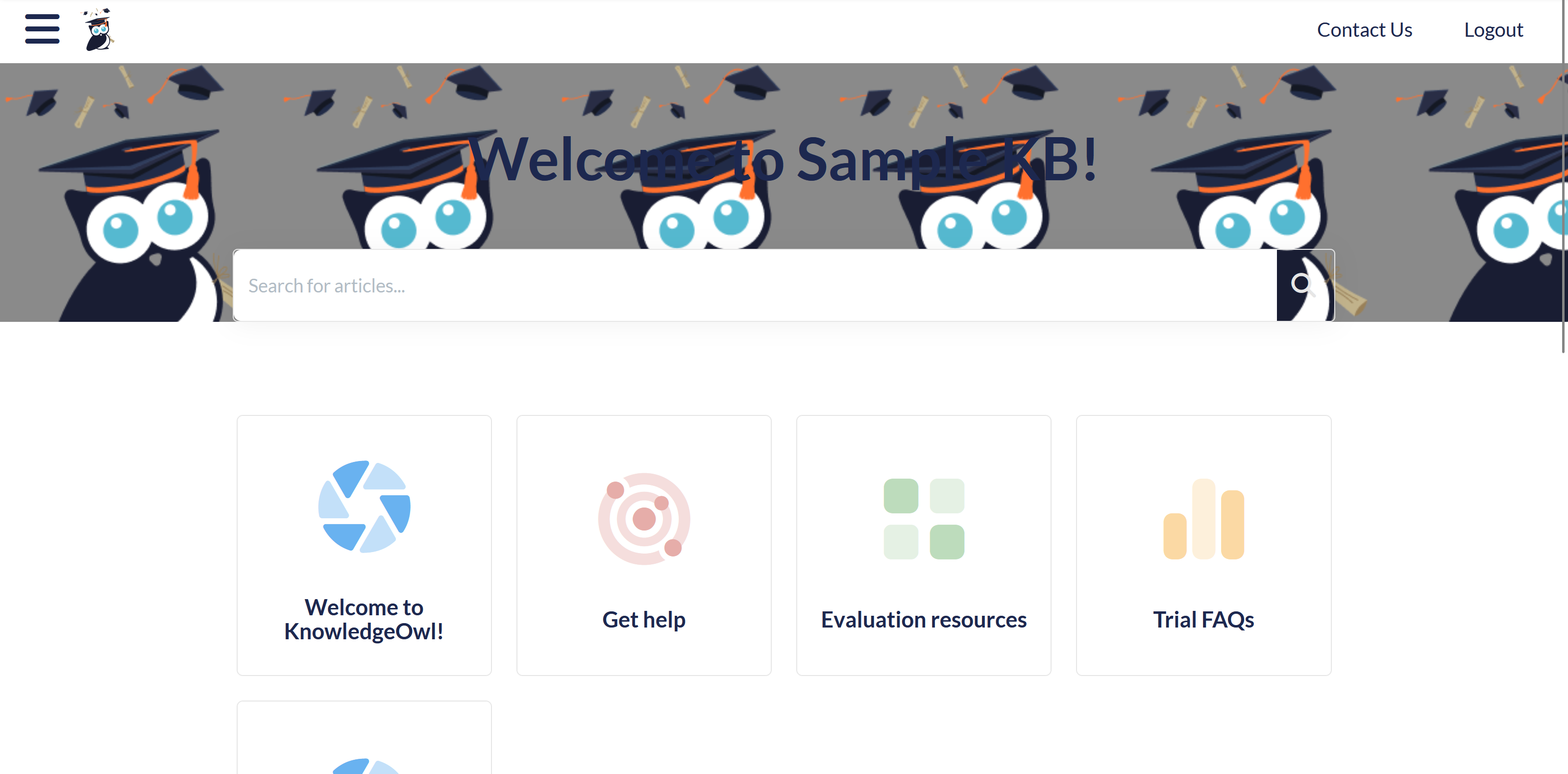 Sample of a repeating/tiled image
To fix this, you have several options:
- Add
background-size: cover;to your CSS. This will stretch the image to make it fit the overall dimensions. Sometimes this works well, but sometimes it distorts or cuts off parts of the image, so take a good look at the results. Your resulting CSS should look something like this:.hg-minimalist-theme .ko-homepage-top { background-image: url("https://dyzz9obi78pm5.cloudfront.net/app/image/id/1ab1ab1ab1ab1ab1ab1ab1ab1/n/sample-banner-image.png"); background-size: cover; padding-top: 2em; padding-bottom: 0em; } - If you don't like the look of
background-size: cover;, try addingbackground-size: 100% 100%;to your CSS. This will try to stretch the image proportionately to fit the screen it's displayed on, which can be more elegant for lots of different devices and sometimes bypasses the off-center distortion ofbackground-size: cover;. Your resulting CSS should look like something like this:.hg-minimalist-theme .ko-homepage-top { background-image: url("https://dyzz9obi78pm5.cloudfront.net/app/image/id/1ab1ab1ab1ab1ab1ab1ab1ab1/n/sample-banner-image.png");background-size: 100% 100%; padding-top: 2em; padding-bottom: 0em; } - If neither CSS option works, consider using image editing software to add a background around the image to meet the 5:1 ratio. Even a transparent background can work wonders.
If your knowledge base homepage already has some kind of banner image or colored background and you'd like to change it, you can change it to:
- A solid color
- A color gradient
- An image of your choice
Don't have an existing homepage banner image?
If your knowledge base homepage doesn't have any kind of background color or image, follow the instructions in Add a background image to my homepage instead.
Before you begin
If your knowledge base already has an image on the homepage of some kind:
- Go to Customize > Style (HTML & CSS).
- In the Customize HTML, CSS, and JS section, be sure Custom CSS is selected.
- Check if your Custom CSS begins with a comment with General structure at the top:
If it does, you're using our new Support Theme and can generally follow the instructions below exactly. Your background image is usually set in the Homepage Top and General section of your Custom CSS, which should be between row 330-350:/******************************************************** General structure ****************************//******************************************************** Homepage Top and General */ /* get rid of background banner and add some padding to top of homepage */ .hg-minimalist-theme .ko-homepage-top { background: none; padding-top: 2em; padding-bottom: 0em; } - If your Custom CSS doesn't begin with General structure, your knowledge base has a customized theme. Check if there's any CSS that includes
.ko-homepage-topand adjust that CSS. Use the instructions below as a guide, but you may need to make additional tweaks. - Check your Custom CSS to see if it already has something set for
.ko-homepage-top.
Replace with a solid color
To change your existing homepage banner/background to a solid color:
- Go to Customize > Style (HTML & CSS).
- In the Customize HTML, CSS, and JS section, be sure Custom CSS is selected.
- Find the section of your Custom CSS that styles
.hg-minimalist-theme .ko-homepage-topor.ko-homepage-top. Refer to the instructions in Before you begin if you're not sure how to do this. - You may have a background-image or a background-color already set. To use a solid color, set
background-image: none;and add abackground-colorto set the solid color. Your CSS should look something like this:/* Set homepage banner image */
.hg-minimalist-theme .ko-homepage-top { background-color: #8bc34a; /* set background color for homepage banner */ background-image: none; /* ensure no background image displays */ } - Replace the background-color hex in row 3 with a color of your choice.
- Be sure to Save your changes once you're done.
Replace with a color gradient
To change your existing homepage banner/background to a color gradient:
- Go to Customize > Style (HTML & CSS).
- In the Customize HTML, CSS, and JS section, be sure Custom CSS is selected.
- Find the section of your Custom CSS that styles
.hg-minimalist-theme .ko-homepage-topor.ko-homepage-top. Refer to the instructions in Before you begin if you're not sure how to do this. - Remove any
background-colorsettings and set thebackground-imageto use alinear-gradient. Your CSS should look something like this:/* Set homepage banner image */ .hg-minimalist-theme .ko-homepage-top { background-image: linear-gradient(red, yellow); /* set background color gradient */ } - Replace the
(red, yellow)linear-gradient values with your choice. You must have at least two colors but can have more, and you can also specify direction and/or degree. Refer to the W3School's entry for linear-gradient function for more details on working with the linear-gradient property. - Be sure to Save your changes once you're done.
Replace with your own image
First, you'll need to find an image you'd like to use. This can involve some trial and error. Generally, you want a 5:1 aspect ratio for the image. Refer to Image guidelines below for more detailed guidance on choosing an image.
Once you have an image that you'd like to work with:
- Go to Files and upload it to your Files page.
- Once you've uploaded your image file, find the URL. Copy it and paste it into a text editor or somewhere else--we'll need it later!
- Go to Customize > Style (HTML & CSS).
- In the Customize HTML, CSS, and JS section, be sure Custom CSS is selected.
- Find the section of your Custom CSS that styles
.hg-minimalist-theme .ko-homepage-topor.ko-homepage-top. Refer to the instructions in Before you begin if you're not sure how to do this. - If your Custom CSS already has a background-image, it will look something like this:
/* Set homepage banner image */
.hg-minimalist-theme .ko-homepage-top { background-image: url("/css/images/tweed.png"); }- Replace the URL with the URL you copied in Step 2 from your Files page. Keep the URL in "quotes". Here's a completed example using an image in our Files page:
/* Set homepage banner image */ .hg-minimalist-theme .ko-homepage-top { background-image: url("https://dyzz9obi78pm5.cloudfront.net/app/image/id/1ab1ab1ab1ab1ab1ab1ab1ab1/n/sample-banner-image.png");padding-top: 2em; padding-bottom: 0em;}
- Replace the URL with the URL you copied in Step 2 from your Files page. Keep the URL in "quotes". Here's a completed example using an image in our Files page:
- If your Custom CSS doesn't already have a background-image:
- Copy the code below below and add it within the
.hg-minimalist-theme .ko-homepage-topCustom CSS:background-image: url("/css/images/tweed.png"); - Replace
/css/images/tweed.pngwith the URL you copied in Step 2 from your Files page. Keep the URL in "quotes". Here's a completed example using an image in our Files page:/* Set homepage banner image */ .hg-minimalist-theme .ko-homepage-top { background-image: url("https://dyzz9obi78pm5.cloudfront.net/app/image/id/1ab1ab1ab1ab1ab1ab1ab1ab1/n/sample-banner-image.png"); }
- Copy the code below below and add it within the
- Make sure your
.hg-minimalist-theme .ko-homepage-topCSS doesn't havebackground: none;set anywhere. - Once you're happy with your image changes, be sure to Save your changes.
- If you have repeating or other issues, refer to the Image troubleshooting tips below.
Image guidelines
Here are some tips to help you find a good image:
- Ideally you want an image with a 5:1 aspect ratio, so it's much wider than it is tall.
- Large overall dimensions tend to work better. Around 1500px x 300px is a good place to start, though we have no set requirements.
- The overall image file size should be relatively small. Ideally the image file size is in kilobytes (KB) not megabytes (MB). Large files will slow down your homepage load time.
- If you have the choice between a .jpg and a .png file, choose the .png. PNG files tend to scale better with different screen sizes, whereas .jpg can become a little fuzzy at certain resolutions. If you have the choice for a .webp file, use that.
- Alternatively, choose a smaller image that would look nice as tiles in the background.
Image troubleshooting tips
If your image is smaller than the space provided it will repeat itself or stretch oddly:
 Sample of a repeating/tiled image
To fix this, you have several options:
- Add
background-size: cover;to your CSS. This will stretch the image to make it fit the overall dimensions. Sometimes this works well, but sometimes it distorts or cuts off parts of the image, so take a good look at the results. Your resulting CSS should look something like this:.hg-minimalist-theme .ko-homepage-top { background-image: url("https://dyzz9obi78pm5.cloudfront.net/app/image/id/1ab1ab1ab1ab1ab1ab1ab1ab1/n/sample-banner-image.png"); background-size: cover; padding-top: 2em; padding-bottom: 0em; } - If you don't like the look of
background-size: cover;, try addingbackground-size: 100% 100%;to your CSS. This will try to stretch the image proportionately to fit the screen it's displayed on, which can be more elegant for lots of different devices and sometimes bypasses the off-center distortion ofbackground-size: cover;. Your resulting CSS should look like something like this:.hg-minimalist-theme .ko-homepage-top { background-image: url("https://dyzz9obi78pm5.cloudfront.net/app/image/id/1ab1ab1ab1ab1ab1ab1ab1ab1/n/sample-banner-image.png");background-size: 100% 100%; padding-top: 2em; padding-bottom: 0em; } - If neither CSS option works, consider using image editing software to add a background around the image to meet the 5:1 ratio. Even a transparent background can work wonders.
By default, the title of your knowledge base will display above the search bar of your homepage in a "Welcome to...." statement:
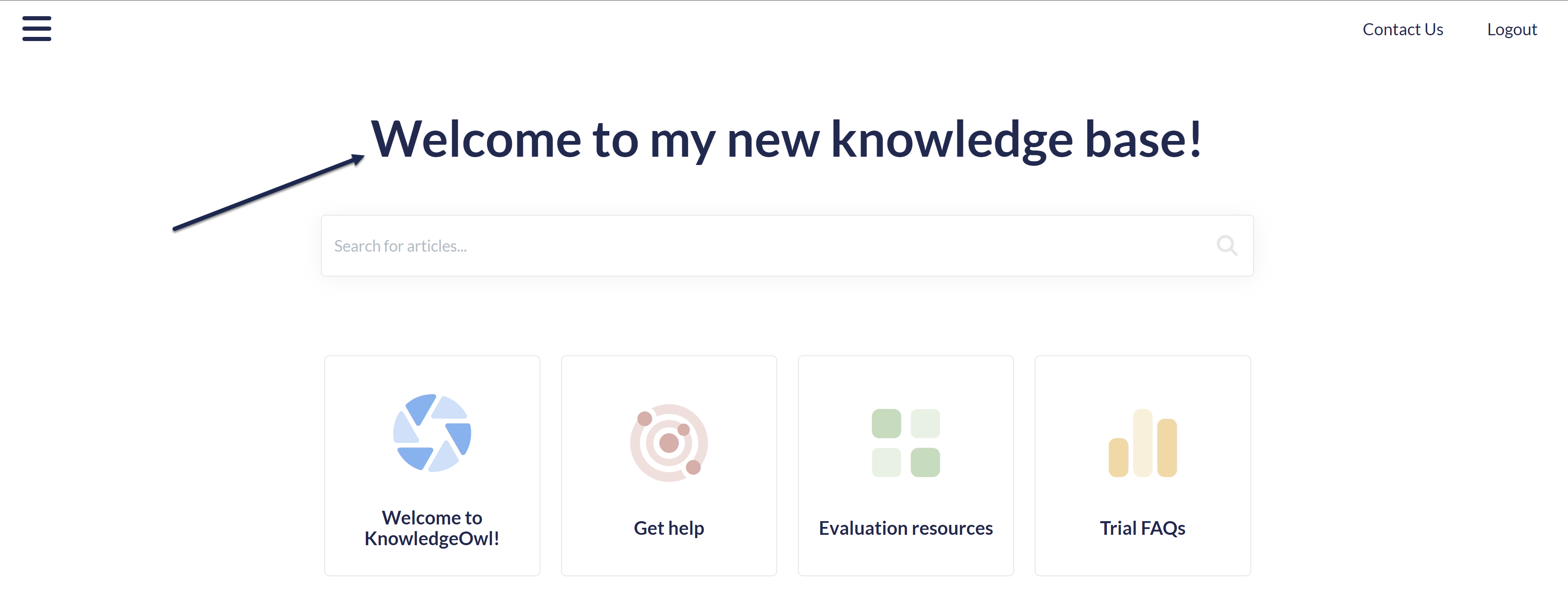 Sample homepage welcome text
You can Change the welcome text on my homepage, but in some cases you might want to remove it entirely. For example, if you add a banner image that has your company name/logo in it already.
To remove that welcome text completely, delete one line of HTML from the Homepage Custom HTML template:
- Go to Customize > Style (HTML & CSS).
- In the Customize HTML, CSS, and JS section, select Custom HTML.
- Select Homepage from the Select HTML section to edit dropdown.
- Delete this line:
<h1 class="hg-article-title xcolor">[homepage("title")]</h1>. In our default template and the sample below, it's in row 2:<div class="ko-homepage-top"> <h1 class="hg-article-title xcolor">[homepage("title")]</h1> [template("large-search")] </div> <div class="hg-article"> <div class="hg-article-body"> - Once you remove that line, your Homepage custom HTML should now look something like this:
<div class="ko-homepage-top> [template("large-search")] </div> <div class="hg-article"> <div class="hg-article-body"> - Be sure to Save your changes once you're done.
By default, the color of the "Welcome to..." statement on the homepage (the homepage title) is set to a dark blue:
 The homepage welcome statement
To change it to another color:
- Go to Customize > Style (HTML & CSS).
- In the Customize HTML, CSS, and JS section, select Custom CSS.
- If your Custom CSS begins with a long comment and General structure,like the code sample below, follow the Update existing CSS instructions. If the Custom CSS section doesn't start with this comment, continue with these instructions.
/******************************************************** General structure ****************************/ /* define most colors */ - Copy the code below and paste it into your Custom CSS pane:
/* Change color of homepage title */
.ko-homepage-top .hg-article-title { color: #000000; /* Update to use the color of your choice */ } - Replace the #000000 on row 3 with the hex code or rbg value of your choice.
- You can Preview Changes to see the difference.
- Be sure to Save once you've got it looking the way you'd like.
Update existing CSS
If your Custom CSS begins with this code:
/******************************************************** General structure ****************************/
/* define most colors */You don't need to add any new CSS. You'll just need to update what's there.
- In Customize > Style (HTML & CSS).
- In the Customize HTML, CSS, and JS section, select Custom CSS.
- Scroll about halfway down the Custom CSS pane until you find the Homepage Top and General section, which is usually near row 350:
/******************************************************** Homepage Top and General */ /* get rid of background banner and add some padding to top of homepage */ .hg-minimalist-theme .ko-homepage-top { background: none; padding-top: 2em; padding-bottom: 0em; } - Look for the third commented section here for change default color for homepage title, shown here in rows 5-8:
/* make sure category title is clickable */ .hg-minimalist-theme .hg-home-page .category-header { z-index: 2; } /* change default color for homepage title */ .hg-minimalist-theme .ko-homepage-top .hg-article-title { color: var(--primary-color); } /******************************************************** Content Lists */ - Update the color listed in that section from
var(--primary-color). You can do this in two ways:- Use a different variable: If the color you'd like to use is already defined in the :root color variables at the top of your Custom CSS pane, update the variable used here to reference that variable color. Replace
--primary-colorwith the variable color you'd prefer to use. For example, this code will use your defined secondary-color instead:color: var(--secondary-color);. - Use a hard-coded color: If you don't have a variable defining this color or if your theme doesn't currently include variables, replace the variable with a hex or rgb value for the color. For example, this CSS will use the hex code #005497 instead:
color: #005497;.
- Use a different variable: If the color you'd like to use is already defined in the :root color variables at the top of your Custom CSS pane, update the variable used here to reference that variable color. Replace
- Be sure to Save your changes once you're done!
By default, all new knowledge bases use category icons on their homepage. If you're using one of our older knowledge base themes, or you're using a knowledge base created from a copy of an older knowledge base, you may need to manually update your knowledge base to use category icons on the homepage.
There are two ways to use category icons in your homepage category panels:
- Use our pre-built merge code to do the work for you: This requires less work and technical knowledge, but it will change the HTML structure of your homepage, which may mean you'll need to update Custom CSS to style the panels the same way. Follow the Use the merge code setup instructions.
Recommended
We recommend starting with this approach, since it uses built-in functionality. - Keep your existing styles and use a script (and some additional Custom CSS) to style your icons: This is a bit trickier but means you won't have to touch your current styles much. Follow the Use a script setup instructions.
We'll walk through each option in more detail below.
Use the merge code
To use the merge code, update your homepage so that it's no longer using the [template("base-cats")] template.
Look before you leap
If your knowledge base is actively being used, contact us to request a sandbox copy of your knowledge base to test this template in, since it will change the styles a bit!
To generate the automatic panels for your current homepage, a template for base-cats is used. This template is usually added in one of two places:
- Customize > Homepage
- Customize > Style (HTML & CSS) > Custom HTML > Homepage
- Check each of these pages to see where
[template("base-cats")]is referenced. Make your edits in the same place. - Once you've found where the template is added, replace "base-cats" with "icon-cats". Your merge code should now look like:
[template("icon-cats")] - By default, the icon-cats template will:
- Display all of your categories
- Display four categories per row
- Won't display the category description
- If you're happy with that, you can Save now. Otherwise, you can adjust the merge code to change this behavior.
- To limit the number of categories it shows, add
,max=8. Make sure you have no spaces, and replace8with the maximum number of categories you want to show. For example, this merge code will limit the number of categories displayed to eight:[template("icon-cats,max=8")] - To adjust the number of categories displayed per row, add
,col=4. Make sure you have no spaces, and replace4with the number of columns of categories you want per row. For example, this merge code will display three categories per row instead of the default four:[template("icon-cats,col=3")] - To show the category description below the category's icon and title, add
,desc=1, which tells the merge code to show descriptions:[template("icon-cats,desc=1")] - You can use any combination of these settings together, too. This merge code will display a total of nine categories even if there are more, and will display them in rows of three with the category descriptions shown:
[template("icon-cats,max=9,col=3,desc=1")] - You can use the Update Preview option to get a sneak peek of how that will look.
- Once you've finished making changes, be sure to Save them.
If you're using the default styles on the homepage, that will shift the homepage from having two or three categories per row with this styling:
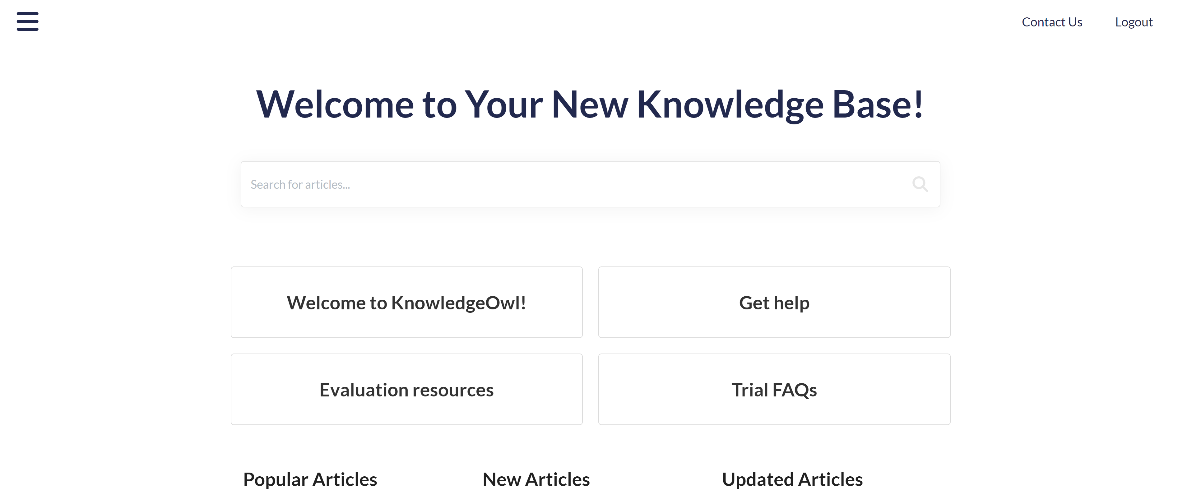 A sample knowledge base using the base-cats template
To have four categories per row with this styling:
Styling the panels
If you have Custom CSS already applied to your homepage category tiles, that CSS won't generally work on the icon-cats template, since it constructs the HTML and CSS classes differently.
In the base-cats format, the row of category tiles is put within a div class="category-list" with divs for faq-cat-panel-container and faq-cat-panel, something like this:
 Sample HTML structure of a homepage using base-cats
faq-cat-panel div, which handles background, border, text alignment, and more.
Once you switch to icon-cats, the format changes significantly:
- The
category-listdiv picks up two extra classes (panelsandcolx, where x is replaced with the number of columns specified in the merge code). - The extra
faq-cat-panel-containeris completely removed. - The
faq-cat-panelclass changes tocat-icon-panel. - The div also includes a div for
category-icon. - The
cat-icon-panelgets a title set, which helps with accessibility.
The default styles we use for the icon-cats classes are:
.cat-icon-panel {
border: 1px solid #e6e6e6;
display: flex;
align-items: center;
justify-content: center;
flex-direction: column;
box-shadow: none;
padding: 16px;
border-radius: 5px;
cursor: pointer;
transition: all .2s ease-in-out;
backface-visibility: hidden;
}
.category-icon {
height: 100px;
transition: all .2s ease-in-out;
}
.hg-minimalist-theme .cat-icon-panel .category-header,
.cat-icon-panel .category-header {
font-size: 18px;
color: #1d284f;
}
.cat-icon-panel .category-header {
text-align: center;
}
.cat-icon-panel:hover {
transform: scale(1.01) translateZ(0);
box-shadow: 2px 4px 4px #aeaeae;
}
.cat-icon-panel:hover .category-icon {
transform: scale(1.10);
}
You can copy these and paste them into your Custom CSS and start tweaking them to do your styles.
Updating your existing CSS
Alternatively, you can try to update your existing CSS in-place. This will take some trial and error, but here are some tips:
- If you have any CSS that is setting the
.faq-cat-panel-containerwidth, you should be able to remove this completely. We no longer wrap the panels in a container to handle width; the icon-catscol=variable lets you set this width directly in the merge code. Be sure that your merge code contains the appropriatecol=setting to mimic this width CSS. - If you have any existing CSS specifying that
.faq-cat-panel-containeror.faq-cat-paneluseflex(or any of the flex attributes), you should be able to remove that entirely. The icon-cats structure uses flex automatically. - If you have existing
.faq-cat-panelstyles, try copying that CSS and adding it to the.cat-icon-panelclass.- For example, if I have this CSS in my existing knowledge base:
.hg-home-page .category-list .faq-cat-panel { border: 2px solid black; box-shadow: none; padding: 16px; border-radius: 5px; } - I can add a comma and add the same selectors but replace .faq-cat-panel with .cat-icon-panel:
.hg-home-page .category-list .faq-cat-panel, .hg-home-page .category-list .cat-icon-panel { border: 2px solid black; box-shadow: none; padding: 16px; border-radius: 5px; }
- For example, if I have this CSS in my existing knowledge base:
- Changes to the base styles for the
.cat-icon-panelas well as the h3 within them should be fairly easy to update using this method. - You may need to add new
:hoverstyles for.cat-icon-panel:hoverand.cat-icon-panel:hover .category-iconrather than updating existing styles for.faq-cat-panel:hover, depending on how the existing CSS was formatted. You can use the default CSS in the previous section as a base and compare that with your current CSS for hover effects to try to find the right combination. - Preview is your friend when testing these CSS changes, or ask our team for a sandbox copy of your current knowledge base to test in!
Use a script
If you don't want to use the merge code, you can use the base-cats template combined with a script to extract the icons. This is a little clunkier but does work.
We strongly encourage you to try the merge code approach though, as it is slightly more accessible for screen readers and much easier to work with for future styling needs.
Add to your knowledge base's Custom HTML and Custom CSS to extract the category icons and display them.
Before you begin
It's a great idea to have at least one category icon added to a category, so you can confirm the script is working and figure out what style tweaks might be necessary.
To get the category icons displaying on your homepage:
- Go to Customize > Style (HTML & CSS).
- In the Customize HTML, CSS, and JS section, select Custom HTML.
- Select Homepage from the Select HTML section to edit dropdown.
- Copy the script below and paste it into the bottom of the Custom HTML editing pane:
<script> //This script runs on the homepage and looks for category icons added to the category, extracts and displays them. $(function() { $.each($(".faq-cat-panel-container"), function() { var imageURL = $(this).find("input.category-icon-url").val(); $(this).find(".faq-cat-panel").prepend("<div><img class='category-icon' src='"+imageURL+"' alt=''></div>"); }); $('.faq-cat-panel-container').show(); }); </script> - Now select Custom CSS.
- Copy the CSS below and paste it into the CSS editing pane. The
.category-iconclass can be used to style your icons as you'd like--the style here is just an example. You can play with this more or talk to our support team for additional help getting the icons to appears as you'd like!/* Hide the homepage category containers at first, so that the category icon script will display them once they run This prevents a blip where the panels show briefly without the icon */ .hg-home-page .faq-cat-panel-container { display: none; } /* Style the category icon; you can use any variety of CSS here */ .category-icon { max-width: 3em; padding-bottom: 0.5em; } - You can preview your changes; just be sure you Save them once you're done.
Variations
If you'd like the alt text of the image to be populated by the category title, use this script instead:
<script>
//This script runs on the homepage and looks for category icons added to the category, extracts and displays them.
$(function() {
$.each($(".faq-cat-panel-container"), function() {
var imageURL = $(this).find("input.category-icon-url").val();
var catTitle = $(this).find(".category-header a").text();
$(this).find(".faq-cat-panel").prepend("<div><img class='category-icon' src='"+imageURL+"' alt='"+catTitle+"'></div>");
});
$('.faq-cat-panel-container').show();
});
</script>KnowledgeOwl offers six article lists that you can use in your knowledge base to help readers find new, updated, popular, recently viewed, required, and relevant content. These lists are automatically generated. Four are added to your homepage or articles by default; the other three are optional lists you can choose to add!
To change the number of articles displayed in each list, refer to Website settings.
Pre-added lists
Popular Articles list
Our Popular Articles List displays articles with the most traffic. This will increase your readers' engagement and your ability to get them the most common answers they might need. This list is added to your homepage by default. Refer to Remove article lists from your homepage if you'd like to remove this list from your homepage.
New Articles list
Our New Articles List displays articles that have been recently created or published. This helps your readers stay aware of newly published content. This list is added to your homepage by default. Refer to Remove article lists from your homepage if you'd like to remove this list from your homepage.
Updated Articles list
Our Updated Articles List displays articles that have recently updated content. This will increase your readers' engagement and your ability to get them the most up-to-date answers they need. This list is added to your homepage by default. Refer to Remove article lists from your homepage if you'd like to remove this list from your homepage.
Related Articles list
Our Related Articles List is used in articles to display articles that have content related to the current article the reader is reading. This will increase your readers' engagement and the your ability to get them the answers they need. This list is added to the article footer by default.
Optional/Feature-specific lists
Favorite Articles list
For knowledge bases that use reader logins and have Article Favorites set up, the Favorite Articles List will display the articles a reader has chosen to favorite.
Recent Articles list
For knowledge bases that use reader logins, the Recently Viewed Articles List displays the current reader's most recently viewed articles. This will help readers return to articles or categories they have recently viewed. Your homepage or righthand column is an excellent place to add this list.
Required Articles list
For knowledge bases that use reader logins and have Required Reading set up, the Required Articles List will display all articles marked as required. Readers can click to open articles to acknowledge them, or select See more... to open the Required Reading page to view the complete list and review the articles they need to acknowledge.
Our New Articles list allows you to display articles that have been created or published most recently. This list is included by default on the homepage of all new knowledge bases.
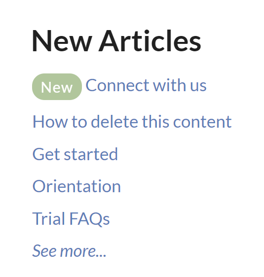 Sample New Articles list
How does it work?
KnowledgeOwl will search behind the scenes for the newest articles and display them within the list, with newest displayed at the top. Articles which have the New callout added to them will display before articles which do not have that callout.
A See more... link at the bottom of the list will take you to a full page of all New articles, located at /help/new-articles (or /home/new-articles or /docs/new-articles depending on which root path you've chosen). You can see ours here: https://support.knowledgeowl.com/help/new-articles. The New Articles page displays the most recent 100 New articles.
Out of the box, this list will display five articles. If no articles are available, it displays the text "None". If more than five are available, it includes a See more... link after the five articles.
You can choose to display up to 10 articles. You can also change the article list heading, the New Articles page heading, "None", and "See more..." text.
To update any of the text, use the options in Customize > Default text in the Article Lists Knowledge Base Section. Refer to Section breakdown: Article Lists for more information.
Change number of articles in the list
By default, the five most recent articles will be displayed. You can change this to display between 1-10:
- Go to Customize > Website.
- Scroll to the Article list settings section.
- Use the Recently published dropdown to select the number of articles you'd like the list to display (1-10).
- Be sure to Save your changes.
In our default themes, the New Articles List is already added to:
- Your knowledge base homepage
- Your 404 error page
If you'd like to add it somewhere else, or if you've customized the HTML and no longer see the list on the pages listed above, review the directions below to add it! You'll need this merge code: [template("new-articles")]
Add the New Articles list to all articles
You can place the new articles merge code in the HTML of all articles. Go to Customize > Style (HTML & CSS) > Custom HTML and select Article. You can place the merge code after the article body merge code or in the hg-article-footer div.
Either of these locations will display at the bottom of each article.
You'll probably also want to add a header to display above the new article links as well and perhaps a div with a class so that you can style the list. Something like the following should do:
<div class="new-articles">
<h3>[translation("article-lists:new-articles")]Add the New Articles list to individual articles
If you only want to display the New Articles list in certain articles you can place the new article merge code at the bottom of individual articles. To do so, edit the article and select the </> Code View button in the upper left of the editor toolbar:
Scroll to the bottom of the article and paste the merge code.
You'll probably also want to add a header to display above the new article links as well and perhaps a div with a class so that you can style the list.
Something like the following should do:
<div class="new-articles">
<h3>[translation("article-lists:new-articles")]If you do this often, create a snippet that holds the above HTML and insert the snippet into your article, instead!
Re-add the New Articles list to the right column
If you've removed the New Articles List from the right column of your knowledge base, you can re-add it by copying the relevant HTML from Default Right Column HTML and pasting it into Customize > Style (HTML & CSS) > Custom HTML > Right Column.
Re-add the New Articles list to your homepage
If you've removed the New Articles list from your homepage, you can re-add it to by copying and pasting the relevant HTML from Default Homepage Article HTML into either the code view of Customize > Homepage or into Customize > Style (HTML & CSS) > Custom HTML > Homepage.
Our recently Updated Articles list allows you to display articles that have recently updated content. This will increase your readers' engagement and your ability to get them the most updated answers they need. By default, we add this list to your homepage but you can use it almost anywhere.
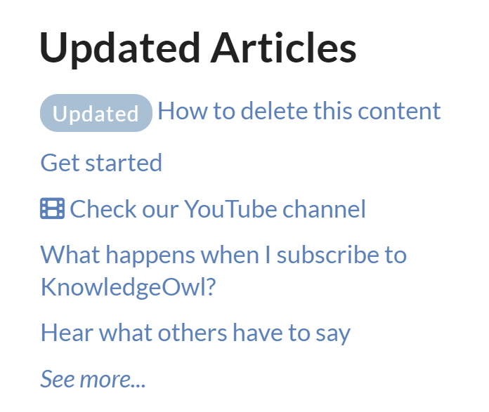 Sample Updated Articles List
How does it work?
Wherever the updated articles merge code is used, KnowledgeOwl will search behind the scenes to pull a list of the articles with last modified dates, with the most recently updated at the top. Articles which have the Updated callout added to them will display before articles which do not have that callout.
A See more... link at the bottom of the list will take you to a full page of all Updated Articles, located at /help/updated-articles (or /home/updated-articles or /docs/updated-articles depending on which root path you've chosen). You can see ours here: https://support.knowledgeowl.com/help/updated-articles. The Updated Articles page displays the first 100 articles that were most recently updated.
Out of the box, this list will display five articles. If no articles are available, it will display the text "None". If more than five are available, it will include a "See more..." link below the articles.
You can choose to display up to 10 articles. You can also change the article list heading, the New Articles page heading, "None", and "See more..." text.
To update any of the text, use the options in Customize > Default text in the Article Lists Knowledge Base Section. Refer to Customize Text: Article Lists for more information.
Change number of articles in the list
By default, the five most recently updated articles will be displayed. You can change this to display between 1-10:
- Go to Customize > Website.
- Scroll to the Article list settings section.
- Use the Recently updated dropdown to select the number of articles you'd like the list to display (1-10).
- Be sure to Save your changes.
In our default themes, the Updated Articles List is already added to:
- Your knowledge base homepage
- Your 404 error page
- Your default right column HTML
If you'd like to add it somewhere else, or if you've customized the HTML and no longer see the list on the pages listed above, review the directions below to add it! You'll need this merge code:[template("up-articles")]
Add the Recently Updated Articles list to all articles
You can place the updated articles merge code in the HTML of all articles. Go to Customize > Style (HTML & CSS) > Custom HTML and select Article. You can place the merge code after the article body merge code or in the hg-article-footer div.
Either of these locations will display at the bottom of each article.
You'll probably also want to add a header to display above the updated article links as well and perhaps a div with a class so that you can style the updated articles list.
Something like the following should do:
<div class="updated-articles">
<h3>[translation("article-lists:updated-articles")]</h3>
[template("up-articles")]
</div>Add the Recently Updated Articles list to individual articles
If you only want to display the updated articles list in certain articles you can place the updated article merge code at the bottom of individual articles. To do so, edit the article and select the Code View button in the upper left of the editor toolbar:
Scroll to the bottom of the article and paste the merge code.
You'll probably also want to add a header to display above the updated article links as well and perhaps a div with a class so that you can style the updated articles list.
Something like the following should do:
<div class="up-articles">
<h3>[translation("article-lists:updated-articles")]If you do this often, create a snippet that holds the above HTML and insert the snippet into your article, instead!
Re-add the Updated Articles list to the right column
If you've removed the Updated Articles List from the right column of your knowledge base, you can re-add it by copying the relevant HTML from Default Right Column HTML and pasting it into Customize > Style (HTML & CSS) > Custom HTML > Right Column.
Re-add the Updated Articles list to your homepage
If you've removed the Updated Articles List from your homepage, you can re-add it to by copying and pasting the relevant HTML from Default Homepage Article HTML into either the code view of Customize > Homepage or into Customize > Style (HTML & CSS) > Custom HTML > Homepage.
The Popular Articles List displays articles with the most views. This list helps readers navigate to your most-viewed articles quickly.
By default, new knowledge bases display this list on the homepage:
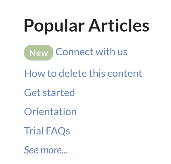 Sample Popular Articles list in a knowledge base
How does it work?
Wherever the popular articles merge code is used, KnowledgeOwl displays a list of the articles with the highest number of views as displayed in the Popular Articles Report in Reporting > Dashboard, sorted with the most views at the top. You can also Reset article views in the Popular Articles report.
The list includes a See more... link to take readers to a full page of all Popular Articles, located at /popular-articles in your knowledge base. For example, the Popular Articles page for this Support knowledge base is here: https://support.knowledgeowl.com/help/popular-articles. The Popular Articles page displays the top 100 articles with the most views.
If no articles are available, it displays the text "None." If more than five are available, it includes a "See more..." link at the bottom of the list.
You can choose to display up to 10 articles in the list. You can also change the article list heading, the Popular Articles page heading, "None", and "See more..." text.
To update any of the text, use the options in Customize > Default text in the Article Lists Knowledge Base Section. Refer to Customize Text: Article Lists for more information.
Change number of articles in the list
By default, the list displays the five most popular articles (those with the most views). You can change this to display between 1-10:
- Go to Customize > Website.
- In the Article list settings section, use the Most popular dropdown to select the number of articles you'd like the list to display.
- Be sure to Save your changes.
In new knowledge bases, the Popular Articles List is already added to:
- Your knowledge base homepage
- Your 404 error page
If you'd like to add it somewhere else, or if you've customized the HTML and no longer see the list on the pages listed above, review the directions below to add it! You'll need this merge code:[template("pop-articles")]
Add the Popular Articles list to all articles
To display the Popular Articles list in all articles:
- Go to Customize > Style (HTML & CSS).
- In the Customize HTML, CSS, and JS section, select Custom HTML.
- Select Article from the Select HTML section to edit dropdown.
- Copy the code below and paste it wherever you'd like the list to appear. (After the article body merge code or in the hg-article-footer div are good choices!):
<div class="pop-articles"> <h3>[translation("article-lists:popular-articles")]</h3> [template("pop-articles")] </div> - Be sure to Save your changes.
Add the Popular Articles list to individual articles
If you only want to display the Popular Articles List in certain articles:
- Open the article you'd like to add the list to.
- Highlight some text near where you want to add the list.
- Select the </> Code View button in the editor toolbar to toggle to Code View:
 Select the Code View button
 - Copy the code below and paste it wherever you'd like the list to appear:
<div class="pop-articles"> <h3>[translation("article-lists:popular-articles")]</h3> [template("pop-articles")] </div> - Be sure to Save your changes.
Save time
If you do this often, create a snippet that holds that code and insert the snippet into your article, instead!
Re-add the Popular Articles list to your homepage
If you've removed the Popular Articles list from your homepage, you can re-add it to by copying and pasting the relevant HTML from Default Homepage HTML.
For knowledge bases using individual reader accounts, our Recent Articles list displays a reader's most-recently-viewed articles, topic display categories, and custom content categories. These links can help readers return to content where they left off. Your homepage is an excellent place to add this article list.
Reader accounts required
This list only works with individual reader accounts. Knowledge bases with KB Settings > Basic > Content authentication set to public, IP address or shared password can't use the list properly.
How does it work?
To set up, you'll add the merge code for the list where you'd like the information to be displayed. Behind the scenes, KnowledgeOwl tracks up to ten of the most recently viewed articles, topic display categories, and custom content categories for each reader, and display those back to the reader in the article list.
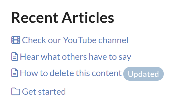 Sample Recent Articles list
Articles display with a document icon. Topic display and custom content categories display with a folder icon. Anything set with the video callout displays the video icon.
The Recent Articles list will not show:
With topic display categories, if you have the option set to Override Article Links (so that opening an article always opens it within the topic display category), when a reader views an article in the category, both the topic display category and the article appear in their Recent Articles list.
Setup
By default, the reader's five most recently viewed articles will be displayed. You can change this to display between 1-10:
- Go to Customize > Website.
- In the Article list settings section, use the Recently viewed dropdown to select the number of articles you'd like the list to display.
- Be sure to Save your changes.
You must add the merge code yourself
We don't add this list to any section of your knowledge base by default.
If you'd like to add this list, you'll add two merge codes to your your Customize > Style (HTML & CSS) settings:
[translation("article-lists:recent-articles")]: Grabs the Recent articles list heading in Customize > Default text > Article Lists, making it so no one has to edit the code in the future to update the title.[reader("recent-articles")]: Generates the individual reader's recent articles list.
Below, we walk through two common setups:
- Add the Recent Articles list to your homepage
- Add the Recent Articles list to your article footer
Add the Recent Articles list to your homepage
Most knowledge bases have their article lists set in Customize > Style (HTML & CSS) > Custom HTML > Homepage. If your knowledge base uses this layout, follow these instructions to add the Recent Articles list there.
If your knowledge base doesn't show any article lists there, they're likely in Customize > Homepage. For that setup, follow these instructions instead.
To update your Custom HTML:
- Go to Customize > Style (HTML & CSS).
- In the Customize HTML, CSS, and JS section, select Custom HTML.
- In the Select HTML section to edit dropdown, select Homepage.
- On or near row 9, find the
div class="homepage-widgets row". - Copy one of the other article lists and paste that code in again.
- Replace the title merge code with:
[translation("article-lists:recent-articles")] - Replace the list merge code with:
[reader("recent-articles")] - Your code should now look something like this:
<div class="homepage-widgets row"> <div class="col-md-4 col-sm-6"><h3>[translation("article-lists:popular-articles")]</h3>[template("pop-articles")]</div> <div class="col-md-4 col-sm-6"><h3>[translation("article-lists:new-articles")]</h3>[template("new-articles")]</div> <div class="col-md-4 col-sm-6"><h3>[translation("article-lists:updated-articles")]</h3>[template("up-articles")]</div> <div class="col-md-4 col-sm-6"><h3>[translation("article-lists:recent-articles")]</h3>[reader("recent-articles")]</div> </div> - Be sure to Save your changes once you're done.
Add the Recent Articles list to article footer
You can place the Recent Articles list in the footer of all articles, too. To use this approach, it's best to create a div and add the title within a header and the article list merge code below that.
We provide a code sample below for you to start with:
- Go to Customize > Style (HTML & CSS).
- In the Customize HTML, CSS, and JS section, select Custom HTML.
- In the Select HTML section to edit dropdown, select Article.
- Copy the code below:
<!--Add Recent Articles list-->
<div class="recent-articles text-center"> <h3>[translation("article-lists:recent-articles")]</h3> [reader("recent-articles")] </div> - Paste it in wherever you'd like. We recommend placing this in the hg-article-footer div in one of two places:
- Above the Related Articles section (added on or around row 15):
<div class="hg-article-footer clear-both"> <!--Add Recent Articles list--> <div class="recent-articles text-center"> <h3>[translation("article-lists:recent-articles")]</h3> [reader("recent-articles")] </div> <div class="ko-related-articles text-center"> <h3>[translation("article:related-articles-heading")]</h3> [template("related")] </div> - Between the Related Articles section and the Ratings and Comments (added on or around row 19):
<div class="hg-article-footer clear-both"> <div class="ko-related-articles text-center"> <h3>[translation("article:related-articles-heading")]</h3> [template("related")] </div> <!--Add Recent Articles list--> <div class="recent-articles text-center"> <h3>[translation("article-lists:recent-articles")]</h3> [reader("recent-articles")] </div> [template("rating")]
- Above the Related Articles section (added on or around row 15):
- Once you're done adding the merge code, text, and any Custom CSS to style it, be sure to Save.
Add the Recent Articles list to Customize > Homepage
If your article list merge codes are located in Customize > Homepage:
- Go to Customize > Homepage.
- Copy one of the other homepage lists and paste it in again.
- Replace the title with this merge code:
[translation("article-lists:recent-articles")]. - Replace the merge code with:
[reader("recent-articles")]. - Save.
By default, your knowledge base includes three article lists on the homepage: Popular Articles list, New Articles list, and Updated Articles list.
You can remove any of these article lists.
The steps to follow depend on how old your knowledge base is.
Remove from Customize > Style
In most knowledge bases, the articles are coded into the raw HTML in the Customize > Style (HTML & CSS) page. To remove one or more article lists from your homepage:
- Go to Customize > Style (HTML & CSS).
- In the Customize HTML, CSS, and JS section, select Custom HTML.
- Select Homepage from the Select HTML section to edit dropdown.
- The article lists HTML begins at row 9:
<div class="ko-homepage-top"> <h1 class="hg-article-title xcolor">[homepage("title")]</h1> [template("large-search")] </div> <div class="hg-article"> <div class="hg-article-body"> <div>[template("icon-cats,max=8,col=4,desc=0")]</div> <div>[homepage("body")]</div> <div class="homepage-widgets row"> <div class="col-md-4 col-sm-6"><h3>[translation("article-lists:popular-articles")]</h3>[template("pop-articles")]</div> <div class="col-md-4 col-sm-6"><h3>[translation("article-lists:new-articles")]</h3>[template("new-articles")]</div> <div class="col-md-4 col-sm-6"><h3>[translation("article-lists:updated-articles")]</h3>[template("up-articles")]</div> </div> </div> </div> - To delete the entire article lists section, delete all of rows 9-13. So your HTML would now look like this:
- To delete only one of the of the article lists, delete the row it's on from rows 10-12. So if we deleted the Popular Articles list only, our HTML might look like this:
<div class="ko-homepage-top"> <h1 class="hg-article-title xcolor">[homepage("title")]</h1> [template("large-search")] </div> <div class="hg-article"> <div class="hg-article-body"> <div>[template("icon-cats,max=8,col=4,desc=0")]</div> <div>[homepage("body")]</div> <div class="homepage-widgets row"> <div class="col-md-4 col-sm-6"><h3>[translation("article-lists:new-articles")]</h3>[template("new-articles")]</div> <div class="col-md-4 col-sm-6"><h3>[translation("article-lists:updated-articles")]</h3>[template("up-articles")]</div> </div> </div> </div>Resize remaining lists
If you want to remove one list and have the others expand to use more space, changecol-md-4tocol-md-6for each remaining article list. - Be sure to Save your changes to make them live!
<div class="ko-homepage-top">
    <h1 class="hg-article-title xcolor">[homepage("title")]</h1>
    [template("large-search")]
</div>
<div class="hg-article">
    <div class="hg-article-body">
        <div>[template("icon-cats,max=8,col=4,desc=0")]</div>
        <div>[homepage("body")]</div>
    </div>
</div>Remove from Homepage content editor
If your Homepage Custom HTML doesn't look like that in the samples above, your article lists are probably in the Homepage content editor. Go to Customize > Homepage and use the editor to delete the article lists from the Homepage content > Custom content editor.
Your knowledge base comes with three article lists on the homepage:
You can also add a Recent Articles list to your homepage.
You can also build your own list. Our favorite approach to this is to build a homepage articles list that populates with articles assigned a specific tag using an API Snippet. It can be useful for setting up Frequently Referenced articles, Quick Links, and so on.
Before you begin
You must have at least one active API key in your account with ONLY GET permission to use this functionality. To retrieve / generate a KnowledgeOwl API key, have an account administrator go to to Account > API and create/verify that a GET-only API key exists. This feature is available on select plans. Refer to API keys for more information.
Step 1: Create your tag and add it to articles
In order to have a list that pulls all articles with a particular tag, the tag needs to exist and needs to be assigned to articles.
Create new tags directly in the Tags page, or create them on the fly by opening an article in edit mode and typing into the Tags section. Once you save, the tag is created and assigned to the article.
Review all tags in your knowledge base by going to Tags in the lefthand navigation.
Step 2: Get your tag's ID
Once your tag has been created, you'll need to know its tag ID, which is a unique identifier for that tag. We use the ID here in case the tag is ever edited--the ID won't change even if the spelling of the tag does.
There are few ways to get your tag's ID. The fastest way is to go the Tags page and inspect the tag. We offer instructions on how to do that below. (If you have an API key and you're comfortable using it, you can make an API call to the tag endpoint to get it.)
Get the tag ID from the Tags page
To get the tag ID from the Tags page, we'll use your browser's built-in Inspect option to look at the code in the page.
- In the lefthand navigation, go to Tags. The Tags page opens.
- Right-click on the tag whose ID you want to get and select Inspect.
- This will open some element details for the tag in a different pane. Look two rows up from the tag-pill with the text of the tag you selected. The value listed there is the tag ID. For example, your Inspect code will show something like this:
 Sample tag ID in dev tools
<div class="tag" id="tag-667c5c6a088856533e032bd7"> <input type="checkbox" value="667c5c6a088856533e032bd7" class="tag-checkbox"> <i id="tag-internal-flag-icon" class="fal fa-tag"></i> <span class="tag-pill">tipsandtricks</span> </div> - The
valuein row 2 is your tag ID. In our example,667c5c6a088856533e032bd7. - Copy and paste this tag ID somewhere for later.
Step 3: Create a snippet that looks up articles for your tag
Now the real fun begins. We'll create an API snippet that will pull the list of articles that have that tag assigned, so it can be displayed in a list on the homepage:
- In the lefthand navigation, go to Snippets. The Snippets page opens.
- Select + Create New Snippet to create a new snippet. If you're unfamiliar with creating snippets, refer to Create a snippet for more detailed instructions.
- Enter a Snippet Name. Since we're using a tag, we might use a name format like
<tagName> article list. Since this example uses the tipsandtricks tag, we'll usetipsandtricks article list. - The Merge Code Name is automatically generated from the snippet name. You can edit it if you'd like.
- Enter a Snippet Description so you remember what this snippet does, for example
Builds a list of articles based on the tipsandtricks tag (ID 667c5c6a088856533e032bd7). - Select the Snippet Content dropdown and select Code Editor:
- Once in Code Editor, copy and paste the code below into the editor:
<ul class="list-unstyled stat-list" id="<name>"> </ul> <script> $(function(){ //get all articles inside $.get('[ko_api(article|{"project_id": "%cur_kb_id%", "tags": {"$in":["<tag-id>"]},"status": {"$in": ["published", "review"]}, "_fields": ["url_hash","name"],"sort": {"name": 1}})]', function(data) { if(data && data.data && data.data.length > 0) { $.each(data.data, function(index, article){ $("#<name>").append('<li><div><a href="/help/'+article.url_hash+'">'+article.name+'</a></div></li>') }); } }).fail(function(error) { //failed }); }); </script> - In row 1, replace
<name>with a label or name that makes sense for your list. Be sure you keep the quotes around it. So if I'm creating this for my tips and tricks, I might useid="tips". - Use that same name in row 11, where it says
$("#<name>"). Be sure to keep the quotes and the # in front of it. So if I usedid="tips"for the first one, I'll use$("#tips")here. - In row 7, replace
<tag-id>with the tag ID you copied in Step 3. Keep it in "quotes". - In row 11, if your knowledge base URL ends in something other than /help (such as /docs or /home), update the <a href="/help/' portion to have the correct location. Replace "/help' with "/home' or "/docs' as appropriate.
- Here is what my complete snippet looks like for my tipsandtricks tag in a knowledge base using /docs/ as the root path:
- Optional: if you'd like this list to only be displayed to certain groups, use the Restrict to Reader Groups checkboxes in the right panel to choose the groups to show it to.
- Once you've finished making changes, select Create to create and save your snippet.
<ul class="list-unstyled stat-list" id="tips">
</ul>

<script>
$(function(){
    //get all articles inside
    $.get('[ko_api(article|{"project_id": "%cur_kb_id%", "tags": {"$in":["667c5c6a088856533e032bd7"]},"status": {"$in": ["published", "review"]}, "_fields": ["url_hash","name"],"sort": {"name": 1}})]',
        function(data) {
            if(data && data.data && data.data.length > 0) {
                  $.each(data.data, function(index, article){
                    $("#tips").append('<li><div><a href="/docs/'+article.url_hash+'">'+article.name+'</a></div></li>')
                });
            }
          }).fail(function(error) {
          //failed
    });
});
</script>Step 4: Test your snippet
To test that your snippet is working:
- Create a new article.
- Add the snippet to your article.
- Publish the article and view it. If your snippet is working, you'll see a list of the articles with the tag you used. If it's not working, be sure you have at least one API key, and be sure that the a href path in row 11 matches your knowledge base. Reach out to our support team if you're having issues.
Step 5: Add your snippet to your homepage
Now that all the architecture is built for the list, let's add it to the homepage. How to do this depends on where you'd like to add the list:
- If you'd like to add the list in with your existing article lists, or replace one of those article lists, follow the instructions to Update the Homepage Custom HTML.
- If you'd like to add the list below the categories on the homepage but above all the other lists, follow the instructions to Update the Homepage content.
Update the Homepage Custom HTML
If your knowledge base is not using the [homepage("body")] template, you can add the snippet merge code for your API snippet directly into the Custom HTML. You'll need to reference the snippet's Merge Code Value:
- In the lefthand navigation, go to Snippets. The Snippets page opens.
- Open the snippet you created for this list.
- Copy the snippet's Merge Code Value.
- Go to Customize > Style (HTML & CSS).
- In the Customize HTML, CSS, and JS section, select Custom HTML.
- Select Homepage from the Select HTML section to edit dropdown.
- Paste the merge code into an appropriate div, paragraph, or whatever you'd like here. If in doubt, you can copy the HTML for one of the other lists, swap out the titles, and replace the article list's template merge code with the snippet merge code.
Update the Homepage content
If you want to place this list in your homepage's body content within the [homepage("body")] template, rather than editing the Custom HTML directly, it is easier to edit the homepage content itself. To do so:
- Go to Customize > Homepage.
- Create a heading for the section, like "Tips & Tricks".
- Use the Insert Snippet option to insert your snippet merge code beneath the heading.
 Use the Insert Snippet option
 - You can Preview the changes if you'd like, but be sure you click Save to save them!
Homepage content looking weird?
If something in the format doesn't look correct, switch to Code View, copy the HTML for one of the other lists to ensure it matches, paste it, and then update it with the snippet merge code and title of your choice!
Use Cases
Use lists like this to provide curated lists of content on your homepage that will update dynamically based on a tag being added to or removed from articles. In internal knowledge bases, these can be a great way to put frequently-referenced articles on your homepage. In software support knowledge bases, these can be a great way to highlight documentation from your latest release. We've also seen customers use these for Announcements.
You can replace all the out-of-the-box homepage article lists, or just one, or add additional lists (though you may have to play with formatting for more than 3 to look good).
Have you added a custom article list to your homepage? Share your use case with us!
You may want to add a banner or announcement to your homepage to draw attention to outages, changes in policy/procedure, or to highlight certain content. There are a number of ways to do this, but here we'll use a fairly straightforward approach: using your knowledge base's existing div styles (Alert Danger, Alert Info, Alert Success, Alert Warning, or Well).
This can get you a very quick announcement on your homepage without a lot of work, and will get you something like this:
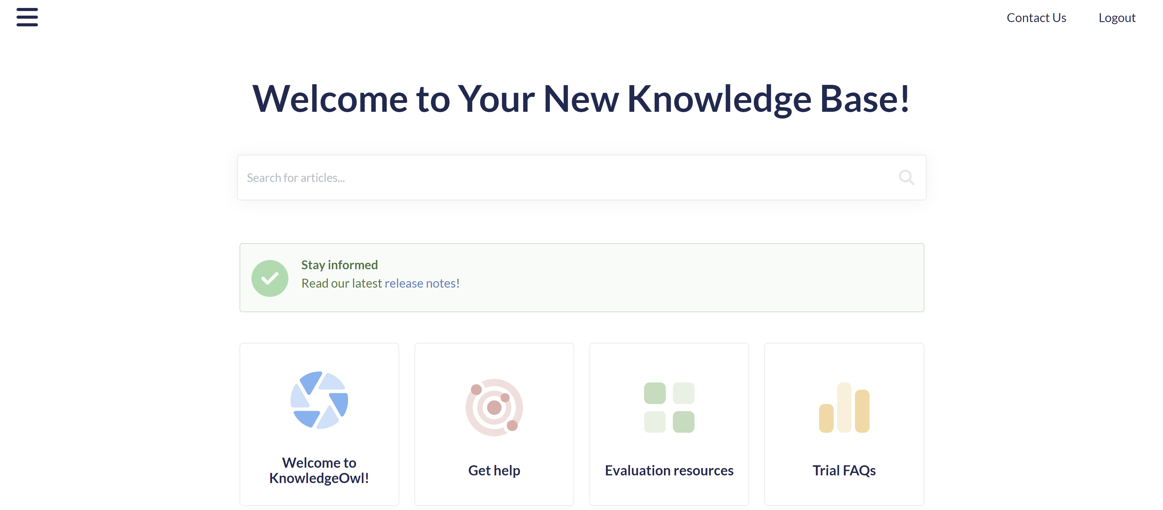 Sample announcement div for our release notes
There are three different ways you can create this callout, from simplest to most complicated:
- Create your alert div in Customize > Homepage. You may need to adjust where your Homepage body text displays, but this lets you use the Homepage WYSIWYG to create your alert div and requires basically no knowledge of working with raw HTML. Refer to the Customize Homepage alert instructions below.
- Create your alert div in an article editor, copy the code for it, and add it directly to Customize > Style > Custom HTML > Homepage. Use this option if Customize > Homepage already has text in it. Refer to the Custom Homepage HTML template instructions below.
- Create your own fully customized div in Customize > Style > Custom HTML > Homepage.
Customize Homepage alert
If you're new to KnowledgeOwl, this set of steps is usually the fastest to get started with.
- Go to Customize > Homepage.
- Make sure there's no content in the Homepage content > Custom content editor.
- Use the Div Style (magic wand) dropdown in the editor to insert the alert div style you'd like to use. Then use normal editor controls to add text, hyperlinks, and formatting as you'd like.
- Use Preview to make sure it's formatting how you like. If it's not showing up in the section you want, don't worry--we'll fix that next!
- Be sure to Save your changes.
New knowledge bases will likely display the Homepage content editor contents below the category icon panels on the homepage. To move that section somewhere else in your homepage:
- Go to Customize > Style (HTML & CSS).
- In the Customize HTML, CSS, and JS section, select Custom HTML.
- Select Homepage from the Select HTML section to edit dropdown.
- Your alert div will appear wherever
<div>[homepage("body")]</div>appears, which is usually placed just below the icon-cats template. To move it, highlight the full div to select it, cut it, then paste it in where you'd like. - Save your changes.
For example, the default Homepage Custom HTML template places the merge code on row 8, just below the template for the icon categories:
<div class="ko-homepage-top">
<h1 class="hg-article-title xcolor">[homepage("title")]</h1>
</div>
<div class="hg-article">
<div class="hg-article-body">
<div>
</div>
<div>[homepage("body")]</div>To get the placement shown in the screenshot at the top of this page, we move that homepage body merge code so that it's directly above the icon-cats template, like this:
<div class="ko-homepage-top">
<h1 class="hg-article-title xcolor">[homepage("title")]</h1>
</div>
<div class="hg-article">
<div class="hg-article-body">
<div>[homepage("body")]</div>
<div>
</div>
<div class="homepage-widgets row">Custom Homepage HTML template
Use these instructions if Customize > Homepage already has text in it. Here, we follow a two-step process:
- Create the alert div in an article editor and then copy the HTML for that div. Refer to Step 1: Create your div for detailed instructions.
- Add that HTML to Customize > Style > Custom HTML > Homepage. Refer to Step 2: Add to your homepage for detailed instructions.
Step 1: Create your div
First things first: use the article editor to create and style the div we want to use.
- Open an article in edit mode. We find it easier to create a new article for this so it's empty of any other code, but do whatever you feel comfortable with.
- In the editor controls, select the magic wand next to the text formatting controls to view Div Style:
 Built-in Div styles
 - Select the div style you want.
- With your div added to the editor, type whatever text and use the regular editor controls to insert hyperlinks and other formatting.
- Then, select the </> Code View button in the editor to switch to Code View.
 The Code View button
 - Copy the HTML code for the div you created. For example, mine looks like this:
<div class="alert alert-success">
    <p><strong>Stay informed</strong>
        <br>Read our latest <a href="/help/release-notes">release notes</a>!</p>
</div>
Step 2: Add to your homepage
Congratulations, you now have a fully-formed div in HTML format! Now we'll add this into the homepage itself:
- Go to Customize > Style (HTML & CSS).
- In the Customize HTML, CSS, and JS section, select Custom HTML.
- Select Homepage from the Select HTML section to edit dropdown.
- This page is going to look a bit different depending on how you've customized your knowledge base, so you may need to play with positioning a bit to get the look you want.
- For our standard layout, most often we see people put an announcement banner below the search bar and above the category panels, so that's what we'll do in this example.
- To add the banner here, look for the
<div class="hg-article-body>. - Add a new line between the hg-article-body div and the icon-cats template (or the homepage body template if that comes first in your Homepage HTML).
- Paste your HTML onto that line.
- So the Custom HTML should now look a little like this, with the new div at rows 7-10 (though your div is probably a bit different!):
<div class="ko-homepage-top"> <h1 class="hg-article-title xcolor">[homepage("title")]</h1> [template("large-search")] </div> <div class="hg-article"> <div class="hg-article-body"> <div class="alert alert-success"> <p><strong>Stay informed</strong> <br>Read our latest <a href="/help/release-notes">release notes</a>!</p> </div> <div>[template("icon-cats,max=8,col=4,desc=0")]</div> <div>[homepage("body")]</div> <div class="homepage-widgets row"> <div class="col-md-4 col-sm-6"><h3>[translation("article-lists:popular-articles")]</h3>[template("pop-articles")]</div> <div class="col-md-4 col-sm-6"><h3>[translation("article-lists:new-articles-heading")]</h3>[template("new-articles")]</div> <div class="col-md-4 col-sm-6"><h3>[translation("article-lists:updated-articles")]</h3>[template("up-articles")]</div> </div> </div> </div> - You can Preview your changes to be sure they look good. If you're comfortable with HTML, you can make tweaks here, or head back to the article editor to re-create your div.
- Once you like the look of it, be sure to Save your changes.
Roll your own
If you have some HTML skills, you can also design your own div rather than using the default alert styles.
To do this, you can create the div in Customize > Website or directly in Customize > Style > Custom HTML > Homepage. Set the background color, padding, any image or icon you want to use, etc. So, for example, this code:
<div style="background-color: #a5edef; color: #7f0707; padding: 15px; margin-bottom: 20px; border: 1px solid transparent; border-radius: 4px; text-align: center;">
    <img src="https://dyzz9obi78pm5.cloudfront.net/app/image/id/5e5d6e4c8e121c80424f245f/n/lightbulb-linus200px.png" style="max-height: 50px;" class="fr-fic fr-dii">Read our latest <a href="/help/release-notes">Release Notes</a>.
</div>
Produces this:
 Read our latest Release Notes.
If you get stuck, contact us--our support owls would be happy to help you get your alert div looking just right.
Formatting your div
For simplicity's sake, we used in-line styles in the HTML example here. You can always use a custom class and Custom CSS.
Do you want to add an icon with text to your homepage? This can be a great way to encourage people to jump to a particular category or resource or encourage awareness of specific issues or content.
In this example, we walk through creating a snippet that contains a div with a Font Awesome icon, some text, and a link to content in your knowledge base. You can then add that snippet to your homepage to display it.
The end-result will look something like this:
![]() Sample icon and link
Sample icon and link
Create the snippet
- Go to Snippets in the lefthand navigation. The Snippets page opens.
- Select + Create New Snippet. If you're not familiar with creating snippets, refer to Create a snippet for more detailed instructions.
- Enter a Snippet Name for your snippet, like
Homepage icon and link. The Merge Code Name is automatically calculated from the name. - Enter a Snippet Description. When anyone tries to insert a snippet using the editor, this description will be shown to them, so make it useful.
- Select the Snippet Content dropdown and select Code Editor:
- Copy the code below and paste it into the editor window:
<div class="homepage-callout-icon"> <!--Adjust the URL below to point to the location you want to use --> <a href="/help/breaking-news"> <!--Font Awesome icon. Can be replaced with code for other FA icons --> <i class="fa fa-life-ring" aria-hidden="true"></i> <!--Text you want displayed below the icon--> <div>Breaking News!</div> </a> </div> <style> /* Style for icon */ .homepage-callout-icon i { max-width: 240px; color: #A1222F; font-size: 48px; } /* Style for hyperlink text */ .hg-minimalist-theme div.homepage-callout-icon a { color: #A1222F; } /* For next section, choose one alignment and remove/comment out the other two Left is used as default */ /* Center*/ /*.homepage-callout-icon { text-align:center; margin: 20px 0; }*/ /* Left */ .homepage-callout-icon { display: inline-block; text-align:center; margin: 20px 0; } /* Right */ /* .homepage-callout-icon { display: inline-block; text-align:center; margin: 20px 0; float: right; }*/ </style> - In row 3, change the
href="/help/breaking-news"to reference the URL you'd like this section to point to. If it's within your knowledge base, you only need to use the relative URL (/help/, /home/, or /docs/ with the URL of the specific article or category). - In row 5: we use a Font Awesome life preserver ring icon. To change this:
- Head to the free Font Awesome icons.
- Browse or search for an icon you'd like to use.
- Select it and copy the HTML it displays for the icon.
- Replace the HTML in row 5 with the HTML you copied from Font Awesome.
- In row 7: Update the text you want displayed with the icon by editing this line. Make sure you keep it wrapped in
<div>and</div>. - In row 14, change the color and size of the icon by adjusting the styles for
.homepage-callout-icon i. - In row 19, change the color of the text font by changing the color for
.hg-minimalist-theme div.homepage-callout-icon a. - Rows 22-42: Choose one of the alignment options and delete or comment out the other two. The code sample defaults to left alignment if you don't make a selection here.
- Optional: If you'd like the linked icon and text to be visible only to certain reader groups, select those reader groups using the boxes in the Restrict to Reader Groups section.
- When you're done making adjustments, select Create.
With your snippet created, follow the instructions to Add the snippet to your homepage.
Here's a completed snippet using the "Center" align with a newspaper icon and text "Latest Releases!" and the colors changed to a dark blue:
<div class="homepage-callout-icon">
  <!--Adjust the URL below to point to the location you want to use -->
  <a href="/docs/release-notes">
    <!--FontAwesome icon. Can be replaced with code for other FA icons -->
      <i class="fa-regular fa-newspaper"></i>
    <!--Text you want displayed below the icon-->
    <div>Latest Releases!</div>
  </a>
</div>
<style>
  /* Style for icon */
  .homepage-callout-icon i {
    max-width: 240px;
    color: #1d284f;
    font-size: 48px;
  }
  /* Style for hyperlink text */
  .hg-minimalist-theme div.homepage-callout-icon a {
    color: #1d284f;
  }
  /* Center*/
  .homepage-callout-icon {
    text-align:center;
    margin: 20px 0;
  }
</style>
Add the snippet to your homepage
- Copy the Merge Code Value of the snippet.
- Go to Customize > Style (HTML & CSS).
- In the Customize HTML, CSS, and JS section, select Custom HTML.
- Select Homepage from the Select HTML section to edit dropdown.
- Paste the merge code value where you'd like your icon and link to appear in your homepage. This may take some trial and error.
- To place it below the search bar but above the category icons, enter it on a new line between the hg-article-body div and the div with the icon-cats template in it, for example, here it is in row 7:
<div class="ko-homepage-top"> <h1 class="hg-article-title xcolor">[homepage("title")]</h1> </div> <div class="hg-article"> <div class="hg-article-body"> <div></div> <div>[homepage("body")]</div>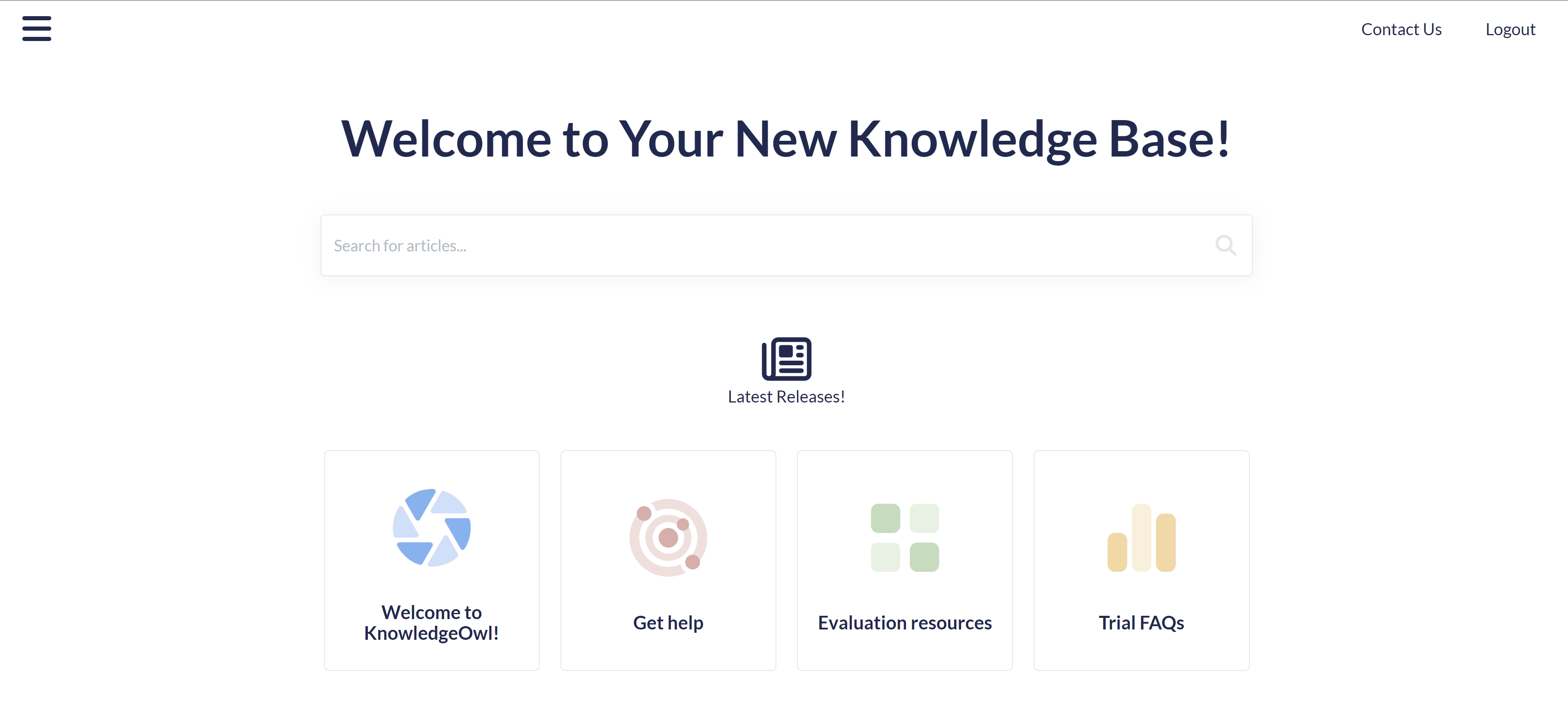 Sample of how that code displays in the live knowledge base
 - To place it between the title and the search bar, enter it on a new line between the h1 with the homepage title merge code and the large-search template, for example, here it is in row 3:
<div class="ko-homepage-top"> <h1 class="hg-article-title xcolor">[homepage("title")]</h1> </div> <div class="hg-article"> <div class="hg-article-body">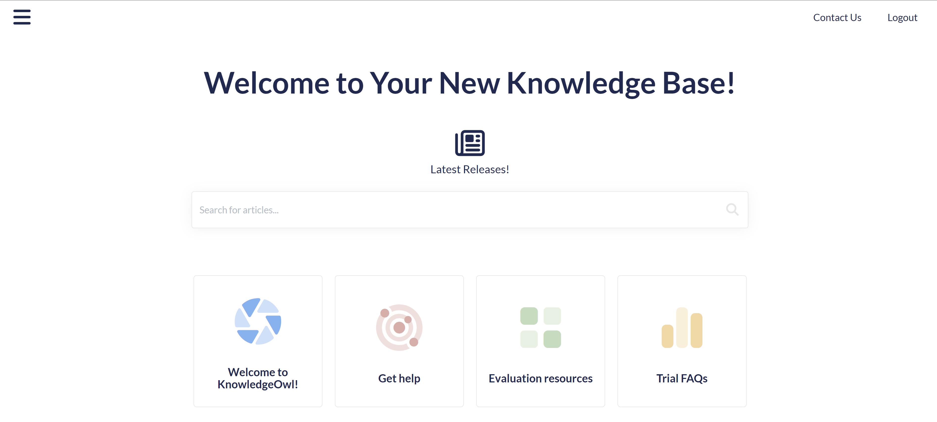 Sample of how that code displays in the live knowledge base
- To place it below the search bar but above the category icons, enter it on a new line between the hg-article-body div and the div with the icon-cats template in it, for example, here it is in row 7:
- Save your changes.

