Don't like the "Search for articles..." placeholder in the search bar?
Follow these steps to change it:
- Go to Customize > Default text. The Customize Text page opens.
- Select Search from the Knowledge Base Section dropdown.
- Find the row for "Search for articles..." (generally the top row!).
- Select the gear cog icon next to that row.
- Add the new placeholder text you'd like to display.
- Once you have the text as you'd like, be sure to select Update Text String.
The placeholder is updated.
For more detailed instructions on Customizing default text, refer to Add or edit your own text string.
Other search-related text you can customize includes:
- The global search bar autocomplete call to action ("Hit enter to search")
- The Search results... page header
- All of the sort options on the search results page
- Most of the metadata on the search results page
- The No results found message
- If you're using the options to Filter search by categories, all of the text related to those.
Refer to Section breakdown: Search for a complete list of customizable default text.
By default, searches that return no results display the text: "No results found" in a box below the results:
 Sample No results found display
You can customize the text in this message:
- Go to Customize > Default text. The Customize Text page opens.
- Select Search from the Knowledge Base Section dropdown.
- Find the row for "No results found".
- Select the gear cog icon next to that row.
- Enter the new text you'd like to display.
- Once you have the text as you'd like, be sure to select Update Text String.
The change will now be live in your knowledge base.
For more detailed instructions on customizing default text, refer to Add or edit your own text string.
Customize more text
This isn't the only search-related text you can customize! Refer to Section breakdown: Search for a complete list of customizable search text.
Search results will automatically display all tags assigned to a given article:
 Sample of Tags showing in Search Results
However, if you're using tags for custom filters in the Manage Articles interface, you might not want some of your internal tags to be shown in search results.
You can mark tags like this as hidden from readers. Hiding a tag from readers:
- Keeps it visible in the article editor and category editor.
- Allows it to be used as a filter in Manage Articles custom filters.
- Prevents the tag from appearing in search results in your knowledge base.
- Prevents the tag from appearing in the typeahead suggestions when a reader types ":" to begin a tag search.
To hide an existing tag from readers:
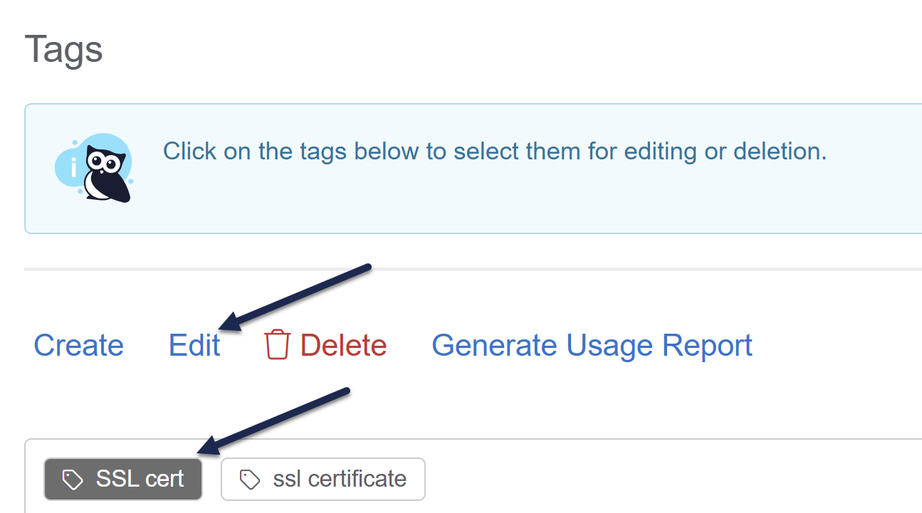
- Select Tags in the left navigation. The Tags page opens.
- Select the tag you'd like to hide from readers.
- Once you select a tag, the Edit link activates. Select it.
 Select the tag you'd like to hide and click Edit
The Edit Tag modal opens. - In the modal, check the Visibility box to Hide tag from readers.
- Select Edit Tag to save your changes.
- Regular tags will have a normal tag icon in the Tags page. Tags hidden from readers will have a padlock icon. Here, readers can see the tag
html(denoted by the regular tag icon), but the tagint: accessibilityis hidden from readers (denoted by padlock icon). Sample tags; the tag on the left with the tag icon is viewable to readers; the tag on the right with the padlock is not
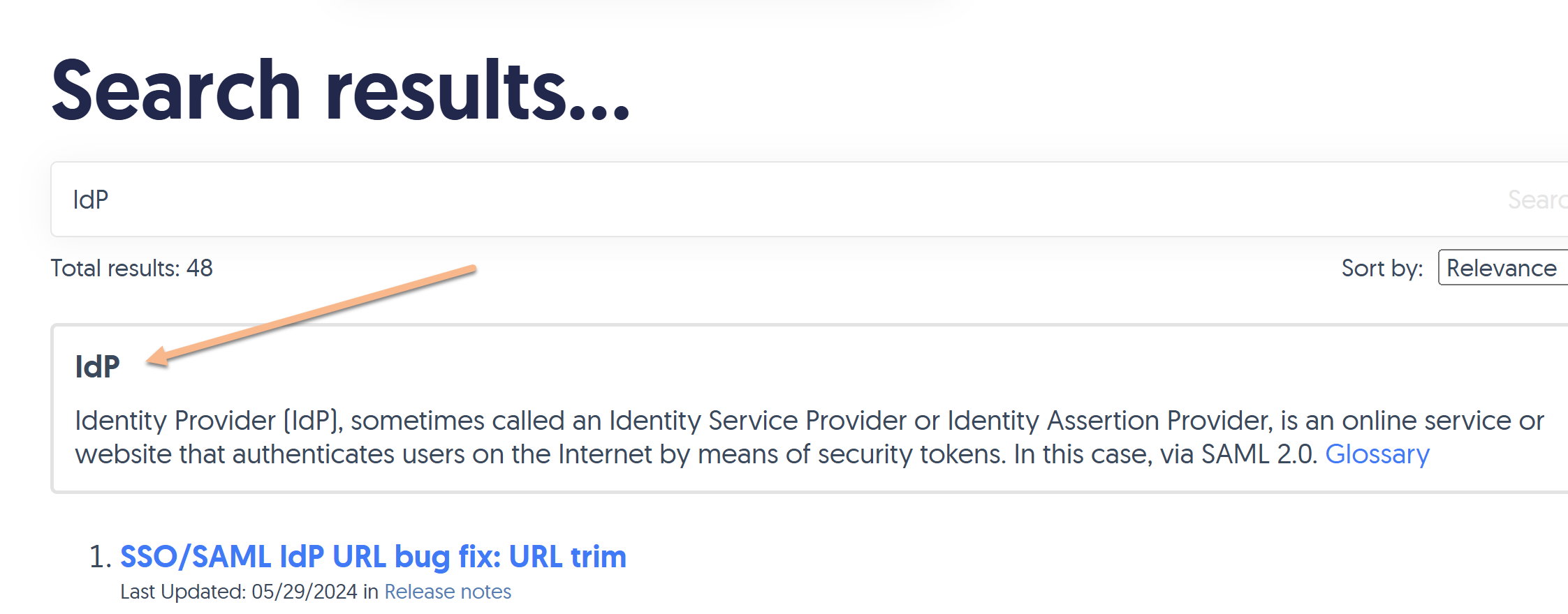
If you've enabled the option to display Glossary term callouts in your search results, they'll look something like this:

You can style different elements of these callouts:
- The box overall, like its color, border, border color, and so on.
- The term
- The definition
- The Glossary link
Refer to the more detailed instructions below.
Style the box
You can style the box the result displays in, to adjust the background color, border, border color, thickness, and so on.
The default styling for this box is:
/* Style the search result glossary term callout box */
.ko-glossary-search {
    border: 2px solid #e3e3e3;
    border-radius: 4px;
    margin: 15px 0;
    padding: 12px;
    position: relative;
}
This creates a box with a light grey border, with a white background and some padding between the text and the border, as seen in the screenshot above.
If you'd like to change any or all of this styling:
- Go to Customize > Style (HTML & CSS).
- In the Customize HTML, CSS, and JS section, select Custom CSS.
- Add CSS to style the
.ko-glossary-searchclass the way you'd like. (You can start by copying the CSS above and tinkering with it!)- For example, this CSS will keep the border the same size and width but change it to dark red, gives the entire box a light pink background color, and changes the font-color of all regular text in the box to white:
/* Style the search result glossary term callout box */
.ko-glossary-search {
    border: 2px solid #9c4728;
    background-color: #dc9b83;
    color: #ffffff;
}
- For example, this CSS will keep the border the same size and width but change it to dark red, gives the entire box a light pink background color, and changes the font-color of all regular text in the box to white:
- Save your changes.
Style the term
By default, the term displays in bold and the definition will appear below it in slightly smaller regular font text.
The glossary term is styled using the .ko-glossary-search-header class. You can add custom CSS to change the font-weight, color, font-family, and so on. To do so:
- Go to Customize > Style (HTML & CSS).
- In the Customize HTML, CSS, and JS section, select Custom CSS.
- Add CSS to style the
.ko-glossary-search-headerclass the way you'd like.- For example, this CSS will display the glossary term in all uppercase letters and in a dark pink color:
.ko-glossary-search-header {
    text-transform: uppercase;
    color: #9c4728;
}
- For example, this CSS will display the glossary term in all uppercase letters and in a dark pink color:
- Be sure to Save your changes.
Style the definition
By default, the term's definition will be displayed in bold, and the definition will appear below it in slightly smaller regular font text.
You can style the definition font differently using one of two classes:
.ko-glossary-search-resultwill style the definition as well as the Glossary hyperlink at the end. Use this class if you want to set the font-family, etc., for all the text there. (Since the Glossary is a hyperlink, the color and a few other traits cannot be styled here and need to be styled for the Glossary hyperlink itself--refer to the next section. But the font-family added here will apply to that hyperlink!).ko-glossary-search-result-definitionwill only style the definition. Use this class if you want to style the definition only but not touch the Glossary hyperlink.
To add styling for either of these classes:
- Go to Customize > Style (HTML & CSS).
- In the Customize HTML, CSS, and JS section, select Custom CSS.
- Add CSS to style the
.ko-glossary-search-resultclass or the.ko-glossary-search-result-definitionclass the way you'd like.- For example, this CSS will set the full search result to display in Garamond, in all uppercase, and a dark pink color:
.ko-glossary-search-result { text-transform: uppercase; color: #9c4728; font-family: Garamond; } - This CSS will make those changes only for the definition itself:
.ko-glossary-search-result-definition {
    text-transform: uppercase;
    color: #9c4728;
    font-family: Garamond;
}
- For example, this CSS will set the full search result to display in Garamond, in all uppercase, and a dark pink color:
- Be sure to Save your changes.
Style the Glossary link
Last but not least, you can also style the hyperlink pointing to the Glossary. To do so:
- Go to Customize > Style (HTML & CSS).
- In the Customize HTML, CSS, and JS section, select Custom CSS.
- To style the link's hover state, copy the CSS below and adjust the color in row 4 as you'd like:
/* Change color of Glossary page link in search results glossary term callouts */
.hg-minimalist-theme a.ko-glossary-search-link:not(btn), a.ko-glossary-search-link { color: #5C9AD1; } - To style the link's hover state, copy the CSS below and adjust the color in row 4 as you'd like:
/* Change color of Glossary page link in search results glossary term callouts */
.hg-minimalist-theme a.ko-glossary-search-link:not(btn):hover, a.ko-glossary-search-link:hover { color: #5C9AD1; } - Be sure to Save your changes.

